
Category Sans Serif, Monospace Date created 2003-11-? | Foundry M FONTS PROJECT | |
 | ||
Designer(s) Morishita, Cōji (森下 浩司) Date released 2003-12-? (TESTFLIGHT-001)2016-09-30 v 062 Variations Proportional with 7 weights from thin to black, and Monospace with 5 weights from thin to bold. Two Kana curve styles.See #Naming. | ||
M+ FONTS are Japanese font families designed by Coji Morishita. The 'M' stands for 'Minimum', while the plus sign means above minimum.
Contents
M+ OUTLINE FONTS
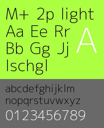
The M+ OUTLINE FONTS are sans-serif, with proportional and monospaced fonts and many different weights ranging from thin to black. The fonts support following characters sets: C0 controls and basic Latin, Latin-1 Supplement, Latin Extended-A, Japanese Kana, and Japanese Kanji. The fonts are developed using FontForge. The current version contains over 4600 glyphs.
Naming
A M+ outline font is named in a pattern like M+ [12](P|C|MN?)?. The numbers denote glyph design styles, while the letters denote latin glyph configurations.
The Latin Type-1 and Type-2 font are designed for use with M+ 1 and M+ 2 fonts respectively. Each Type-2 font has several alternative glyphs different from the respective Type-1 font.
Awards
The font family was selected as one of the "free fonts of the month" in Smashing Magazine, and also selected as "Project of the Month" in SourceForge.JP. It has also been selected as an excellent font among eight fonts for print and screen.
M+ BITMAP FONTS
M+ BITMAP FONTS consists of raster fonts, originally developed in 2002.
Font list
Licensing
The license for these font files is as follows:
These fonts are free software.
Unlimited permission is granted to use, copy, and distribute them, with or without modification, either commercially or noncommercially.
THESE FONTS ARE PROVIDED "AS IS" WITHOUT WARRANTY.