
Name Josef Tyfa | ||
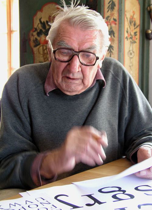 | ||
Josef Týfa (5 December 1913 – 19 January 2007) was a Czech type designer. He significantly contributed to the cultivation of corporate style and the development of book design and advertising in the 1950s and 60s. Typefaces he designed include: Kolektiv, Tyfa, Juvenis, Amos and Academia, many of which he digitized with František Štorm, founder of Storm Type Foundry. He has indicated that his influences include Jaroslav Benda, Pier Luigi Nervi, and modern graphic design and architecture including functionalism.
Contents
Life
He was born in Běloves, Náchod, Bohemia in December, 1913. He studied graphics at the Rotter School in Prague and later became art director of the Centrotex export company. In the 50s and early 60s he designed advertisements for companies such as Pilsner Urquell Brewery, Bata Shoes and the department store Brouk and Babka. Later in the 60s he began to focus more on type design and won several contests announced by state type foundry Grafotechna. Throughout his whole career Týfa designed hundreds of books.
Upon the improvement and popularization of digital typography software, although familiar with traditional requirements on metal type, he quickly began to enjoy the technology, and adjusted his old designs to a more contemporary look.
He died in Prague at the age of 93.
Tyfa
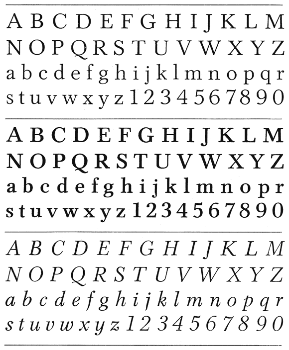
"Tyfa" was designed in 1959 and first released in 1960 when a Czechoslovakian design competition was held to determine the best new Czech typeface for book composition. Týfa's "Tyfa" typeface was the winner and the design was made into fonts for the linotype machine and as a hand-set type by the Czech type foundry, Grafotechna (for hot metal typesetting). Berthold Type Foundry later produced letter matrices of the design for Staromat devices, used for manual phototypesetting of display alphabets. It was also available on dry transfers of Transotype in the 80's. Although the design found immediate and continued popularity in Czechoslovakia, it saw little use elsewhere. The design was inspired by the work of architect Pier Luigi Nervi.
ITC Tyfa
18 years after the publication of the original design Jan Solpera, another Czech type designer, sent a letter ITC suggesting that it should release Tyfa as an ITC font. ITC was unable to communicate with Týfa at the time due to existence of the "Iron Curtain". Týfa was willing to licence his design to ITC but could only provide his original sketches from the late 50's, which were a set of signs on pieces of yellowing cardboard about B2 in size. In 1995 František Štorm approached Týfa, proposing to digitize his design under Týfa's direction. It was issued by ITC in 1998.
Design
Storm began digitizing the typeface under Týfa's direction and feels the design shows "a little touch of baroque typography". According to ITC, while it is possible to see the influences of older Czech designers such as Oldřich Menhart, ITC Týfa is a unique typeface with a distinctive character all its own and international appeal. The structure is considered neoclassical, with clear contrasts between thin and thick strokes and italics, other than the majuscule letters, differ largely in style from the regular characters.
Academia
Josef Týfa first published the Academia typeface in 1967–68. It was the winning design from competition aimed at new typeface for scientific texts, announced by Grafotechna. It was cut and cast in metal in 1968 in 8 and 10 point sizes of plain, italic and semi-bold designs.
Digitization
In 2003 Týfa began work with František Štorm on digitizing the typeface. As usual, Light and Black weight designs were used as starting points for the interpolation of the other weights. During 2004 Týfa approved a number of differences from the original typeset in order to bring the typeface more original and timeless feeling. Such differences were:
The new name, "Academica" distinguishes the present digital transcription from the original idea. It comprises Týfa’s initial concept to create a typeface for scientific application with versatility to other genres of literature.
Juvenis
Juvenis is a contemporary typeface originally intended for children's literature. It was digitized by Josef Týfa and František Štorm in 2002 and conceived half a century ago. Despite its original purpose as a contemporary typeface for children's literature, it can now be applied to posters, periodicals and longer works. Distinguishing characteristics include a large x-height and semi-serifs on lower case letters. On Týfa's attitude during the making process Štorm said: "it would not be Josef Tyfa, if he did not redesign the entire alphabet, and to such an extent that all that has remained from the original was practically the name".