
Nationality American Name Jane Frank | Role Artist Known for Painting, Sculpture | |
 | ||
Full Name Jane Babette Schenthal Died May 31, 1986, Balti, Maryland, United States Artwork Crags and Crevices, Frazer's Hog Cay #18 Periods Contemporary art, Modern art | ||
Jane Schenthal Frank (born Jane Babette Schenthal) (July 25, 1918 – May 31, 1986) was an American artist. She studied with Hans Hofmann and Norman Carlberg and is known as a painter, sculptor, mixed media artist, and textile artist. Her landscape-like, mixed-media abstract paintings are included in some important public collections, including those of the Corcoran Gallery of Art, the Baltimore Museum of Art, and the Smithsonian American Art Museum.
Contents
- Work
- Training in commercial art
- Becoming a painter
- Marriage and family and childrens books
- Health catastrophes and recovery
- Encountering Hans Hofmann and discovering a sculptural landscape
- Combining diverse materials and techniques
- Apertured multiple canvas paintings
- Standing apart
- Sculpture depths and shadows reflections and refractions
- Aerial landscape paintings
- Discussion of Jane Franks work
- References
Work
Jane Frank was a pupil of Hans Hofmann. She can be categorized stylistically as an abstract expressionist, but one who draws primary inspiration from the natural world, particularly landscape — landscape "as metaphor", she once explained. Her later painting refers more explicitly to aerial landscapes, while her sculpture tends toward minimalism. Chronologically and stylistically, Jane Frank's work straddles both the modern and the contemporary (even postmodern) periods. She referred to her works generally as "inscapes".
Jane Frank's paintings and mixed media works on canvas are in the collections of the Corcoran Gallery of Art ("Amber Ambience", 1964), the Smithsonian American Art Museum, the Baltimore Museum of Art ("Winter's End", 1958), the Herbert F. Johnson Museum of Art at Cornell University ("Red Painting", 1966), the Arkansas Arts Center in Little Rock ("Web Of Rock", 1960), and the Evansville Museum ("Quarry III", 1963). Her works are in many other public, academic, corporate, and private collections.
Training in commercial art
Jane Frank (when she was still Jane Schenthal) attended the progressive Park School and received her initial artistic training at the Maryland Institute of Arts and Sciences (now known as MICA, the Maryland Institute College of Art), earning in 1935 a diploma in commercial art and fashion illustration [Watson-Jones]. She then acquired further training in New York City at what is now the Parsons School of Design (then called the New York School of Fine and Applied Art), from which she graduated in 1939 [Stanton]. In New York she also studied at the New Theatre School. Her schooling complete, she began working in advertising design and acting in summer stock theater. From the sources, it is unclear whether she worked in these fields while still in New York, or only after returning to Baltimore. We do know, however, that she began painting seriously in 1940.
Becoming a painter
In a letter to Thomas Yoseloff, she wrote (quoted in Yoseloff's Retrospective, 1975, p. 34) that "prior to 1940 my background had been entirely in commercial art" and that when she began painting seriously, she had to "put behind me everything I had so carefully learned in the schools" (p. 34). She began a study of the history of painting and "went through a progression of spatial conceptions" (p. 35) from cave painting through the Renaissance, then concentrating on Cézanne, Picasso, and De Kooning. "I was also much concerned with texture, and heavy paint", she adds (p. 35).
Marriage and family - and children's books
After returning to Baltimore, she married Herman Benjamin Frank in 1941. According to the biography in "Baltimore County Women, 1930-1975" listed below, Jane had previously been working as a commercial artist "for department stores and advertising agencies", but she "gave up her career in commercial art for marriage and a family" (p. 16). After marrying, she signed her works consistently as "Jane Frank", apparently never including a maiden name or middle initial. Her husband, a builder, constructed their home, including a studio for his wife. With the initial demands of a new marriage and family presumably beginning to relax a bit, Jane Frank returned seriously to painting in 1947 (according to Stanton, p. 9).
In the following decade, while raising a family and rapidly developing as a serious painter, the young mother also illustrated three children's books. Monica Mink (1948) featured, along with Jane Frank's illustrations, a whimsical text by the artist herself, entirely in verse, relating a tale in which (according to the review published by the National Council of Teachers of English) "In rhyme the obstreperous Monica Mink 'who wouldn't listen and didn't think' is finally taught that 'all Mother Minks know best'." [1]. Thomas Yoseloff's The Further Adventures of Till Eulenspiegel (1957, New York City), featured Jane Frank's block prints, which already show a penchant for collage-like textural juxtapositions and strong diagonal composition. Jane Frank's 1986 obituary in the Baltimore Sun mentions that she published a third children's book, entitled Eadie the Pink Elephant, with both text and pictures by the artist, and this is confirmed in an excerpt from Publishers Weekly available online [2].
Health catastrophes and recovery
Professor Phoebe B. Stanton of Johns Hopkins University (see below) mentions that twice in the 20 years after 1947, Jane Frank suffered from illnesses which "interrupted the work for long periods". The first of these catastrophes was a serious car accident in 1952, requiring multiple major surgeries and extensive convalescence, and the second was a "serious and potentially life-threatening illness" soon after her 1958 solo show at the Baltimore Museum of Art. The latter illness was so severe, according to Stanton, that it interrupted Jane Frank's painting work for about two years.
Encountering Hans Hofmann, and discovering a "sculptural landscape"
Health problems notwithstanding, the latter 1950s proved decisively fruitful for Jane Frank as a serious artist. Having fairly well recovered from her injuries in the traumatic 1952 accident, she studied for a period in 1956 with the great abstract expressionist painter Hans Hofmann in Provincetown, Massachusetts, and this mentoring gave her a jolt of inspiration and encouragement. She soon had solo exhibitions at the Baltimore Museum of Art (1958), the Corcoran Gallery of Art (1962), the Bodley Gallery in New York (1963) and Goucher College (1963), among others.
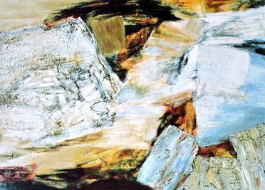
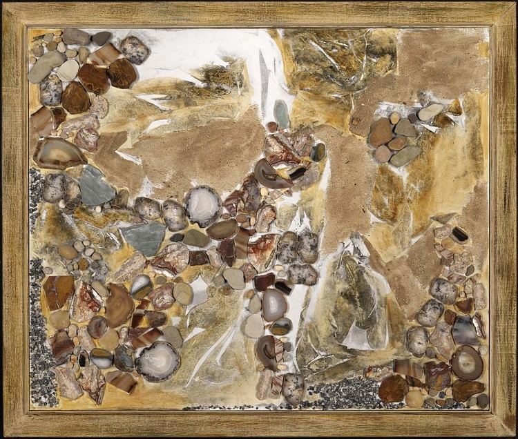
She also, in 1962 (1961 according to some sources), won a Rinehart Fellowship, enabling her to study with Norman Carlberg [3] at the Rinehart School of Sculpture, Maryland Institute College of Art. This might seem a sudden and late detour away from painterly pursuits, but it is really a logical step: the canvases in the 1962 Corcoran show, such as "Crags and Crevices" and "Rockscape II" [4][5], already feature passages that are sculpturally "built up" with thick mounds of gesso (or "spackle", as Stanton tends to call it).
The single best source on Jane Frank is The Sculptural Landscape of Jane Frank (1968), by Phoebe B. Stanton (the art history professor emerita at Johns Hopkins University who died in 2003). Stanton's text provides a guide to Jane Frank's life and work, and there is a helpful and liberal use of quotations from the artist herself, enabling the reader to understand how Frank's thinking evolved, especially from the late 1950s through the late 1960s. The book (out of print but still in many public and university art libraries) also contains a wealth of biographical information and many large plate reproductions of the artist's works, some in color. There are also photographs of the artist.
Jane Frank's preoccupation with space was evident even before her paintings became overtly "sculptural" in their use of mixed media. Of the paintings in the 1962 Corcoran Gallery show, she tells Phoebe Stanton: "I was trying to pit mass against void and make it look as though there were passages that went way back - that's why 'crevice' is in so many of the titles" (Stanton, p. 15). Indeed, "Crags and Crevices" (70"x50", oil and spackle on canvas), completed in 1961, dominated the show.
Combining diverse materials and techniques
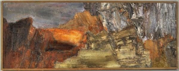
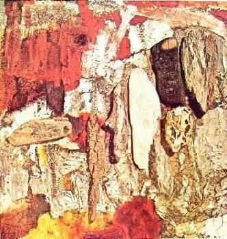
Soon after the month-long Corcoran Gallery solo exhibition, Jane Frank began to apply not just spackle but a variety of other materials - sea-weathered or broken glass, charred driftwood, pebbles, what appears to be crushed graphite or silica, and even glued-on patches of separately painted and encrusted canvas (canvas collage) - to her jagged, abstract expressionist paintings. "I wanted work that was painterly but with an actual three-dimensional space", she later wrote (Yoseloff 1975, pp. 37–39). Jane Frank's first solo show at New York City's Bodley Gallery (1963), as well as her 1965 solo show at Baltimore's International Gallery, featured many of these radically dense and variegated mixed media paintings.
"Apertured", multiple-canvas paintings
Later she began making irregular holes in the canvases ("apertures", as she called them: the earliest example is "Winter Windows", 1966–1967), disclosing deeper layers of painted canvas underneath (so-called "double canvases" - and sometimes triple canvases), with painted-on "false shadows", etc. - increasingly invoking the third dimension, creating tactile, sculptural effects while remaining within the convention of the framed, rectangular oil painting. The apertures also suggest a view into some sort of psychological interior, as though the second canvas - seen only partially, through the hole in the forward canvas - were some half-concealed secret, perhaps even another whole painting that we will never see.
Stanton (p. 24) also notes that Jane Frank worked out a method - unspecified - of stiffening the apertures' often jagged edges so that they held their shape and flatness. These creations are a type of "shaped canvas", though obviously very different from the shaped canvases of Frank Stella and others more commonly associated with this term.
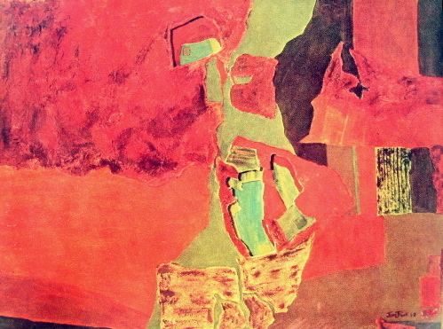
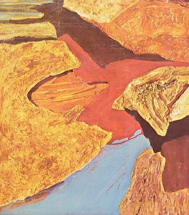
In much of her output before the late 1960s, Frank seems less interested in color than in tonality and texture, often employing the gray scale to create a sense of depth or of motion from light to dark, this frequently moving in a diagonal (as in "Winter's End", 1958), and otherwise employing one basic hue (as with the earthy reds in "Plum Point", 1964). However, the later, "windowed" paintings show a sharper interest in vivid color relationships: indeed, Yoseloff (p. 20) notes that with the later paintings "she has gone to bolder colors". This is especially true, as he notes, in the "aerial" paintings, of which an early and monumental example is "Aerial View no. 1" (1968, 60 inches by 84 inches, collection of the Turner Auditorium complex at the Johns Hopkins School of Medicine, Johns Hopkins University). This was one of the artist's favorites, according to Baltimore County Women [see below].
Standing apart
While these highly complex and laborious constructions (she often called them "three-dimensional paintings") moved her well beyond the vocabulary of the improvisatory, so-called "action painting" usually associated with American abstract expressionism, they also had virtually nothing to do with the pop art and minimalism which were then the rage of the 1960s New York art scene. Furthermore, they bore little resemblance to the serene "color field" paintings of Morris Louis, Helen Frankenthaler, or Mark Rothko. Whether brooding or exuberant, the (as it were) geologically deposited, erupted, eroded, and gouged canvases of Jane Frank stand apart from all else. Perhaps this style could be called "geomorphic abstraction" - though apparently no such term can be found as a stylistic category in art history books.
This standoffish aesthetic position, her chosen departure from the career-making New York City scene, and the fact that her overall output was not very large (by some standards at least), were factors that limited her career and her contemporary impact on the course of American art. Yet perhaps, as time goes on, present-day art lovers who get to know these pieces will agree with Professor Stanton that they are powerful and beautiful creations, worthy of contemplation and admiration on their intrinsic merits - regardless of what was supposedly fashionable in 1960-something:
Sculpture: depths and shadows, reflections and refractions
In the late 1960s, Jane Frank turned her energies toward the creation of free-standing sculpture, i.e., sculptures properly speaking, as opposed to "sculptural paintings" or mixed media works on canvas.
The sculptures, with their clean lines and surfaces, often in sleek lucite or aluminium, completely dispense with the earthy, gritty qualities of those "sculptural landscape" canvases. Busch (1974) quotes Frank as saying: "I begin [working] from a drawing or cardboard mockup. I give my welding and aluminum pieces to a machinist with whom I work quite closely".
There were more solo exhibitions, at venues including New York City's Bodley Gallery again in 1967, Morgan State University (1967), Goucher College (for the second time) in 1968, London's Alwin Gallery in 1971, the Galerie de l'Université, Paris (1972), the Philadelphia Art Alliance (1975), and a major retrospective at Towson State College (now Towson University) in 1975. She also won the Sculpture Prize at the 1983 Maryland Artists Exhibition (source: Watson-Jones).
Aerial landscape paintings
Even after 1967, when Jane Frank began making sculptures, grappling with new media such as plastics and metals, she maintained her ever-evolving production of mixed media paintings on canvas, virtually until the end of her life. Continuing her exploration of the possibilities of multiple-canvas, "apertured" paintings, she began to create her "Aerial Series" pieces, which came more and more explicitly to suggest landscapes seen from above. Especially noteworthy and striking are the "Night Landings" paintings, such as "Night Landings: Sambura" (1970), with the city grid glinting below like a dark jewel in a deep, nocturnal blue river valley. The 1975 Yoseloff retrospective catalogue listed below is very illuminating on these latter developments, and the color plates (which include images of some of the sculptures) are of higher quality than those in the Stanton book.
Several sources note that Jane Frank also designed rugs and tapestries; a color photograph showing a detail from one of these textile works is reproduced in the Ann Avery book listed below.
Jane Frank died on Saturday, May 31, 1986. In some sources, her place of residence is listed as Owings Mills, Maryland, which is a near suburb of Baltimore. The 1986 Watson-Jones book's entry on Jane Frank, available at the "Questia" link given below, states her address as "1300 Woods Hole Road Towson, Maryland 21204". Towson is another near suburb of Baltimore.
Discussion of Jane Frank's work
Phoebe Stanton writes that "landscape" is for Jane Frank a way of conveying ideas which (to Stanton) recall Heidegger's definition of poetry, which included "the recreation of the experience of standing 'in the presence of the gods and to be exposed to the essential proximity of things' ". According to the jacket notes of the Stanton book, Pictures on Exhibit magazine commented in a similar vein, saying that these landscapes are "to a compellingly strong degree, poetic evocations of communion with Nature's basic essentials". We are in direct contact with the primal forces, exposed and profoundly alone.
These works are at once sensually compelling and incorporeal — "out-of-body", so to speak. And as Julia M. Busch points out, even the sculptures avoid reference to anything recognizably, bodily human. Stating that Frank's sculptures are "environmental", Busch goes on to define this term in a way that points to their "beyond-human" quality:
"Environmental sculpture is never made to work at exactly human scale, but is sufficiently larger or smaller than scale to avoid confusion with the human image in the eyes of the viewer."
Also, the canvases of the 1960s, for all their landscape-like qualities, usually avoid anything that can be read as a horizon or a sky: we literally don't know which way is up; for as Stanton (p. 12) points out, Jane Frank - starting with "Winter's End" (1958) - avoids horizontal orientation in favor of strong diagonals. Furthermore, in this painting, as in many others of the next decade, scale is undecidable. Stanton, again speaking of "Winter's End", writes:
"One is given no indication of the size of the scene; the way through which winter passes could be either a mountain gorge or a minute water course" .
Plenty of cues are there that this is some sort of landscape, and Frank herself avows it:
"The beginning of my efforts to make my own statement, I would trace to my first visit to the Phillips Gallery.... Landscape was a natural metaphor, and so it is still for me today, in my three-dimensional double canvases".
Summing up the ambiguous position of Jane Frank's work on canvas with respect to both landscape art and pure abstraction, a reviewer for The Art Gallery magazine wrote of her 1971 solo show at London's Alwin Gallery: "Her richly textured canvases evoke a world of crags and forests, rivers and plains, in terms which are entirely non-representational." [6]
The catalogue of the 1963 Bodley Gallery show contains a long essay by the artist, and the following three quoted passages capture many of the concerns described here:
(1) On constructing her metaphorical landscape vocabulary: "I prefer to create my own landscapes or vocabulary of shapes and patterns. However, it is rock and mineral substances, their veins and surfaces, projections and infinite hollows, which spark my particular fantasy - also beach wood, well worn with time, that is to be found on the water's edge. Issues of space have always been one of my prime concerns, and these substances seem to relate most closely to this concern. These then are the metaphor..."
(2) On the quality of interiority in her works: "It is also an attempt to penetrate the surface of an object, presenting not only the outside but what occurs within - the essence or core."
(3) On the essential aloneness of her vision: "The artist must create his own space, of his own time and personal vision. The result is not a unique image for the sake of 'newness', but rather for the sake of the artist, who must be concerned with it daily. These days are spent quite alone."
These pieces of the late 1950s and 1960s never lapse into the complaisantly decorative: there is a certain deliberate instability, often even violence, that prevents that. This quality comes through in another remark from Dr. Stanton's book. She's speaking of "Crags and Crevices", but it fits many of the works: "Nothing in the painting is still, for the big forms seem to hover in mid-air, colliding as they fall. There are provocative and startling contrasts between passages of thin, transparent paint and thick impasto, filled with striatures left by the palette knife."
Even 1968's "Aerial View No. 1", despite the spatial hint of the title, is far from literal. Certain features of structure and color render a literal interpretation of this image as an aerial landscape difficult or even impossible. The attempt at interpretation is both invited and repulsed. But by about 1970, with the "Night Landings" paintings, there was a definite shift away from the previous decade's stubbornly refractive attitude. The "Night Landings" offer a much more definite sense of scale and viewpoint, especially with the aid of the titles. "Night Landings: Nairobi" is not disorienting in the least: we know where we are; we know we're in a plane, we know the plane is landing, and we even know roughly what time it is: we are looking down, and we see vividly the city named in the title, with the surrounding land and water.
Furthermore, the fact that we see a city down there means that - at least implicitly - there are people in this painting.
Yoseloff, in his 1975 "Retrospective" book, enthuses:
"Perhaps the ultimate achievement in the direction in which Mrs. Frank has been tending is her series of "night landings".... Now, more than ever, the viewer is deeply involved, and he can feel himself carried downward into the landscape that is the canvas before him"
A staunch modernist might scoff that with the "Night Landings" of 1970 Jane Frank's art begins to "go gentle into that good night" (perhaps even lapsing into "postmodernism"). But if these more literal aerial landscapes - created in 1970 and after - lose some of the tension that gives the earlier paintings their distinctive power, they nevertheless address, with an intensely intimate delight, a perspective on reality which we must remember was still quite young in 1970, at least as a painterly subject. In "Aerial Perception" (1985), author Margret Dreikausen sees Jane Frank's aerial landscapes as sharing the spirit of the work of artists such as Georgia O'Keeffe, Susan Crile, and others, in creating images which "reflect contemporary interest in reality", experienced from a historically new vantage point. Dreikausen insists that this art "does not merely show landscape from the air" but incorporates the "earthbound vision" into "remembered images from both spaces". Dreikausen also sees Frank's aerial paintings as consisting of two basic types: the "day scenes" (such as "Ledge of Light") and the "night landings" (such as "Night Landing: Sambura"). The day scenes show a fascination with the play of actual shadows and false, painted ones, "inviting the viewer more closely to inspect the textures on the canvas and its 'reality' ". In the night landings, by contrast, the city is the focus, nestled in the canvas's aperture, like a precious jewel in a dark velvet box, with its "enticing twinkling lights", suggesting "the anticipation of the unknown, mysterious city.... The use of beads and glitter, partially covered with paint, conveys a sense of personal landscape".
The 1999 Benezit book's entry on Jane Frank takes it as a given that her works on canvas may be summarized as semi-abstract aerial views: "Sa peinture, abstraite, fait cependant reference a un paysagisme aerien, comme vu d'avion." ("Her paintings, though abstract, nevertheless make reference to aerial landscapes, as viewed from an airplane.")