
 | ||
An isochrone map (isochrone plan, isochrone diagram) in science and urban planning is a map showing areas related to isochrones between different points. An isochrone is defined as "a line drawn on a map connecting points at which something occurs or arrives at the same time". Such a map is sometimes termed simply an isochrone. In hydrology and transportation planning isochrone maps are commonly used to depict areas of equal travel time. The term is also used in cardiology as a tool to visually detect abnormalities using body surface distribution.
Contents
History
Isochrone maps have been used in transportation planning since 1887 or earlier. Early examples of Isochrone maps include the Galton´s Isochronic Postal Charts and Isochronic Passage Charts of 1881 and 1882, Bartholomew's Isochronic Distance Map and Chart first published 1889 or earlier and Albrecht Penck's Isochronenkarte first published 1887. Where as Galton and the Bartholomews published maps depicting the days or weeks it took to travel long distances, Albrecht further developed the idea to not only depict long distances and world travel but also smaller areas. Penck also created a series of maps that only depict the travel times of a certain transportation mode, for example Rail transport. Isochrone maps are commonly used in the UK in connection with development control. Information technology in the 21st century has enabled them to be dynamically generated for use in websites, being used by house hunters wishing to evaluate residential areas.
Hydrology
Isochrone and related maps are used to show the time taken for runoff water within a drainage basin to reach a lake, reservoir or outlet, assuming constant and uniform effective rainfall. An early example of this method was demonstrated by Clark in 1945.
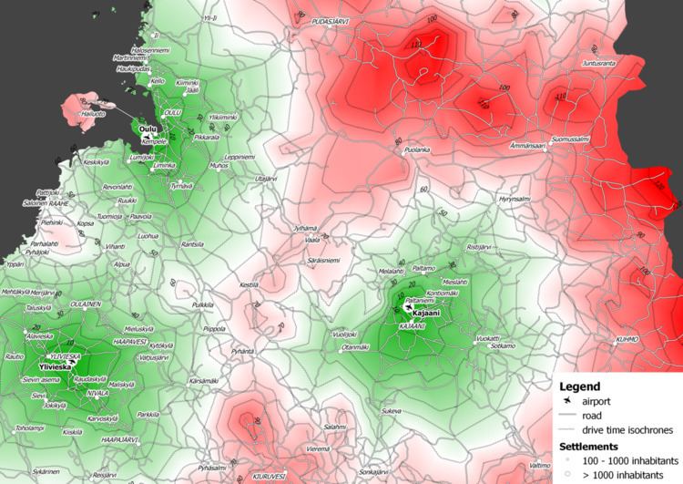
Transportation planning
Time-based travel maps can be created for different modes of transportation, e.g. foot, pedal cycle, motor vehicle. Such maps for private motor transport were widely used in a 1972 study into airport accessibility in Hampshire, South East England. At that time, their use was disadvantaged by being time consuming to create.
Isochrone maps can be generated using the Google Maps API and this can be done from arbitrary starting points. The creation of journey time isochrones to airports in Finland has been explained using the GIS software QGIS and pgRouting (an extension of PostGIS).
General public
Journey time websites have been built using mapping technologies and open data. Examples of such sites are PedCatch, instaGIS, TravelTime platform by iGeolise, Mapumental and Mapnificent. Such sites can be used by house hunters wishing to evaluate residential areas. An isochrone map of the London Underground network was made available in 2007. Iso4App is an isochrone map service (car, bike and pedestrian) available on Europe, Russian Federation, Ukraine, China, North America, Latin America, Australia-Oceania, South Africa; in addition iso4app implements isochrones on public transport. Demo is available at Tolosa (France). A time-based travel map that went viral was the Isochronic World Map, produced using data from Rome2rio's routing engine for plane, train, bus, ferry and automobile. It compared travel times from London in 2016 versus 1914.