
Classification Grotesque | ||
 | ||
The Stephenson Blake Grotesque fonts are a series of sans-serif fonts created by printing company Stephenson Blake of Sheffield mostly around the end of the nineteenth century.
Contents
Stephenson Blake's grotesque faces are in the traditional "grotesque" style of sans-serif, with folded-up letterforms and a solid structure not intended for extended body text. Forming a sprawling series, they include several unusual details, such as an 'r' with a droop, very short descenders and considerable variation in stroke width, creating a somewhat eccentric, irregular impression. Rather than "true" italics, with letterforms influenced by handwriting, sharper obliques are used, in which the letterforms are slanted but do not take on handwriting characteristics.
Much less artistically and systematically designed than later families like Univers and Helvetica, they were very commonly used in British commercial printing in the metal type era, with a revival of interest as part of a resurgence of use of such "industrial" sans-serifs around the 1950s. Writing in The Typography of Press Advertisement (1956), printer Kenneth Day commented that the family "has a personality sometimes lacking in the condensed forms of the contemporary sans cuttings of the last thirty years." Jeremy Tankard has described them as the "most idiosyncratic of designs". Not all versions have been digitised.
Family
The family of typefaces was sold by number rather than using weight names. Commonly used numbers included:
Stephenson Blake also used the terms "Condensed" and "Elongated Sans Serif" in some cases.
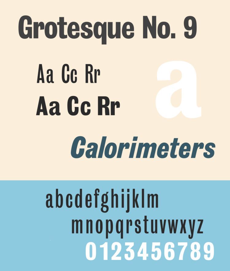
A particularly popular member of the family is Grotesque No. 9, a bold condensed weight, and its companion oblique. Users of "Grot No. 9" include Wyndham Lewis's 1914 avant-garde magazine Blast and more recently Q magazine. It reached Letraset dry transfer lettering and, unlike many of the other Stephenson Blake Grotesques, has been digitised.
The Stephenson Blake Grotesques of the late nineteenth century should not be confused with the first sans-serif font ever made, the Caslon Egyptian of c. 1816 which Stephenson Blake sold, which was a quite separate design.
Related fonts
Similar designs include:
The modern corporate font of Sheffield, Wayfarer designed by Jeremy Tankard, is designed with some influences of the Stephenson Blake Grotesque series but predominantly based on their unrelated sans-serif Granby.