
 | ||
The Two Lines English Egyptian typeface is a font created by the Caslon foundry of London around or probably slightly before 1816, that is the first general-purpose sans-serif typeface in the Latin alphabet known to have been created. A capitals-only design, original matrices of the typeface (with a replacement 'C') survive. ("English" is an archaic name for its body size.)
Sans-serif lettering had been developing in popularity over the past decades, initially due to interest in classical antiquity in which inscriptions often had minimal or no serifs, and come to be used by architect John Soane and copied by others, particularly in signpainting. Historian James Mosley, a leading expert on early sans-serifs, has suggested in his textbook The Nymph and The Grot that Soane's influence was crucial in spreading the idea of sans-serif letterforms around the end of the eighteenth century. However, it was some decades before a printing typeface would be released in this style, now commonly used. Somewhat "classical" in style and not particularly bold (although still bolder than conventional body text fonts), the "Egyptian" typeface appears similar to Soane's lettering. The name "Egyptian" had become commonly used in England by 1816 to describe this style of lettering; it may originate from the image of sans-serifs being historical in style, the Egyptomania of the period and the "blocky" nature of ancient Egyptian architecture. (The term "Egyptian" has since become associated with slab-serif typefaces.)
Caslon's Egyptian typeface was shown in the foundry's specimen books, the earliest edition with a date dated 1816 although some possibly earlier. It appears in the specimen book sandwiched by larger and much more ornate typefaces, apparently not marketed with any prominence. Aside from its documented existence and survival, the reasons behind its creation are not clear, since no contemporary uses of it have been found. Mosley suggests that it may have been created on commission by a specific client. The matrices were acquired by the Stephenson Blake company among other Caslon foundry materials. With increasing interest in sans-serifs around the early 1830s, the company revived the matrices and matching versions in other sizes (of lower quality of execution) were cut. (These should not be confused with Stephenson Blake's unrelated "Grotesque" typefaces of the late nineteenth century.)
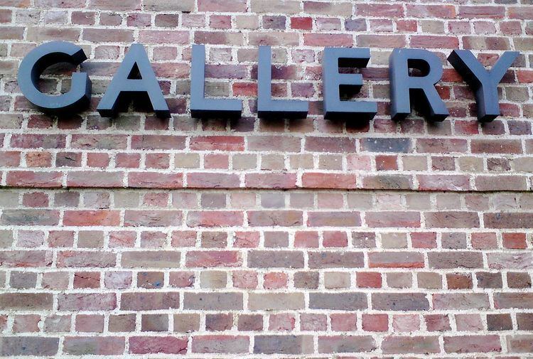
Several digital revivals of Caslon's Egyptian have been made, for commercial use by Font Bureau (adding an invented lower case) and for private use by Justin Howes and James Mosley. Howes' revival is used for signage at Dulwich Picture Gallery, designed by Soane. In 1987 metal type was cast by Oxford University Press from the original matrices to print a special edition of reprinted type from the early nineteenth century crafted by Ian Mortimer.
To mark the two-hundredth anniversary of the first dated printing of a sans-serif typeface, a conference was held at Birmingham City University in September 2016.