
Category SerifDisplay Foundry StempelLinotype | Designer(s) Gudrun Zapf-von Hesse Date released c. 1951 | |
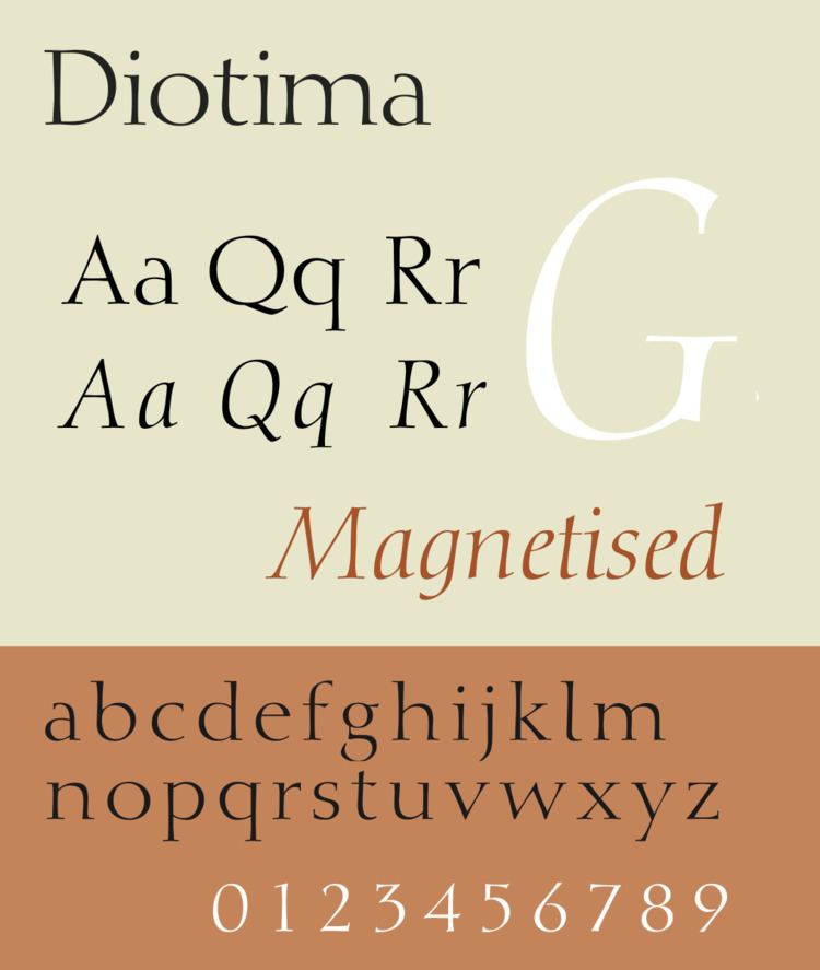 | ||
Diotima is a serif typeface designed by Gudrun Zapf-von Hesse and published by Stempel.
Diotima has a relatively slender and wide design, light in colour and suitable for purposes such as decorative printing and headings rather than for body text. Aspects of the roman recall Roman square capitals such as those on the Column of Trajan, such as the 'M' with no upper serifs (it has serifs in italic). The italic lower-case is relatively calligraphic in design with a 'single-story' 'g'. The design is named for the philosopher Diotima of Mantinea, perhaps appropriately highlighting its status as one of the few typefaces designed by a woman up to this point.
Diotima was released in the roman or regular style around 1951 and the italic around 1953, although Zapf-von Hesse had been working on the design for some years by this point. The design was her first full typeface. Her husband, Hermann Zapf, used it for typesetting their wedding announcement.
As was common for work by Stempel at this time, the original release was crafted by the punchcutter August Rosenberger. Stempel later released Ariadne-Initialen (Ariadne Initials), a set of swash capitals to complement it. The design was later reissued by Linotype.
In 2001, San Francisco Public Library held an exhibition on Hermann and Gudrun Zapf's work, showcasing early specimens of Diotima.
Digitisations
Diotima was digitised early on in the period of digital fonts, with releases by Linotype (which had inherited the rights from Stempel) and Adobe.
In 2008-9, Zapf-von Hesse and Akira Kobayashi of Linotype released Diotima Classic, a new interpretation. It is in light, regular, bold and heavy weights and italics. Linotype described the 'regular' weight as corresponding to the metal type after ink spread, and the light as analogous to the previous digital version (that shown right). The bold and heavy weights were new additions. The width was somewhat reduced in roman and widened in italic.