
Date released 1799 | ||
 | ||
Link linotype.com/1012/linotype-didot-family.html Foundry Mergenthaler Linotype Company | ||
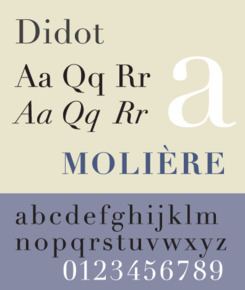
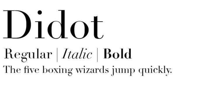
Didot typeface
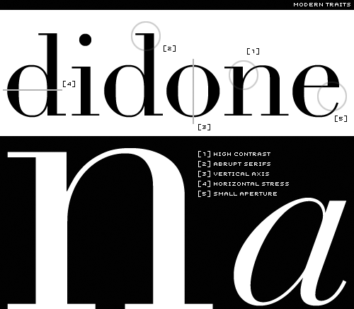
Didot is a group of typefaces named after the famous French printing and type producing Didot family. The classification is known as modern, or Didone.
Contents
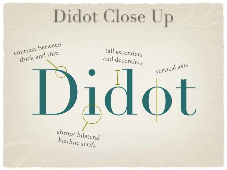
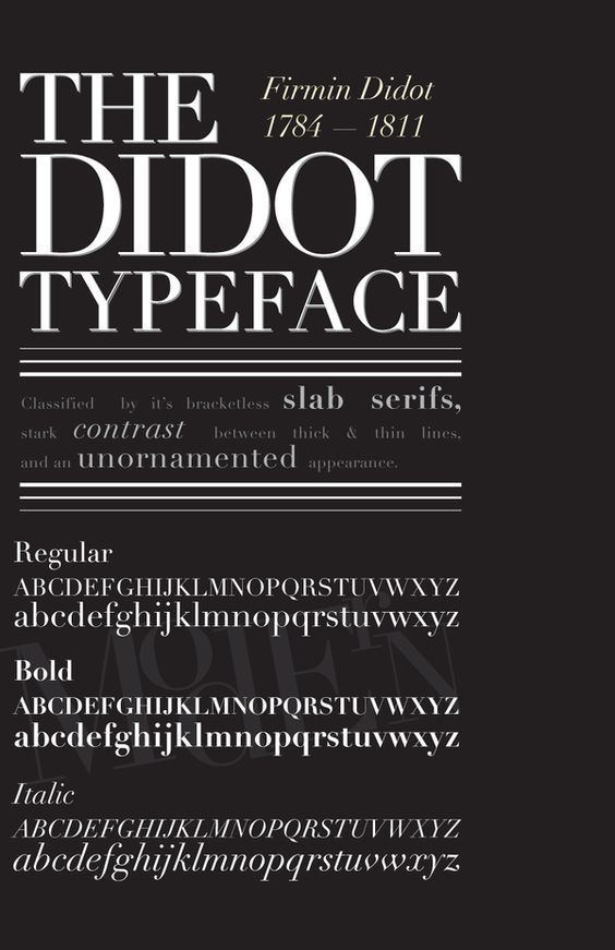
The most famous Didot typefaces were developed in the period 1784–1811. Firmin Didot (1764–1836) cut the letters, and cast them as type in Paris. His brother, Pierre Didot (1760–1853) used the types in printing. His edition of La Henriade by Voltaire in 1818 is considered his masterwork. The typeface takes inspiration from John Baskerville's experimentation with increasing stroke contrast and a more condensed armature. The Didot family's development of a high contrast typeface with an increased stress is contemporary to similar faces developed by Giambattista Bodoni in Italy.
Didot is described as neoclassical, and evocative of the Age of Enlightenment. The Didot family were among the first to set up a printing press in the newly independent Greece, and typefaces in the style of Didot have remained popular in Greek since.
Revivals and digitisations
Several revivals of the Didot faces have been made, first for hot metal typesetting and then for phototype and digital versions.
Digital use of Didot poses challenges. While can it look very elegant due to the regular, rational design and fine strokes, a known effect on readers is 'dazzle', where the thick verticals draw the reader's attention and cause them to struggle to concentrate on the other, much thinner strokes that define which letter is which. For this reason, using a font adapted to the intended text size - optical sizing - has been described as particularly essential with Didone designs. Fonts to be used at text sizes will be sturdier designs with thicker 'thin' strokes and serifs (less stroke contrast) and more space between letters than on display designs, to increase legibility. (Optical sizes were a natural requirement of printing technology in the time of metal type, since each size of metal type would be custom-cut, but declined as digital fonts made printing the same font at any size possible. A revival has taken place in recent years but they are normally only offered in commercial fonts.)
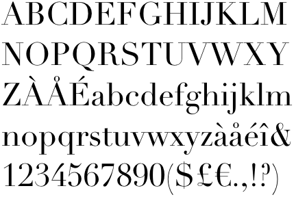
Among the most successful contemporary adaptations are the ones drawn by Adrian Frutiger for the Linotype foundry, and by Jonathan Hoefler for H&FJ. Hoefler's design anticipates the degradation of hairline in smaller point sizes by employing heavier weighted strokes in the smaller point sizes. Frutiger's Didot revival, which is bundled with OS X, was specifically intended for display use and not for body text, and adds in addition an even more delicate headline font.
Usage
The Style Network used a bold weight of Didot in its on-air identity (in addition to the News Gothic font). Alexey Brodovitch implemented the usage of Didot in Cahiers d'Art and Harper's Bazaar. Vogue has been using Didot as the typeface for their cover title since 1955.
A survey of 368 people done by writer and typographer Sarah Hyndman suggested that bold typefaces with rounder terminals appear cheaper, whereas lighter weights, serifs, and contrasts were rated as more expensive, with the modern Didot selected as the most expensive looking font.
The "CBS Didot" version of Didot was commissioned and used by broadcast network CBS for many years alongside its famous "eye" logo. While the network's use of Didot with its logo is not as prevalent as it once was, it is still a common sight, used mainly for the imaging of CBS News, the logo for CBS Corporation, and the logotype for The Late Show with Stephen Colbert.