
 | ||
Cursive Hebrew (Hebrew: כתב עברי רהוט ktav ivri rahut) is a collective designation for several styles of handwriting the Hebrew alphabet. Modern Hebrew, especially in informal use in Israel, is handwritten with the Ashkenazi cursive script that had developed in Central Europe by the 13th century. This is also a mainstay of handwritten Yiddish. It was preceded by a Sephardi cursive script, known as Solitreo that is still used for Ladino and by Jewish communities in Africa.
Contents
Contemporary forms
As with all handwriting, cursive Hebrew displays considerable individual variation. The forms in the table below are representative of those in present-day use. The names appearing with the individual letters are taken from the Unicode standard and may differ from their designations in the various languages using them – see Hebrew alphabet / Pronunciation of letter names for variation in letter names. (Table is organized right-to-left reflecting Hebrew's lexicographic mode.)
Note: Final forms are to the left of the initial/medial forms.
Historical forms
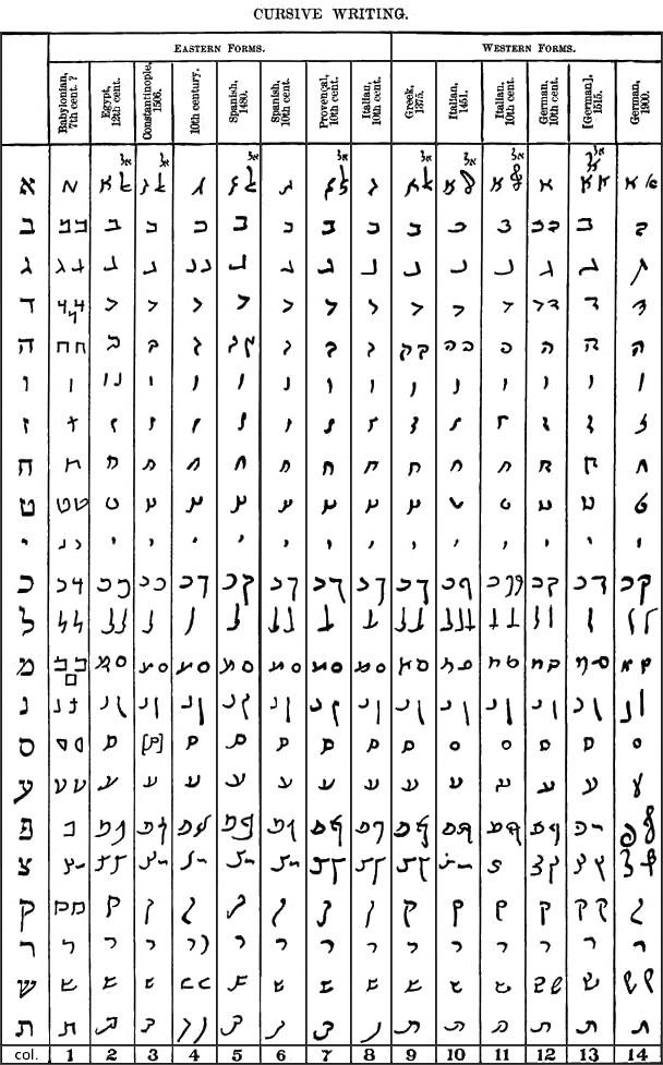
This table shows the development of cursive Hebrew from the 7th through the 19th centuries. This is discussed in the following section, which makes reference to the columns in the table, numbered 1 through 14.
Figure 3: "Cursive Writing" (Jewish Encyclopedia, 1901-1906).
Column:
- Incantation upon Babylonian dish
- Egyptian, 12th century.
- Constantinople, 1506.
- 10th century.
- Spanish, dated 1480.
- Spanish, 10th century.
- Provençal, 10th century.
- Italian, 10th century.
- Greek, dated 1375.
- Italian, dated 1451.
- Italian, 10th century.
- German, 10th century.
- Eleazer of Worms, copied at Rome in 1515 by Elias Levita
- Ashkenazi, 19th century.
History
The brief inscriptions daubed in red ink upon the walls of the catacombs of Venosa are probably the oldest examples of cursive script. Still longer texts in a cursive alphabet are furnished by the clay bowls found in Babylonia and bearing exorcisms against magical influences and evil spirits. These bowls date from the 7th or 8th century, and some of the letters are written in a form that is very antiquated (Figure 3, column 1). Somewhat less of a cursive nature is the manuscript, which dates from the 8th century. Columns 2–14 exhibit cursive scripts of various countries and centuries. The differences visible in the square alphabets are much more apparent. For instance, the Sephardi rounds off still more, and, as in Arabic, there is a tendency to run the lower lines to the left, whereas the Ashkenazi script appears cramped and disjointed. Instead of the little ornaments at the upper ends of the stems, in the letters a more or less weak flourish of the line appears. For the rest the cursive of the Codices remains fairly true to the square text.
Documents of a private nature were certainly written in a much more running hand, as the sample from one of the oldest Arabic letters written with Hebrew letters (possibly the 10th century) clearly shows in the papyrus, in "Führer durch die Ausstellung", Table XIX., Vienna, 1894, (compare Figure 3, column 4). However, since the preservation of such letters were not held to be of importance, material of this nature from the earlier times is very scarce, and as a consequence the development of the script is very hard to follow. The last two columns of Figure 3 exhibit the Ashkenazi cursive script of a later date. The next to the last is taken from a manuscript of Elias Levita. The accompanying specimen presents Sephardi script. In this flowing cursive alphabet the ligatures appear more often. They occur especially in letters which have a sharp turn to the left (ג, ז, כ, נ, צ, ח), and above all in נ, whose great open bow offers ample space for another letter (see Figure 2).
The following are the successive stages in the development of each letter: