
Designer Fred Lambert Date created 1963 | ||
 | ||
Variations Light, Regular, Bold, BlackObliques Link linotype.com/276/compacta-family.html | ||
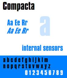
Compacta is a condensed sans-serif typeface designed by Fred Lambert for Letraset in 1963. It is visually similar to the typefaces Impact and Haettenschweiler, though Compacta has a distinctively square shape in comparison. Letraset was a dry transfer system, widely used by amateur or small-scale lettering projects, although many professional designers used it as well. Compacta was Letraset's first original typeface design, and proved widely popular. Rights to it were acquired by Linotype and others, leading to it becoming available in other formats such as digitally.
Compacta was reportedly designed to be similar to stencilled alphabets of the 1920s and to the 'much lusted-after' Schmalfette Grotesk, an upper-case only predecessor to Haettenschweiler, which had attracted attention among British designers but was not available in the UK. Impact was released slightly later for similar reasons. Lambert taught typography at the London College of Printing as well as working for Letraset; he also curated the Graphic Design Britain anthology, as well as a book on lettering. The style of lettering Compacta is based on has been called gaspipe. It is also quite similar to the masthead of Private Eye (which is caps-only), designed by Matthew Carter around the same time. Carter would later design Helvetica Compressed for similar reasons.
Popular media
The dense, industrial appearance of Compacta was a popular genre in the early 1960s, and Rolling Stones albums such as Aftermath and 12 X 5 and the Who's I Can See For Miles either use Compacta or are in a similar style, as does the first edition of The Bell Jar. Compacta has remained popular on album covers, being used by Portishead and The KLF on all their albums.
Outside the UK, it was used on-screen by NBC Sports from 1991 to 1995, in the TV series Baywatch, the logotype to Devo's 2010 album Something for Everybody, and in the logo of Team Fortress 2. This font has been used by the Seattle Mariners Major League Baseball team since 1993.
It was used on end credits from The Powerpuff Girls Season 3.