
Date released 1894–1923 | ||
 | ||
Variations Century Expanded, Century Schoolbook, Century Old Style, Century Catalogue | ||
Century is a family of serif type faces particularly intended for body text. The family originates from a first design, Century Roman cut by American Type Founders designer Linn Boyd Benton in 1894 for master printer Theodore Low De Vinne, for use in his Century magazine. ATF rapidly expanded it into a very large family, first by Linn Boyd and later by his son Morris.
Contents
- Distinctive characteristics
- Century Roman
- Century
- Hot metal copies
- Cold type copies
- Digital variants
- Century Oldstyle
- Century Catalogue
- Century Schoolbook
- Digital copies
- Century Schoolbook Infant
- Cyrillic adaptations
- Century Nova
- Related digital revivals
- References
Century is based on the "Scotch" genre, a style of type of British origin which had been popular in the United States from the early nineteenth century and is part of the "Didone" genre of type popular through the entire nineteenth century. Its design emphasises crispness and elegance, with strokes ending in fine tapers, ball terminals and crisp, finely pointed serifs. However, compared to many earlier typefaces in the genre, stroke contrast is quite low, creating a less sharp and highly readable structure. With ATF no longer operating, a wide variety of variants and revivals with varying features and quality are available.
Despite originating in the nineteenth century, use of the typeface remains strong for periodicals, textbooks, and literature. The Supreme Court of the United States requires that briefs be typeset in Century family type. According to Charles Shaw, "The rugged simplicity of the Century family of types has made it an enduring favorite of American typographers for almost one hundred years. Beginning as foundry type, Century has withstood a series of technical transformations into Linotype, Monotype, Ludlow, phototype, transfer type, digital type, and Xerox-like 'toner type'."
Distinctive characteristics
Characteristics of this typeface are:
lower case: curl ending in a ball terminal on top of letter c. Ball terminal on hook of f, ear of g, and tail of j.
upper case: curled tail on the capital R and reflexive curled tail on the capital Q. Prominent top spur on capital C.
figures: curl ending in a ball terminal on both tails of 3, and on single tail of 2, 5, 6 and 9.
Century Roman
Theodore Low De Vinne, publisher of the Century Magazine, wanted a more legible font for his magazine. He commissioned his friend Linn Boyd Benton from the newly formed American Type Founders to devise such a face. Over the course of the nineteenth century, largely because of the influence of Bodoni, common printing fonts had become thin, making a weak impression on the page. De Vinne and aesthete William Morris decried this “growing effeminacy” and called for a reversion to blacker faces. The face L.B. Benton produced, Century Roman, had a larger x-height than most faces and thicker hair-lines than was common, yet the proportions of a condensed face because De Vinne believed this to be more legible. This was made only in foundry type and later an accompanying face of normal width was produced by L.B. Benton, called variously Century Broad Face or Century No. 2. Despite being the original member of the Century family, it is not popular compared to the later members of the family with more normal proportions.
Century
With the merging of twenty-three foundries into American Type Founders in 1892, Linn Boyd Benton’s son, Morris Fuller Benton, was given the task of consolidating and purging the faces of these manufacturers into a coherent selection. Following this, he was given the task of adapting Century No. 2 to meet the Typographical Union standards of the time. Records now in the Smithsonian show that M.F. Benton not only re-designed his father's face, but did so with reference to #16 Roman of the Bruce Type Foundry which A.T.F. had recently acquired. (And which, probably not coincidentally, had been introduced in the Bruce Foundry catalog of 1877 which had been printed by De Vinne.) The result was Century Expanded, which proved hugely successful. By 1912 the A.T.F. catalog no longer offered the original Century Roman, while displaying 64 pages of samples of other members of the Century family. Following the successful introduction of this type, M.F. Benton embarked upon the creation of the first planned type family, and it is this conception of "type families" that is probably Benton's single greatest achievement. The faces were issued over a period of ten years, all of which were designed by Benton and issued by A.T.F.:
Hot metal copies
Century proved to be hugely popular and was either licensed or copied by all the makers of mechanical composition machines, including Linotype, Intertype, and Monotype. Barnhart Brothers & Spindler called their version Century Roman, while Ludlow called their 1953 version Century Modern. A few variants were even added:
Cold type copies
Century’s popularity and usefulness continued right through the cold type era and was made available for photocomposition by all the leading producers under the following names:
A Century typeface was also available for the IBM Selectric Composer.
Digital variants
A digital version named Benton Modern Text was first prepared by Font Bureau for the Boston Globe and the Detroit Free Press. It was designed by Tobias Frere-Jones and is based on Century Expanded, however, the accompanying italic and bold, are based upon Century Schoolbook, and were designed by Richard Lipton and Christian Schwartz. Benton Modern was released in two different optical sizes: text for general use and display for large text sizes. Font Bureau had already digitised as a separate project Century Bold Condensed on its own, intending it particularly for newspaper headline use.
Century Oldstyle
Century Oldstyle was released at a time when heavier faces with bracketed serifs were returning to vogue. The faces were issued over a period of six years, all of which were designed by Benton and issued by A.T.F. Despite the name it is not purely an old-style serif font (the type of metal type used before around 1750), but retains many more modern characteristics such as its curling capital Q.
Hot metal copies
Century Oldstyle was not as popular as its predecessor, but the roman and italic were copied by Linotype, Intertype, and Monotype.
Cold type copies
As oldstyle faces gained in popularity during the photo-comp era, Century Oldstyle was copied more widely then than during the hot type era. Copies were made under following names:
Century Catalogue
Century Catalogue (as spelled in ATF specimen books) had a lower x-height than Century Expanded but, despite longer ascenders, adheres to the same general design. Century Catalogue Italic is basically a re-working of Baskerville Italic, only the A, V and W being different. Both were designed by M.F. Benton and released by A.T.F. in 1917. As far as is known, Century Catalogue was never copied by other foundries, for machine composition, or as cold type. Digital versions may exist.
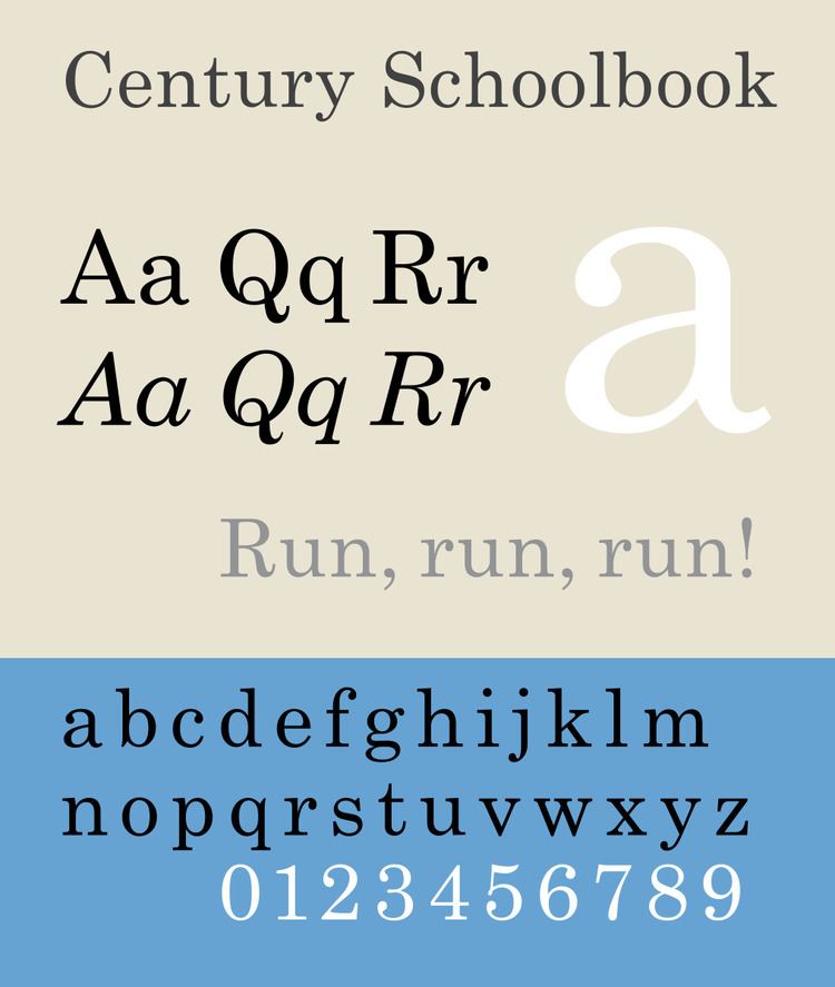
Century Schoolbook
Century Schoolbook is a transitional serif typeface designed by Morris Fuller Benton in 1919 for the American Type Founders (ATF) at the request of Ginn & Co., a textbook publisher, which wanted an especially easy-to-read face for textbooks. Century Schoolbook has elements similar to the Didone classification. Century Schoolbook is based on the earlier Century Roman.
Century Schoolbook is familiar to many in North America as being the typeface with which many first learned to read. Morris Fuller Benton utilized research done by Clark University that showed young readers more quickly identified letterforms with contrasting weight, but with the lighter strokes maintaining presence. Tests also showed the importance of maintaining counter-form (the white space around the black letterform) in recognizing the face at smaller sizes. In designing Century Schoolbook, M. F. Benton increased the x-height, the stroke width, and overall letterspacing. The faces were issued over a period of five years, all of which were designed by Benton and issued by A.T.F.:
A final member of the Century family was an oldstyle version called Schoolbook Oldstyle begun in 1920 and released in 1926, an italic following in 1928. This never achieved the popularity of its sister faces, was never adapted for machine composition (much less cold type or digital). and was eventually withdrawn.
Hot metal copies
Another immensely popular face for A.T.F. and Benton, Century Schoolbook was either licensed or copied by all the makers of mechanical composition machines, including Linotype, Intertype, Monotype, and Ludlow. One variant, Century Schoolbook Bold Italic was even added by Intertype. Linotype also commissioned Rudolph Ruzicka to design Primer, which was intended to compete directly with Century Schoolbook for the text-book market.
Cold type copies
The popularity of Century Schoolbook outstripped that of Century in the cold type era, and it was offered by all manufacturers under the following names:
Digital copies
The most common digital version is Monotype's, bundled with many Microsoft products. There are also versions of New Century Schoolbook by URW++, DTP Types, Bitstream, Elsner+Flake and others.
A very limited set of styles digitised by URW++ has been released as open-source software as part of the Ghostscript project in type 1 format. TeX Gyre Schola is an adaptation of the URW release by a Polish group. Including a Cyrillic version and small caps, it is perhaps the most complete open-source digitisation of the Century family.
Confusingly, the Monotype version offered with Microsoft products is also called just 'Century', perhaps for backwards compatibility reasons from the period when file names had to be short. Modern Microsoft products include both this 'Century' (in roman style only but with Cyrillic characters) and the same design as 'Century Schoolbook', only the latter including the whole family with bold and italics.
Digital variants
Grad is a variant by Phil Martin (digitized by Mark Simonson) based on the original ATF Century Schoolbook. It is an extensive digitisation with text figures and small caps, also adding unusual features such as asymmetric serifs.
Century Schoolbook Infant
This is a single-story version of the typeface that is used to help children learn to read. It is very rare, but it can be found in the Spot books by Eric Hill.
Cyrillic adaptations
The Century Schoolbook typeface was also adapted by Soviet typographies. The first Cyrillic adaptation, named Pioner (Russian for "pioneer"), was designed in 1939, and later in 1961 the second adaptation was made in the scientific research institute (NII) "Poligrafmash". The latter version acquired the name Shkol'naya (Russian for "of school") and since then it has been the standard and most widely used typeface for children publications and for school textbooks in the Soviet Union and later in Russia.
Century Nova
Century Nova + Italic (1964) was designed by Charles E. Hughes with the stipulation from A.T.F. that it must be equally suited for both letterpress (hot type) and offset (cold type) reproduction. The thin lines are substantial and the lower-case letters have a larger x-height, and (perhaps ironically) it returns to the condensed nature of the original Century Roman. This was the second-to-last face cut by A.T.F. Scangraphic has released a digitisation.
Related digital revivals
Nick Shinn's Scotch Modern revival is a digitisation in three optical sizes of the Scotch Modern types that inspired Century. Described by reviewer Mark Simonson as 'insanely complete', it has a stronger level of contrast and sharper Didone serifs than Century designs, in a release featuring small caps and a range of matching figure designs. Shinn based the revival on that used in an 1873 book on New York State wildlife.
The Old Standard web font by Alexey Kryukov is loosely based on the similar styles of type that were used in Europe during the early 20th century. It includes Cyrillic and polytonic Greek glyphs for classical studies use.
Matthew Carter's Miller is a revival of the Scotch Roman types that are Century's distant ancestors in the early nineteenth century. It features a much more restrained level of stroke contrast. It is an extremely large family often used by newspapers, with five optical sizes and many professional features such as small caps and alternate figure designs. Chronicle Text and Display by Hoefler & Frere-Jones are another large Scotch Roman-inspired family with optical sizes intended for newspaper and professional use.
Eames Century Modern is a digitisation inspired by the family's use by furniture designers Charles and Ray Eames. It is used by Comedy Central, among others.
Century 751 from Bitstream Inc is actually a digital revival of Rudolph Ruzicka's Primer.