
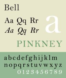
Date created 1788 | Classification Scotch roman | |
 | ||
Link catalog.monotype.com/family/monotype/bell | ||
Bell is the name given to a serif typeface designed and cut in 1788 by the punchcutter Richard Austin for the British Letter Foundry, operated by publisher John Bell, and revived several times since.
Contents
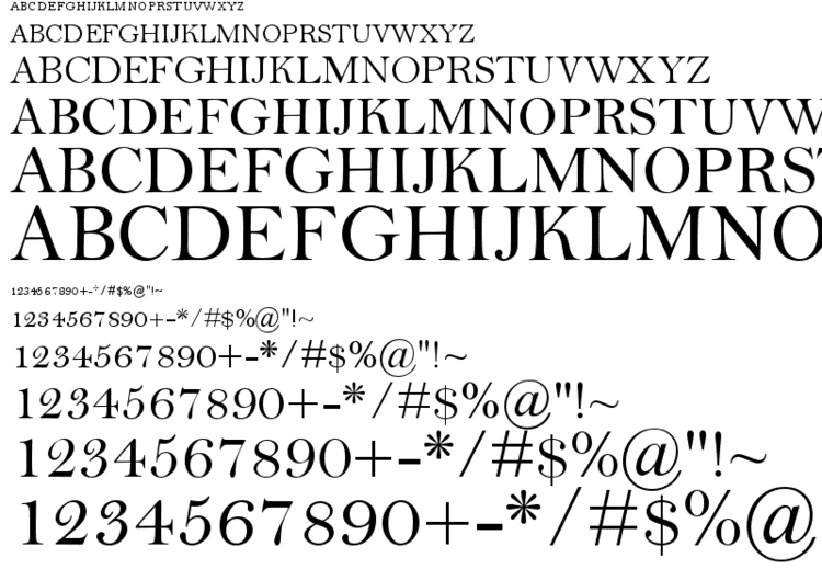
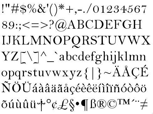
The Bell typeface has a precise appearance that features stylish contrasts between thick and thin strokes and ball terminals on many letters; it was influenced by the radical Didone styles of type becoming popular on the continent, in particular the work of the Didot family. However, it is less severe in design, somewhat similar to the earlier Baskerville and slightly later Bulmer typefaces. The figures are distinctive for being at fixed height, or lining, at approximately three-quarter the height of the capitals, in contrast to earlier numerals of variable height. The figures have a number of elaborate details reminiscent of the steely calligraphy of the period, and the slight inclination of some of them led Walter Tracy to suggest that Austin was following a written example. In italic, like Baskerville, several letters have flourishes.
After a short initial period of popularity, the face fell into disuse in Britain and Austin's later typefaces are quite different in style, although copies in the United States became popular around the early twentieth century with artisan printers. Its history was studied by the historian Stanley Morison in the late 1920s and early 1930s, whose employer, the Monotype Corporation, created a 1931 revival, particularly popular for printing on high-quality paper. Morison praised Austin for his "exceptional technical gift" and described his Bell typeface as "surpassing all previous English and continental type-cutting in precision [and maintaining] independence equally against Bodoni and Baskerville".
Besides the digitisation of the Bell face by Monotype, an alternative professional adaptation of the Austin face in optical sizes by Paul Barnes and others under the name of "Austin" is available sold by Commercial Type. As of 2017, it is used by the Daily Telegraph among others. Austin's original matrices came into the possession of Stephenson Blake, and are now in the Type Museum collection in London.
History

The innovative book and newspaper publisher John Bell, impressed by the sophistication and contrast found in contemporary French typefaces cut for Firmin Didot, commissioned Austin to produce a new typeface to be sold by his British Letter Foundry. Austin was a former cutter of engraved letters who would develop a career as a punchcutter. Bell wanted a crisply serifed face, like Didot in its crisp contrast of thick and thin strokes. The design is however, more traditional in style: Mosley writes that "the serifs, though sharply cut, are not the severe unbracketed strokes of the French type...a fusion of the new French style of roman with a flowing, cursive italic in the manner established by Baskerville".
The result was later described by Stanley Morison as the first typeface developed in England to show effective harmony between the roman, or regular style and the italic. It achieved popularity in newspaper and magazine printing. It featured two innovations of the period which would become universal, the general abolition of the "long s" and lining figures that were all the same height. Austin's biographer Alastair Johnston has written that his typeface began "a glorious but short-lived" period for type design in England "of harmonious types that had the larger-on-the-body proportions of the Romain du Roi, with the modelling of Baskerville but more colour and fine serifs". He has suggested that the Bell type's development was influenced by the greater quality possible in printing by more general use of hot-pressing of paper, which previously had only been used in Baskerville's elite printing, and the growth of fine book printing in London in the period. Historian James Mosley has also written in that in this period "the use of wove paper, hot-pressed [and] the cult of a simpler, more open page made the appearance of the type itself a more prominent feature of an edition, and one to which its promoters tended increasingly to draw attention." Besides body text faces, the foundry sold ornamented and inline letters, some based on French examples.
The initial success of the face was short lived however, both due to business problems with the British Letter Foundry, which led first to Bell leaving it and then its sale in 1797, and later by 1808 a dramatic change in tastes in printing towards darker typefaces with greater extremes of thick and thin strokes. (Austin found the change distasteful, writing in 1819 that "a transition was made from one extreme to its opposite: thus instead of having letters somewhat too clumsy [in the eighteenth century], we now have them with hair lines so extremely thin as to render it impossible for them to preserve their delicacy... how can it be expected that types cut nearly as thin as the edge of a razor can retain their form for any reasonable length of time[?]".) While Austin went on to a successful career running his own foundry and selling punches to other companies, his later typefaces are different in style, some more "modern" in appearance. Some may have influenced the "Scotch Modern" style popualar in the United States. From the early nineteenth century onwards, the Bell typeface remained in the collection of various companies and finally Stephenson Blake, generally overlooked and little-used.
While Bell's type was seldom seen after 1800 in England, it went on to become a favourite in the United States. When the Boston publisher Henry Houghton went to Europe to purchase type for his Riverside Press in 1864 he purchased the Bell from its then-owners the Fann Street Foundry, who were at the time offering it for sale under the name "Old Face". Back in Boston the face was called copperplate and copied by electrotyping. In 1900, when Bruce Rogers found the face at the Riverside Press, he used it for book work under the name "Brimmer". Daniel Berkeley Updike used another font of this type at his Merrymount Press where it was called "Mountjoye". Morison, who corresponded extensively with Updike, was impressed with the typefaces' quality and after researching their history arranged for Monotype to develop a revival for Monotype's hot metal typesetting system, in collaboration with Stephenson Blake who held the original. The Monotype revival included a wide range of Austin's character variants, including swash versions of the italic A, J, N, Q, T, V, and Y. The designer Jan Tschichold favored the typeface Bell in much of his book design, and mentioned it in his book Typographische Gestaltung.
Foundry type
Digital versions
Monotype's contemporary digital version was developed under the supervision of Robin Nicholas, and is based on the larger display style of Monotype's metal version. Another digital version, believed to be based on a smaller cut of the same metal type, is available from URW++.