
Category Sans-serif Date released 1988 | ||
 | ||
Link linotype.com/1245613/avenir-family.html Foundry Mergenthaler Linotype Company | ||
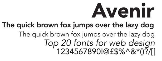
Avenir is a sans-serif typeface designed by Adrian Frutiger and released in 1988 by Linotype GmbH.
Contents
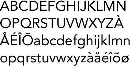
The word avenir is French for "future". As the name suggests, the family takes inspiration from the geometric style of sans-serif typeface developed in the 1920s that took the circle as a basis, such as Erbar and Futura. Frutiger intended Avenir to be a more organic interpretation of the geometric style, more even in colour and suitable for extended text, with details recalling more traditional typefaces such as the two-storey 'a' and 't' with a curl at the bottom, and letters such as the 'o' that are not exact, perfect circles but optically corrected.
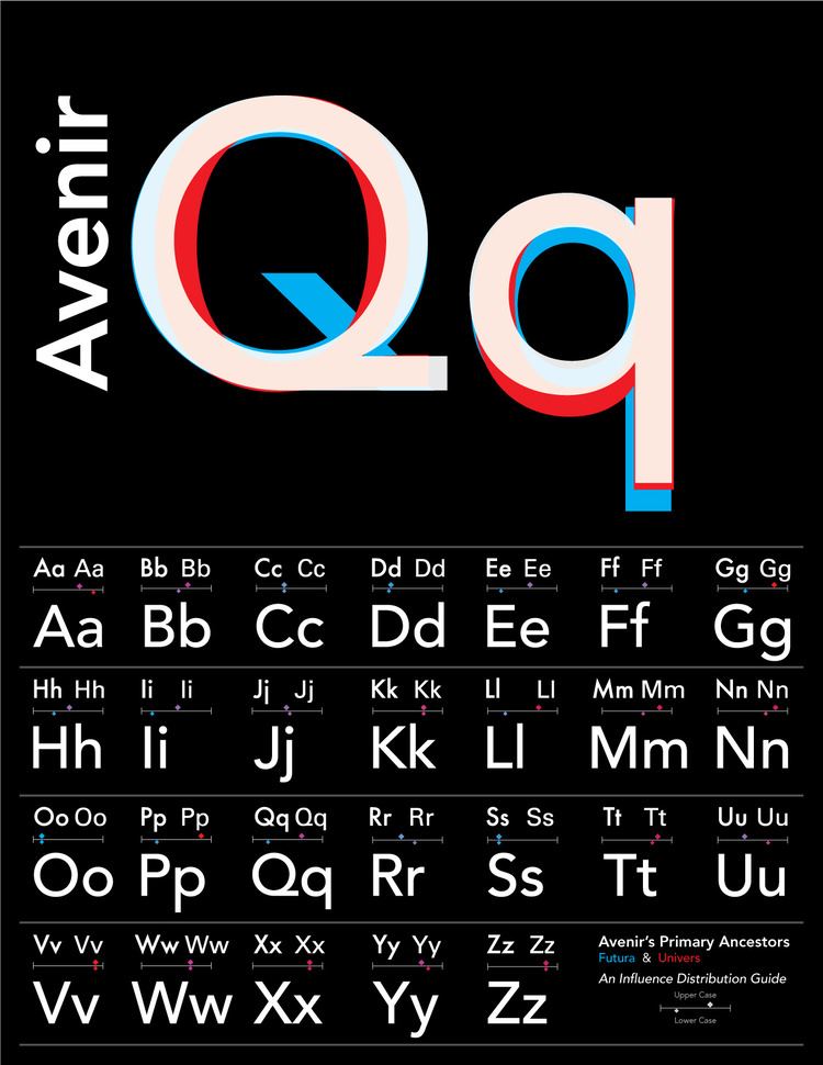
Frutiger has described Avenir as his finest work. 'The quality of the draughtsmanship – rather than the intellectual idea behind it – is my masterpiece. (...) It was the hardest typeface I have worked on in my life. Working on it, I always had human nature in mind. And what's crucial is that I developed the typeface alone, in peace and quiet – no drafting assistants, no-one was there. My personality is stamped upon it. I'm proud that I was able to create Avenir.'
Releases
Avenir was originally released in 1988 with three weights, each with a roman and oblique version, and used Frutiger's two-digit weight and width convention for names: 45 (book), 46 (book oblique), 55 (text weight), 56 (text weight oblique), (75)85 (heavy), and (76)86 (heavy oblique). The typeface family was later expanded to six weights, each with a roman and an oblique version.
The original release of Avenir has weights grouped very close together, with the difference barely distinguishable. In his autobiography, Frutiger explains that this was a response to the effects of how people perceive colour. He intended the slightly bolder designs for white-on-black text, so they would look the same to a viewer as black-on-white.
Avenir Next
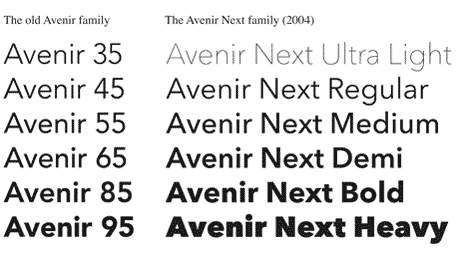
Between 2004–2007, Frutiger, together with Linotype's in-house type designer Akira Kobayashi, reworked the Avenir family to expand the range of weights and features. The result was titled Avenir Next.
The initial release of the typeface family was increased to 24 fonts: six weights, each with a roman and italic version, in two widths (normal and condensed). Frutiger's numbering system was abandoned in favor of more conventional weight names. The glyph set was expanded to include small caps, text figures, subscript and superscripts, and ligatures.
Two extra font weights (light and thin) were added to the font for the release of Avenir Next W1G, for a total of 32 fonts. This release also added Greek and Cyrillic glyphs in the regular width only.
The current set of weights is therefore ultra light, thin, light, regular, medium, demi bold, bold and heavy, in four styles each (two widths and italics for each width). The installation on OS X does not include the thin and light weights, but does include Greek and Cyrillic glyphs in the regular width.
Janna
Janna is an Arabic variant designed by Nadine Chahine, based on the original Avenir. Janna (Arabic: جنّة), which means "heaven" in Arabic, was first designed in 2004 as a signage face for the American University of Beirut. The Arabic glyphs are based on the previously released Frutiger Arabic, but were made more angular.
Two roman fonts, in regular and bold weights, were produced. The typeface supports ISO Adobe 2, Latin Extended, Arabic, Persian, and Urdu characters, and tabular numerals for the supported languages.
Avenir Next Rounded (2012)
It is a version of Avenir Next with rounded terminals, designed by Akira Kobayashi and Sandra Winter.
The family includes 8 fonts in 4 weights (regular, medium, demi, and bold) and 1 width (based on normal width), with complementary italics. OpenType features include numerator and denominator, fractions, standard ligatures, lining and old-style figures, localized forms, scientific inferiors, subscript and superscript, and small caps.