
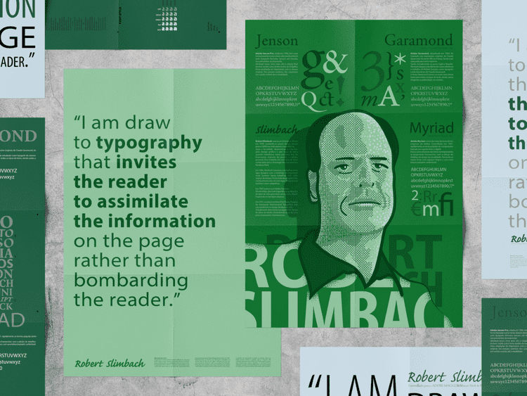
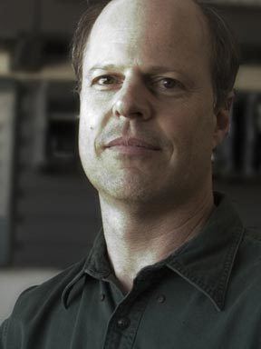
Name Robert Slimbach | Role Type designer | |
 | ||
Occupation Principal Designer, Adobe Systems | ||
Robert Joseph Slimbach is Principal Type Designer at Adobe Systems, where he has worked since 1987. He has won many awards for his digital typeface designs, including the rarely awarded Prix Charles Peignot from the Association Typographique Internationale, the SoTA Typography Award, and repeated TDC2 awards from the Type Directors Club. His typefaces are among the most commonly used in books.
Contents
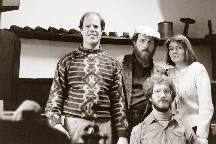
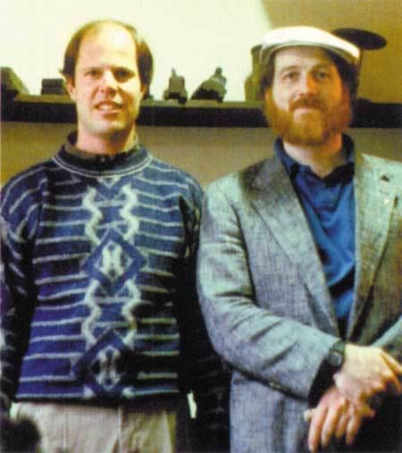
Sumner Stone
Biography
Slimbach was born in Evanston, Illinois in 1956. Shortly after, he moved to Southern California where he spent his childhood and his youth. After attending UCLA on an athletics scholarship, he developed an interest in graphic design and typefaces while running a small screen printshop for manufacturing posters and greeting cards. This work brought him into contact with Autologic Incorporated in Newbury Park, California. After training from 1983 to 1985, Slimbach worked as a type designer with Autologic Incorporation, where Sumner Stone also worked for a short time. There he received further training, not just as a type designer but also as a calligrapher. Slimbach was then self-employed for two years as a freelance type designer, during which developed the two typefaces ITC Slimbach and ITC Giovanni for the International Typeface Corporation. He later commented of this period that "I wasn’t really making enough money to live on."
In 1987 he joined Adobe Systems. Since then, he has concentrated primarily on designing typefaces for digital technology, often drawing inspiration from classical sources. He has developed many new fonts for the Adobe Originals program. Among his early projects at Adobe were the Utopia (1988), Adobe Garamond (1989), Minion (1990) and Poetica (1992) families.
In 1991, he received the Prix Charles Peignot from the Association Typographique Internationale for excellence in type design. More recently, Slimbach's own calligraphy formed the basis for his typeface Brioso. Slimbach has described himself as being particularly interested in humanist and serif projects, calling his work on the neo-grotesque Acumin, in the Swiss modernist style, as being "outside of the design realm I normally prefer."
Since 2000, the rate of Slimbach's (and Adobe's) new typefaces has slowed, as he has taken advantage of the new linguistic and typographic capabilities offered by the OpenType format. Where in the 1990s a given typeface design might be instantiated in one or two fonts, with 200-500 glyphs, a typical new Slimbach work post-2000 has 1500-3000 glyphs. Reviewing Slimbach's 2007 project Arno, font designer Mark Simonson noted that it 'almost becomes a different typeface' when italic alternates are enabled. A hallmark of Slimbach's designs is his use of a 'Th' ligature.
In 2004, Adobe released Garamond Premier Pro, a new take on the Garamond designs, which Slimbach had been working on for 15 years, since he first completed Adobe Garamond in 1989.
Outside of work for public use, Slimbach has designed Adobe's corporate font, Adobe Clean Sans and Adobe Clean Serif, which are used by Adobe in branding and user interfaces. He also designed Adobe Hand B, based on his handwriting, for use in Acrobat's digital signature feature.
Slimbach has notable skills in several fields other than type design: he went to college on a gymnastics scholarship, and he is an accomplished calligrapher and photographer. His photographic work uses black & white film, and is mainly portraits that examine human foibles and idiosyncrasies.
Typefaces
Before Slimbach came to Adobe, he has designed the following fonts for the International Typeface Corporation (ITC):
Slimbach typefaces designed before the 2000s were first released in the PostScript Type 1 format, and later re-released in the more capable OpenType format (abbreviated OT in the following table).