
Designer Luc(as) de Groot Date released 1994 | Classification Humanist Foundry FontFabrik | |
 | ||
Link fontfabrik.com/fofafon2.html | ||
Thesis is a large typeface family designed by Lucas de Groot. The typefaces were designed between 1994 and 1999 to provide a modern humanist family. Each typeface is available in a variety of weights as well as in italic. Originally released by FontFont, it is now sold by de Groot through his imprint LucasFonts.
Contents
- TheSans
- TheSansMono
- TheSansTypewriter
- TheSerif
- TheMix
- TheMixMono
- TheMix Arabic
- TheAntiqua
- Collections
- Uses of Thesis fonts
- References
Thesis fonts have become popular and can be seen in various publications or logotypes.
To create a varied range of fonts of different thicknesses and levels of condensation, Thesis was developed using multiple master technology, in which weights were created by 'averaging' and extending the trend between a thick and thin design to create a smooth, continuous trend in styles from thin to very bold. The fonts also include a large number of stylistic alternate characters.
The family is a font superfamily, since it includes both serif and sans-serif designs.
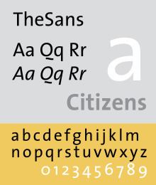
TheSans
A humanist sans-serif font family, somewhat similar to Frutiger. It included fonts in 8 weights and 2 widths, with complementary italic fonts. A distinctive figure is the 'Q' with the detached slash, somewhat similar to that on Dwiggins' Metro; an alternate is provided for when this is unsuitable.
In TheSans Condensed, each weight only includes roman and italic, but all 4 number styles can be found.
TheSansMono
It is a monospaced variant. 3 widths have been produced. All fonts use hanging monospaced figures.
TheSansTypewriter
It is a monospaced variant with ragged strokes. It included fonts in regular and bold weights in the widest TheSansMono width, with complementary italic fonts. It uses hanging monospaced figures.
TheSerif
It is a slab serif font family. It included fonts in 8 weights and 1 width, with complementary italic fonts.
TheMix
It is a slab serif font family, but using only serif on upper portion of small letters. It included fonts in 8 weights and 1 width, with complementary italic fonts.
TheMixMono
It is a monospaced variant. Each weight only includes roman and italic. All fonts use hanging monospaced figures.
TheMix Arabic
It is a variant designed by Lucas de Groot, Arab calligrapher and designer Mouneer Al-Shaarani, and with technical support from Pascal Zoghbi. Lucas designed the Bold version of the type, while Pascal finalized the Bold design by modifying some glyphs, spacing and encoding/scripting the font, and later developed TheMix Arabic Regular.
The font was included in the Typographic Matchmaking Project organized by the Khatt Foundation.
TheAntiqua
It is a variant based on TheSerif. It included fonts in 7 weights and 1 width, with complementary italic fonts. OpenType feature includes small caps (roman only).
The Antiqua won an award in 1999 from Type Directors Club.
Collections
Each of the family are categorized in following family collections: Classic, Basic, Office.
Classic family includes all 8 font weights, with roman, italic, small caps roman, small caps italic, expert, expert italic in each weight. It includes hanging proportional, hanging monospaced, lining proportional, lining monospaced figures; and additional f-ligatures. Expert fonts include arrows, swashes, fraction figures, alternate styles, mathematic symbols, ornaments.
Basic family includes all 8 font weights, but without small caps and expert fonts. It includes lining proportional figures (smaller than in classic).
Office family only includes Regular and Bold weights, with only roman and italic in each weight. It includes hanging monospaced figures.
de Groot's choice of weights to release was developed using an "interpolation theory". The optical interpolation b, in the three stems a (thinnest), b (interpolation) and c (thickest), is set to the geometric mean of a and c, i.e. b² = ac (as opposed to the linear arithmetic mean).
As an amusement, de Groot also developed a number of parodic reworkings of Thesis, including Nebulae and JesusLovesYouAll.