
Designer HANS E. MEIER | Date created 1968 | |
 | ||
Link linotype.com/54897/linotype-syntax-family.html Foundry Mergenthaler Linotype Company | ||
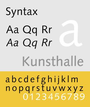
Syntax comprises a family of fonts designed by Swiss typeface designer Hans Eduard Meier. Originally just a sans-serif font, it was extended with additional serif designs.
Contents
- Syntax
- Different brand names and derivate fonts
- Oberon version
- Linotype Syntax
- Linotype Syntax Lapidar
- Linotype Syntax Lapidar Serif
- Linotype Syntax Letter
- Linotype Syntax Serif
- Badiya
- Awards
- Usages
- References
Syntax
Syntax is a humanist sans-serif typeface designed by Meier in 1968, and released in 1969 by the D. Stempel Schriftgießerei (type foundry) of Frankfurt am Main. It is believed to be the final face designed and released by D. Stempel for foundry casting.
The original drawings were done in 1954; first by writing the letters with a brush, then redrawing their essential linear forms, and finally adding balanced amounts of weight to the skeletons to produce optically monoline letterforms. In the period 1968–1972, Meier worked on additional weights and variations to the Syntax typeface. In 1989, the original foundry metal design was digitized by Adobe, which also expanded the family to include bold and ultrabold weights, resulting in a font family of 4 romans and 1 italic (in lightest weight) fonts.
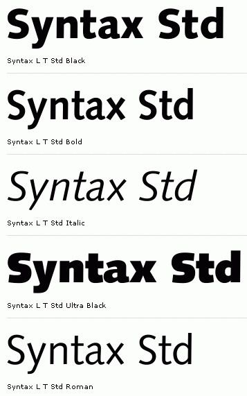
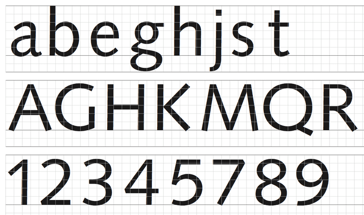
Meier described Syntax as being a sans-serif face modeled on the Renaissance serif typeface, similar to Bembo. The uppercase has a wide proportion, and the terminals not being parallel to the baseline provide a sense of animation. The lowercase a and g follow the old style model of having two storeys. The italics are a combination of humanist italic forms, seen in the lowercase italic q, and realist obliques, seen in the lowercase italic a, which retains two storeys, unlike in other humanist sans-serif typefaces like FF Scala Sans and Gill Sans, where the a has a single storey italic.
Different brand names and derivate fonts
Bitstream released Syntax under the name Humanist 531. The family does not include an italic font.
Infinitype released Syntax under the name Saxony, including an italic and medium font.
The Cyrillic version was developed at ParaType in 1999 by Isay Slutsker and Manvel Shmavonyan.
Oberon version
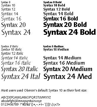
The Syntax font family was chosen by Niklaus Wirth for the Oberon operating system. During part of the period that Oberon was under development, Meier worked in Wirth's group at ETH, developing hand-optimized bitmap versions of the Syntax fonts (this was in the days prior to font anti-aliasing).
Linotype Syntax
In 1995, Hans Eduard Meier and Linotype began to produce an extensive revision and expansion of the Syntax font family. Based on original font design, the alterations made to accommodate hot metal and phototypesetting machines were discarded. The family was expanded to 6 weights with italics on all weights. All fonts include old style figures and proportional lining figures, while 3 lightest weights also include small caps glyphs. Regular and bold weight fonts also include Cyrillic characters. Letters such as @, C, R, fi, fl, were redesigned.
The font family was released in 2000.
Linotype Syntax Lapidar
It is a variant of Linotype Syntax, but modelled after chiseled letter forms of the ancient Greeks. Linotype Syntax Lapidar is available in two different design forms: Linotype Syntax Lapidar Text and Linotype Syntax Lapidar Display.
Linotype Syntax Lapidar Text supports old style figures, while Linotype Syntax Lapidar Display supports titling capitals. Both families come in 5 weights of roman fonts, covering Basic Latin to ISO Latin-1 character sets, available in TrueType or PostScript Type 1 formats.
Linotype Syntax Lapidar Serif
It is a variant of Linotype Syntax containing serifs. Like the sans-serif version, it comes with Text and Display designs with same amount of fonts per family, and covers same character sets. However, Linotype Syntax Lapidar Serif Display does not support titling capitals.
Linotype Syntax Letter
It is a variant of Linotype Syntax modelled after the style of the Roman Rustic capitals. This family come in 6 weights with complementary italic fonts on all weights, covering ISO Adobe 2, Adobe CE, Latin Extended character sets. OpenType features include old style figures.
Linotype Syntax Serif
It is a variant of Linotype Syntax with serifs. This family come in 6 weights with complementary italic fonts on all weights, covering ISO Adobe 2, Adobe CE, Latin Extended character sets. OpenType features include old style figures, with small caps and proportional lining figures on 3 lightest weights.
Badiya
It is an Arabic variant designed by Nadine Chahine, based on the original Syntax. Badiya, which means "desert" in Arabic, is a modern and slightly modulated Naskh. The design has open counters that enable it to be used in quite small sizes, optimized for print in magazines and corporate communication.
2 roman fonts, in regular and bold weights, were produced. It supports ISO Adobe 2, Latin Extended, Arabic, Persian, and Urdu characters, tabular numerals for the supported languages.
Awards
Linotype Syntax won TDC² 2000 (Type Directors Club Type Design Competition 2000) award under the Text/display type systems category.
Bitstream Humanist 531 Cyrillic won awards at Kyrillitsa'99 under text category, and "bukva:raz!" type design contests.
Usages
Linotype Syntax is used in OÖ Nachrichten, Deccan Herald newspapers, Lonely Planet Guidebooks; impuls 2000 magazine.