 | ||
Sentence spacing studies analyse the effects of sentence spacing techniques on the readability of text. The only direct scientific studies have been conducted by researchers from the University of Georgia, for on-screen text. There are currently no direct sentence spacing studies for printed text.
Contents
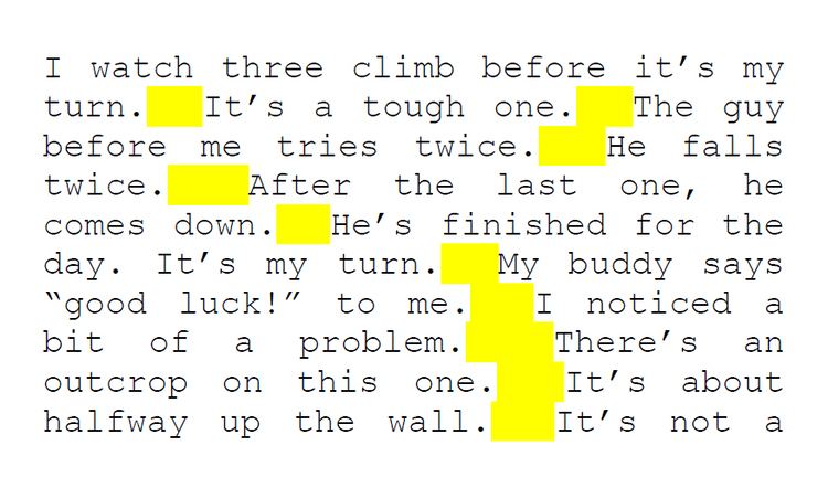
The direct studies, started in 2002, analysed single, double, and triple sentence spacing to determine what was most readable on screen. The researchers concluded that their tests did not show a statistically significant difference between the various techniques, but that further testing was needed.
Effects on readability and legibility
Claims abound regarding the legibility and readability of the single and double sentence-spacing methods—by proponents on both sides. However, typographic opinions are typically anecdotal with no basis in evidence. According to Miles Tinker, "Opinions are not always safe guides to legibility of print," and when direct studies are conducted, anecdotal opinions—even those of experts—can turn out to be false. For example, text that seems readable at first glance may be shown to impair reading effectiveness when subjected to scientific study.
Direct studies
Direct studies include those by Loh, Branch, Shewanown, & Ali (2002), Clinton, Branch, Holschuh, & Shewanown (2003) and Ni, Branch & Chen (2004) with results favouring neither single, double, nor triple spacing. The 2002 study indicated that "the 'double space group' consistently took longer time to finish than the 'single space' group", but the authors concluded that "there was not enough evidence to suggest that a significant difference exists". The 2003 study analysed on-screen single, double, and triple spacing. Again, the authors stated that there was insufficient evidence to draw a conclusion. A similar study was conducted in 2009 using identical spacing variables. The authors concluded that the "results provided insufficient evidence that time and comprehension differ significantly among different conditions of spacing between sentences".
Related studies
There are other studies that could be relevant to sentence spacing, such as the familiarity of typographic conventions on readability. Some studies indicate that "tradition" can increase the readability of text, and that reading is disrupted when conventional printing arrangements are disrupted or violated. The standard for the Web and published books, magazines, and newspapers is single sentence spacing.
David Jury's book, What is Typography? notes the following: "Changes in spacing either between letters and words, or between the words only ... do not appear to affect legibility. [These rather extraordinary conclusions are contrary to all other surveys on readability of texts.]"
A widespread observation is that increased sentence spacing creates "rivers" or "holes" within text, making it visually unattractive, distracting, and difficult to locate the end of sentences. Comprehensive works on typography describe the negative effect on readability caused by inconsistent spacing, which is supported in a 1981 study which found that "comprehension was significantly less accurate with the river condition." Another 1981 study on Cathode Ray Tube (CRT) displays concluded that "more densely packed text is read more efficiently … than is more loosely packed text." This statement is supported in other works as well. Canadian typographer Geoffrey Dowding suggests possible explanations of this phenomenon:
A carefully composed text page appears as an orderly series of strips of black separated by horizontal channels of white space. Conversely, in a slovenly setting the tendency is for the page to appear as a grey and muddled pattern of isolated spats, this effect being caused by the over-widely separated words. The normal, easy, left-to-right movement of the eye is slowed down simply because of this separation; further, the short letters and serifs are unable to discharge an important function – that of keeping the eye on "the line". The eye also tends to be confused by a feeling of vertical emphasis, that is, an up & down movement, induced by the relative isolation of the words & consequent insistence of the ascending and descending letters. This movement is further emphasized by those "rivers" of white which are the inseparable & ugly accompaniment of all carelessly set text matter.
Some studies suggest that readability can be improved by breaking sentences into separate units of thought—or varying the internal spacing of sentences. Mid-20th century research on this topic resulted in inconclusive findings. A 1980 study split sentences into 1–5 word phrases with additional spacing between segments. The study concluded that there was no significant difference in efficacy, but that a wider study was needed. Numerous other similar studies in 1951–1991 resulted in disparate and inconclusive findings. Finally, although various studies have been conducted on the readability of proportional vs. monospaced fonts, the studies typically did not decrease sentence spacing when using proportional fonts, or did not specify whether sentence spacing was changed.
