
 | ||
A reverse-contrast letterform is a typeface or custom lettering in which the stress is reversed from the norm: instead of the vertical lines being the same width or thicker than horizontals, which is normal in Latin-alphabet writing and especially printing, the horizontal lines are the thickest. The result is a dramatic effect, in which the letters seem to have been printed the wrong way round. Originally intended as attention-grabbing novelty display designs, modern font designer Peter Biľak, who has created a design in the genre, has described them as "a dirty trick to create freakish letterforms that stood out."
Contents
- Historical background
- The first reverse contrast types
- French Clarendon
- Modern reverse contrast types
- References
Reverse-contrast letters are rarely used for body text, being more used in display applications such as headings and posters, in which the unusual structure may be particularly eye-catching. They were particularly common in the mid- to late nineteenth century, and have been revived occasionally since then. They could be considered as slab serif designs because of the thickened serifs, and are often characterised as part of that genre.
Particularly in recent times, the reverse-contrast effect has been extended to other kinds of typeface, such as sans-serif designs and designs more suitable for extended text passages. The design style, also known as "reverse-stroke" or "horizontal-stress", has no connection to reverse-contrast printing, where light text is printed on a black background.
Historical background
Since the earliest days of printing in roman (or antiqua) type, it has been the norm for the vertical lines to generally be of the same width, or thicker than the horizontals, sometimes at an angle mimicking script written by a quill pen. However, from the arrival of roman type around 1475 to the late eighteenth century, relatively little development in letter design took place, as most fonts of the period were intended for body text, and they stayed relatively similar in design.
Towards the end of the eighteenth century, printers developed what are now called transitional and then Didone types. These typefaces had a far greater amount of stroke contrast than before, with the difference in stroke width much greater than in earlier types. The resulting, daringly slender horizontals and serif details could show off the increasingly high quality of paper and printing technology of the period. In addition, these typefaces had a strictly vertical stress: without exception, the vertical lines were thicker than the horizontals, creating a much more geometric and modular design.
A second major development of the period was the arrival of the printed poster and increasing use of signpainting and printing for publicity and advertising material, for example in newspaper adverts. This caused a desire to develop eye-catching new types of letters. As a result, new styles of painted letters and "display type" began to appear, such as slab serif and then sans-serif letters around the same time, which were not just larger versions of traditional serif letters. Presumably to be more eye-catching, these new styles of letter were often extremely bold.
The first reverse-contrast types
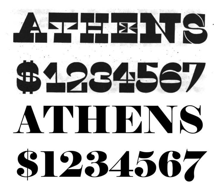
The earliest known reverse contrast types date to about 1821. They were created H.W. Caslon company in London, presumably as a parody of Didone typefaces and lettering of the period. Nicolete Gray, quoting Francis Thibaudeau, wrote in Nineteenth Century Ornamented Typefaces that the style appeared (presumably as lettering) in France slightly earlier during the First French Empire (1804-1815) without giving a specific example. The typeface had very thick serifs, so the gap between the serifs and the main strokes making up the letters was very small, as can be seen on letters such as 'E' and 'S'. To make the effect even more shocking, the thicker line on the 'A' was moved from its normal position on the right to the left, making a letter that seems to be the wrong way round. A caps-only design, steel master punches for the typeface (perhaps not the very first) survive in the collection of the St Bride Library, London. Writing for Print magazine, Paul Shaw described it as "one of the most bizarre slab serif types of the 19th century." Barnes and Schwartz describe it as "perverse [but] done with sureness and confidence."
The Caslon company called the type Italian. Nicolete Gray has concluded that the style was "probably" Italian in origin, although it was certainly very common for display types to be given unusual, exotic names as a brand; for example, "Egyptian" was often applied to sans (and later slab) serif types of the period and "Antique" to slab-serifs. Reverse-contrast designs do slightly resemble capitalis rustica Roman writing, although this may be a coincidence. They were also called Egyptian.
Within a few years of their introduction the printer and social reformer Thomas Curson Hansard had described them as "typographic monstrosities":
Fashion and Fancy commonly frolic from one extreme to another. To the razor-edged fine lines and serifs of [Didone] type...a reverse [of sans and slab serifs] has succeeded...the property of which is, that the strokes which form the letters are all of one uniform thickness! After this, who would have thought that further extravagance could have been conceived? It remains, however, to be stated, that the ingenuity of one founder has contrived a type in which the natural shape is reversed, by turning all the serifs and fine strokes into fats, and the fats into leans. Oh! sacred shades of [eminent typefounders of the past] Moxon and van Dijck, of Baskerville and Bodoni! What would ye have said of the typographic monstrosities here exhibited [shown], which Fashion in our age has produced?
In contrast, Walter Tracy described the design in 1986 as "a jeu d’esprit, not meant to be judged in conventional aesthetic terms."
In any case, reverse-contrast types rapidly spread to the United States. The George Bruce company of New York displays Caslon's Italian or a close copy in its 1828 specimen book.
Peter Biľak's Karloff is a sophisticated revival designed partly through mathematical interpolation. Biľak's group digitally inverted the contrast of a conventional Didone font: this allowed Biľak to create a normal and matching reverse-contrast font, together with a low-contrast slab serif design all with the same basic structure, named Karloff Positive, Negative and Neutral with an upper and lower case. Village Type's Arbor like Karloff adds a lower-case, while Match & Kerosene's Slab Sheriff is caps-only, with a 'A' featuring the conventional stress on the right. Other unreleased revivals have reportedly been made for private use by Paul Barnes and Justin Howes.
French Clarendon
In the mid to late nineteenth century, it became popular for type foundries to offer reverse-contrast variants of Clarendon, a popular slab serif type genre, especially in the United States, creating large block serifs at the top and bottom of the letter. This was known as French Clarendon type. The advantage of French Clarendon type was that it allowed very large, eye-catching serifs while the letters remained narrow, suiting the desire of poster-makers for condensed but very bold type. French Clarendon types are often associated with wild-west printing and seen on circus posters and wanted notices in western movies. In fact, the style was used in many parts of the world during this period. The style is sometimes called 'circus letter'. The practice was less popular with Arts and Crafts movement printers: DeVinne commented in 1902 that "To be hated, it needs but to be seen." In Europe the style was sometimes called Italienne, matching the Caslon name. In contrast to the original Caslon type, which features horizontals in the middle of the letter (like the cross-bar in the H) that are often but not always thick, French Clarendon types have the only thick lines at the top and botton, and all inner horizontals thin.
French Clarendon designs were often created in wood type, used for large-print letters on posters. The University of Texas at Austin, which maintains a large archive of American wood type, reports that the first known wood French Clarendon type was issued by William Hamilton Page in 1865. Their collection shows the many other names used for wood type which display reverse-contrast characteristics, including 'Celtic', 'Belgian', 'Aldine' and 'Teutonic', as well as Italian again and sometimes 'Tuscan' or 'Etruscan' also. (At the time a separation did not fully exist between genre names and typeface names, so these may be the names of individual types, or if they proved popular the name of the subgenre they created.) At least one sans-serif typeface with reverse contrast was developed in this period.
A variety of more modern adaptations have been made of the style, including Robert Harling's Playbill (1938) and more recently Adrian Frutiger's Westside, URW++'s Zirkus and Bitstream's P. T. Barnum.
Writing on why he created a design in the genre, Frutiger, a designer better-known for his work in the sans-serif genre, commented:
As a type designer I wanted to draw something in every style. It's a matter of professional pride...I found the existing Italiennes with their big feet too harsh and strict...the fine curves in the serifs give Westside its own expression. A text set in this typeface looks like a weaving pattern...I really enjoyed drawing it. For one thing it was great fun.
Frutiger decided to return to the Caslon type's pattern of all horizontals being thick apart from those on 'a' and 'e', which he felt could not be fitted into this system.
Modern reverse-contrast types
Because of their quirky, hand-made design, lighter versions of the style were popular for uses such as film posters in the 1950s and 60s.
A well-reviewed modernisation of the style has been Trilby by David Jonathan Ross, who has written and lectured on the history of the genre. Released by Font Bureau, it is reminiscent of Clarendon revivals from the 1950s. It attempts to adapt the style to use in a much wider range of settings, going so far as to be usable for text. Bigfish is another modernisation inspired by lettering, in which the thickest stress is at the top. Some other adaptations have preserved the concept but changed genre, presenting sans-serif or script typefaces in the same style. Antique Olive of 1966 by Roger Excoffon is a well-known sans-serif design with subtle reverse-contrast aspects, particularly visible in its ultra-bold 'Nord' style, while Signo is an award-winning sans-serif reverse-contrast design from 2015.