
Classification Neo-grotesque | ||
 | ||
Designer | ||
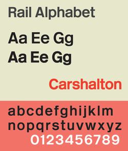
Rail Alphabet is a typeface designed by Jock Kinneir and Margaret Calvert for British Railways. First used by them at London's Liverpool Street Station, it was then adopted by the Design Research Unit (DRU) as part of their comprehensive 1965 rebranding of the company.
Contents
Rail Alphabet is similar, but not identical, to a bold weight of Helvetica. It is not quite as similar to Akzidenz Grotesk or Arial. Akzidenz Grotesk had earlier also provided the same designers the broad inspiration for the Transport typeface used for all road signs in the United Kingdom.
British Rail
In 1949 the Railway Executive decided on standard types of signs to be used at all stations. Lettering was to use the Gill Sans typeface on a background of the regional colour. This style persisted for nearly 15 years.
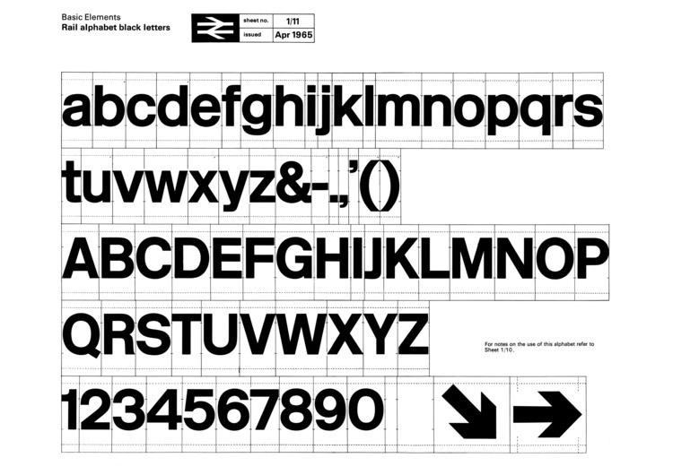
In the early 1960s, British Rail trialled new signs at Coventry station that made use of Kinnier and Calvert's recently launched Transport typeface. While Transport has since been an enduring success on road signs, it was designed around the specific needs of the roadside environment - such as visibility at speed and in all weathers. The subsequent creation of Rail Alphabet was intended to provide a style of lettering more specifically suited to the station environment, where it would primarily be viewed indoors by pedestrians.
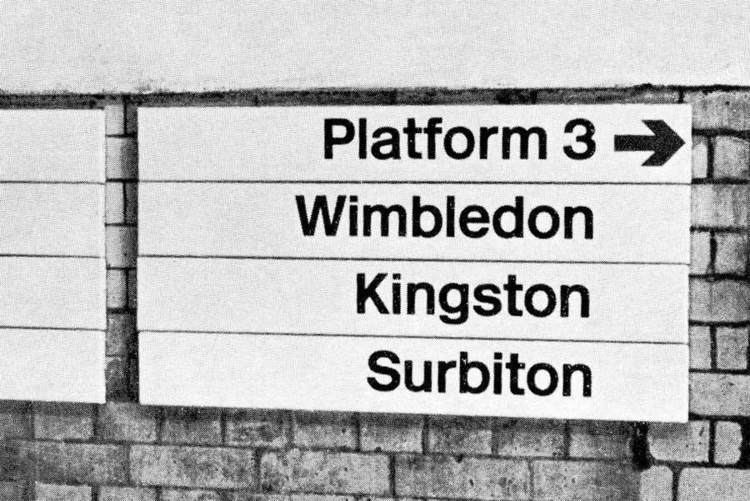
The DRU's 1965 rebranding of British Railways included a new logo (the double arrow), a shortened name British Rail, and the total adoption of Rail Alphabet for all lettering other than printed matter including station signage, trackside signs, fixed notices, signs inside trains and train liveries.
Key elements of the rebranding were still being used during much of the 1980s and Rail Alphabet was also used as part of the livery of Sealink ships until that company's privatisation in the late 1980s. However, by the end of the 1980s, British Rail's various business units were developing their own individual brands and identities with use of Rail Alphabet declining as a consequence. The typeface remained in near-universal use for signs at railway stations but began to be replaced with alternatives in other areas, such as in InterCity's 1989 'Mark 4' passenger carriages which made use of Frutiger for much of their interior signage.
Post British Rail
The privatisation of British Rail from 1994 accelerated the decline in use of the typeface on the railway network with most of the privatised train operating companies who now manage individual stations choosing to use the fonts associated with their own corporate identities for station signs and publicity. More recently, the custom Brunel typeface introduced by Railtrack for signs at major stations and adapted by Network Rail as NR Brunel was recommended as a new national standard for station signs by a 2009 report commissioned by the Secretary of State for Transport, and has since been adopted by South West Trains and East Midlands Trains. Meanwhile, Helvetica Medium has replaced Rail Alphabet as the industry's preferred typeface for safety notices within passenger trains due to the ready availability of the former and for consistency with British Standards on general safety signs.
Some of the privatised train operators, such as Arriva Trains Wales, and Merseyrail have continued to use the typeface for station signage and its use is still prescribed for trackside warning signs and safety/operating notices.
Other uses
The National Health Service across England, Scotland and Wales adopted Rail Alphabet for its signs. It is still the dominant typeface used on signs in older hospitals. It ceased to be used in new builds in the late 1990s.
The English NHS now uses Frutiger, while NHS Scotland uses Stone Sans.
Rail Alphabet was widely used on signs by the British Airports Authority and by Danish railway company DSB.
New Rail Alphabet
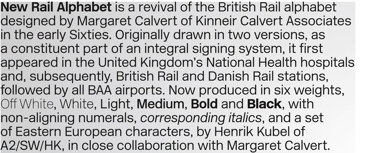
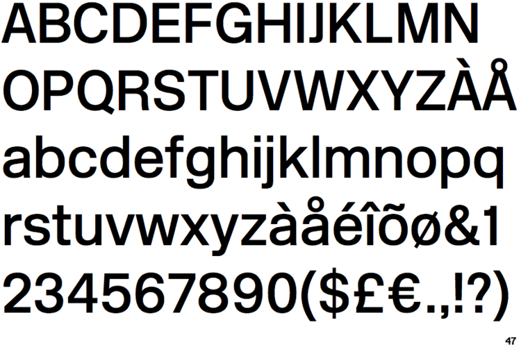
In 2009, a newly digitised version of the typeface was publicly released. Created by Henrik Kubel of A2/SW/HK in close collaboration with Margaret Calvert, New Rail Alphabet features six weights: off white, white, light, medium, bold and black, with non-aligning numerals, corresponding italics and a set of Eastern European characters.