
 | ||
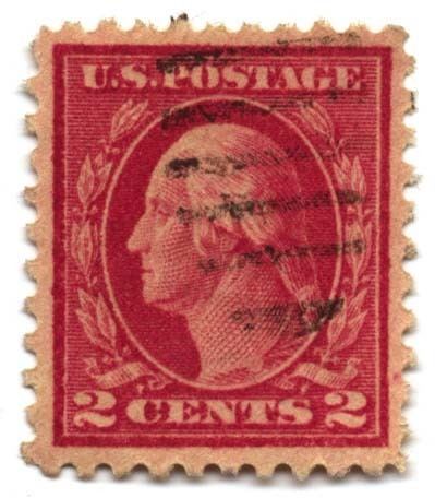
The colors of postage stamps are at once obvious, and among the most difficult areas of philately. Different denominations of stamps have been printed in different colors since the very beginning; as with their successors, postal clerks could distinguish the Penny Black and Two pence blue more quickly by color than by reading the value, and the practice generally continues today. In practice, the actual color of a stamp may vary, and while collectors will pay high prices for rare shades, it may not be easy to tell those apart from variations caused by age, light, chemicals, and other factors. Stamp colors are routinely described by color name rather with any sort of a numerical system like CMYK; several color guides showing a selection of colors have been produced, but are not especially popular with collectors.
Contents
Nearly all stamps get their color from inks printed on white or light-colored paper; the handful of exceptions include early issues of Natal consisting only of embossing on colored paper, some recent stamps embossed on gold foil or with foil blocking to achieve a metallic appearance, and the Uganda Cowries produced on a typewriter. A number of early stamps were printed in black on differently-colored papers; the most famous example is the British Guiana 1c magenta.
History
Initially, countries typically made a random choice of colors for denominations. In 1896, the members of the Universal Postal Union agreed on green, red, and blue as the standard colors for standard printed matter, postcard, and letter rates, respectively, when sent abroad. This convention was gradually abandoned as inflation created too many exceptions from the 1930s and onwards.
Stamps with two colors ("bi-colored") began to appear very early, although typically reserved for higher values, due to the added expense of multiple print runs. Multicolored stamps appeared along with the development of color printing techniques; they now account for the majority of modern stamps, although single-color designs are still common, more so for some countries than others.
Shades and color changes
Color shades have several different causes. The printer may use a different ink; in the early days, inks were made up in batches as needed, and were rarely consistent. In such cases, the shade provides information about when the stamp was made, and possibly even identify a particular printing. Extreme variations may be considered color errors; for instance, the 4c value of the US Columbian Issue of 1893 was normally printed in ultramarine, but a handful were printed in blue, a shade with distinctly more green; these are worth in the US$10,000 range instead of the usual $10.
Inks may also be diluted or applied more thinly, as for instance the World War I stamps of Germany and World War II stamps of the United Kingdom. It can also happen randomly, if a printing plate is accidentally under-inked.
Ultraviolet light is destructive to a great many pigments, and can cause considerable lightening. In addition, some countries have used water-soluble materials known as fugitive inks to prevent postage stamp reuse. Stamps of this type may be much lighter in color after being soaked.
Some dramatic color variations occur as a result of chemical action; such stamps are called color changelings. Examples include sulfuretting (often misnamed "oxidation"), a reaction involving lead that may turn a blue or green stamp to black, and the effects of salt water, famously seen in stamps of New South Wales recovered from the wreck of the Colombo. Forgers have also used chemicals to try to produce seeming rarities, although by now experts know how to identify these attempts.
Nomenclature
In general, collectors follow the stamp catalogs in matters of color nomenclature, even though the different catalogs are not consistent with each other. Although there are a great many named colors, the selection used by philatelists is limited to several dozen, modified by adjectives such as "dark", "light", "pale", "bright" and "deep". In addition, two color names may be combined, as in "gray green" or "brown orange", where the first name indicates the direction of modification to the second color. Thus "brown orange" is a duller and darker orange, while "orange brown" has a tinge to it that is more orange than would be seen with a "yellow brown" or "red brown". This system becomes less clear when extended to other colors, and few collectors could describe precisely how "carmine rose" is different from "rose carmine". Certain colors such as "lake", a shade of red which often commands a price premium, have a traditional, but somewhat uncertain, meaning which differs from general usage of "lake" in terms of pigments and dyes.
Originally, government-issued official descriptions merely gave out a primary name such as "red" for a whole range of shades. In more recent years, the descriptions have become more precise, such as "dark sage green", though not necessarily enlightening collectors any more than previously.