
Name Peter Bilak | Role Graphic designer | |
Font letters and language peter bi ak tedxtrencin
Peter Biľak (born 1973 in Czechoslovakia) is a Slovakian graphic and typeface designer, based in The Hague, The Netherlands. He works in the field of editorial, graphic, and type design, teaches typeface design at the postgraduate course Type&Media at the KABK, Royal Academy of Art (The Hague),. He started Typotheque in 1999, Dot Dot Dot in 2000, Indian Type Foundry in 2009, Works That Work magazine in 2012, and Fontstand, in 2015. He is a member of AGI (Alliance Graphique Internationale.) and lectures on his work internationally. He is a writer for numerous design magazines and frequently contributes writing and design to books and publications that include Print, Emigre, Eye (magazine), Items, tipoGrafica, Idea (magazine), Abitare and Page.
Contents
- Font letters and language peter bi ak tedxtrencin
- tptalks16 Peter Bilak
- Studies and influences
- Career and achievements
- Typeface design
- Magazines
- Other projects
- Talks and lectures
- Exhibitions
- References
He has designed several fonts including FF Eureka (published by Fontshop) and Fedra (published by his own type foundry Typotheque). Presently, he is working on a broad range of cultural and commercial projects.
Bil’ak’s interest in each discipline extends beyond the practise of design to the inquisitive exploration of it.
tptalks16: Peter Bilak
Studies and influences

Biľak’s biggest influences were the places he has lived. He was born in Czechoslovakia, where the regime changed when he turned sixteen. He learned that many things he was taught in school turned out to be half-truths, and that it was easy is to manipulate information. He started art at the Art Academy in Bratislava, then studied briefly in the UK and US. Later, he went to Atelier National de Création Typographique in Paris to get his Masters, and Jan van Eyck Academy in Maastricht, Netherlands for his postgraduate laureate. Those places made him question what he already knew. Travelling during that time made him more independent and allowed him to see things from multiple perspectives.

As a student in Czechoslovakia, Biľak was often frustrated by the fact that his language wasn’t supported by most typefaces. Even though it’s a Latin-based script, “all the accents weren’t available for Czech or Slovak,” he said. “I had to make my own fonts to be able to design books.” He went on to develop typefaces for Russian and Greek, but the real breakthrough came with Arabic—a language he knew nothing about. This became the roots of his type-designing career.
During his studies, he had encountered inspiring teachers including Irma Boom, Karel Martens, Armand Mevis, and Michael Rock.
Career and achievements
Biľak kicked off his career with international design agency, Studio Dumbar in The Hague, where he worked between 1999 and 2001. After leaving Studio Dumbar he has started working on my own.
In 1999, Biľak established the type foundry Typotheque with the idea of digging out all the projects from the drawers and publishing them. Typotheque started with a single typeface. Typotheque has published articles, book reviews and interviews with other designers, quickly becoming a reference in the world of design and typography. In October 2009, Typotheque, was the first type foundry to license its entire font collection for as webfonts. “Web fonts, as a concept, have existed for about fifteen years. But there was a lot of resistance from type foundries, because if you put something online, users could copy fonts freely from the browser,” Bil’ak said. “There’s also a lot of complexity behind what you actually see on the screen, given the different browsers, computer platforms, and versions of software.” Typotheque’s webfont service uses @font-face rule in CSS, and serves correct font file to different browsers, from their network of distributed servers.
Because of his interest in languages, he worked with Indian designer Satya Rajpurohit on the Hindi version of Fedra, and two years later in 2009 started the Indian Type Foundry. Just like Typotheque, ITF started out with a single typeface, but has larger plans to develop typefaces for all Indian writing scripts including Devanagari, Tamil, Bengali, Gujarati, Kannada, Malayalam, etc. It also has plans to organise lectures and workshops in India, and to publish typefaces made by local designers. Prajavani, a major South Indian newspaper, has engaged the firm to create a custom typeface, something virtually unheard of in Indian publishing. Since then, ITF has created fonts for multinationals such as Google, Apple, Sony, Samsung, Amazon, amongst others.
For his contribution to the non-Latin typography, he was named in 2012 one of the 12 Game Changers by Metropolis (architecture magazine).
In 2014, Deputy Prime Minister and Minister of Foreign and European Affairs of the Slovak Republic awarded Biľak the Goodwill Envoy award for the successful spreading of the good name of Slovakia abroad.
Together with Kristyan Sarkis, a Lebanese designer based in the Netherlands, Bil’ak has co-founded TPTQ Arabic, a sister company dedicated to developing original high-quality Arabic typefaces and systems for bi-lingual typography.
In 2015, Peter Biľak, together with Andrej Krátky co-founded Fontstand, a desktop app that allows trying fonts for free or renting them by the month, also referred to as iTunes for fonts. Fontstand has been included in the New Europe 100, a list of Central and Eastern Europe innovations that recognises those who - with their courage for innovation, expertise in emerging technologies, unique skills and social outreach - are having a global impact. New Europe 100 is organised by Res Publica together with Google, the Visegrad Fund, and in cooperation with the Financial Times.
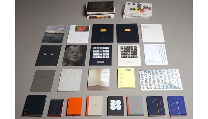
Typeface design
Bil’ak has been designing typefaces since the early 1990s. The most notable ones so far has been listed below.
Magazines
Between 2000 and 2007 Biľak was the co-founder (along with Stuart Bailey), co-editor, and designer of Dot Dot Dot, an art and design journal. Dot dot dot is a biannual, self- published, after-hours magazine, originally centred around graphic design, later broadening in scope to interdisciplinary journalism on subjects that affect the way we look at the world, how we think about and make design. It was not to be a magazine showing visual outcomes of the design process, but presenting the recurring themes of daily work. It was designed to change the way of thinking from ‘what a design magazine should show’ to ‘what we are interested in as designers’. After three issues, the tagline ‘graphic design/visual communication magazine’, was scrapped, since Bil’ak thought there was no reason why some things like film, music, literature should not be in the magazine. The only connection it has with graphic design is that the co-founders studied design. The last issue of Dot Dot Dot magazine was published in summer 2010.
In 2013, after raising €30.000 in a crowdfunding campaign, Biľak founded Works That Work, a magazine of unexpected creativity, published twice a year by Typotheque, in print and digital edition. Works That Work is an international design magazine that looks studies the impact of design around the world — a kind of National Geographic of design. The British national daily newspaper The Guardian named Works That Work as ‘some of the best-looking new magazines’, and Nieman Journalism Lab at Harvard University reported how ‘the small magazine has found a way to get noticed globally by creating a beautiful digital edition as well as a creative way to distribute its print copies—gaining a lot of ever-coveted user engagement in the process.’ . Works That Work distributes 43% of its print run via its innovative Social Distribution, a reader-based system of distribution of physical copies of magazine bypassing traditional distribution channels.
Other projects
In 2003, he designed a series of the standard post stamps for the Dutch Royal mail (TNT Post), today one of the Icons of the Post. The design of these standard postage stamps was inspired by the Dutch landscape, the starting point being the well-known view of geometric fields from the air, the first view of the country offered to any visitor landing at Amsterdam airport. Besides the inspiration coming from the landscape, the stamps offer another reading. The design is purely typographical, as the width of each letter determines the width of the surrounding block. This is how old-style metal printing works, setting metal punches next to each other. In this respect the stamps can be seen as a modest homage to the traditions of Dutch typography. The stamps have been reprinted three times, totalling over 143 000 000 copies. The 2010 edition is slightly modified.
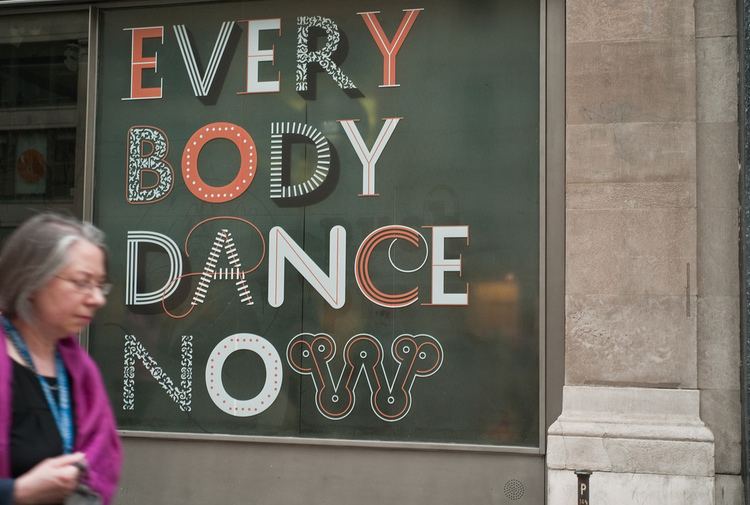
From 2004 he has been collaborating with the choreographer Lukáš Timulak on the concepts of dance performances. Together they were subject of an exhibition ‘InLoop/EnTry’ in Stroom, Centre for Art and Architecture. Bil’ak defines the concept of the dance pieces, getting involved very early on in the process. While it is clear what Timulak does as the choreographer, Bil’ak’s role has been defined in the theatre credits sometimes as designer, stage designer, sometimes as dramaturge, sometimes described simply by the noun ‘concept’.