
 | ||
The Multimark was a logo introduced by Canadian Pacific Railway on July 17, 1968 to identify each of its various operations.
Contents
Composition
Each operation was assigned a different colour while taking on a new identity:
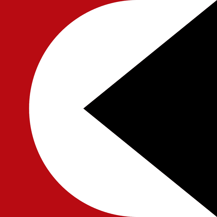
The Multimark was made up of a triangle, suggesting motion or direction. In contrast, a circle suggests global activities and a square suggests stability. By the 1990s, the logo was sometimes referred to as the "Pac-Man logo" by railfans for its resemblance to the early video game character.
Industry Changes
The Multimark was gradually eliminated in the 1980s as the various components of Canadian Pacific Limited changed names. CP Air became Canadian Pacific Airlines and was later sold off. CP Hotels became Canadian Pacific Hotels and Resorts and much later sold off. CP Express & Transport went out of business due to deregulation. CP Telecommunications was merged into CN-CP Telecommunications which soon went out of business due to the changing industry. (Unitel was then created to acquire what remained.) CP Ships became Canadian Pacific Ships and was finally sold off in 2005. CP Rail became known as CP Rail System in January 1991, with the acquisition of the bankrupt American Delaware and Hudson Railway. The marketing name included Soo Line Railroad which had become 100% owned. (CPR had long had controlling interest in it).
The use of the Multimark on CP Rail slowly faded away with no official announcement. September 1987 saw the first diesel to be repainted without it, a GP7 yard engine, 1684.