
 | ||
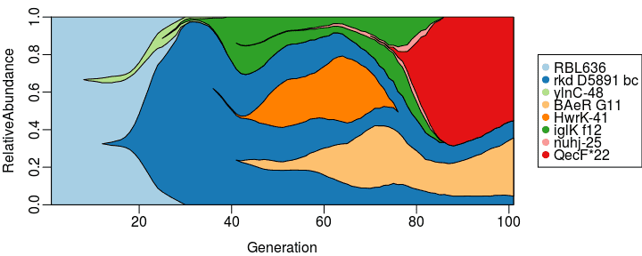
A Muller plot combines information about the succession of different OTUs (genotypes, phenotypes, species, ...) and information about dynamics of their abundances (populations or frequencies) over time. Muller plots may be used to visualize evolutionary dynamics. They may be also employed in the study of diversity and its dynamics; that is, how diversity emerges and how changes over time.
They are called Muller plots in honor of Hermann Joseph Muller, who used them to explain his idea of Muller's ratchet.
In a Muller plot, the horizontal axis typically shows time or generations and the vertical axis represents relative abundances of OTUs at the corresponding times or generations. Different OTUs are usually shown with polygons or areas with different colors, and each OTU originates somewhere in the middle of its parent area in order to illustrate their succession in the evolutionary process.
One difference between Muller plots and normal bar plots of abundances is that a Muller plot depicts not only the relative abundances but also succession of OTUs based on their genealogy/phylogeny/parental relation.
To generate a Muller plot one needs the genealogy/phylogeny/parental relation of OTUs and their abundances over time.