
 | ||
The Legibility Group is a series of serif typefaces created by the American Mergenthaler Linotype Company and intended for use in newspapers on Linotype's hot metal typesetting system. They were developed in-house by Linotype's design team, led by Chauncey H. Griffith, and released from 1922 onwards.
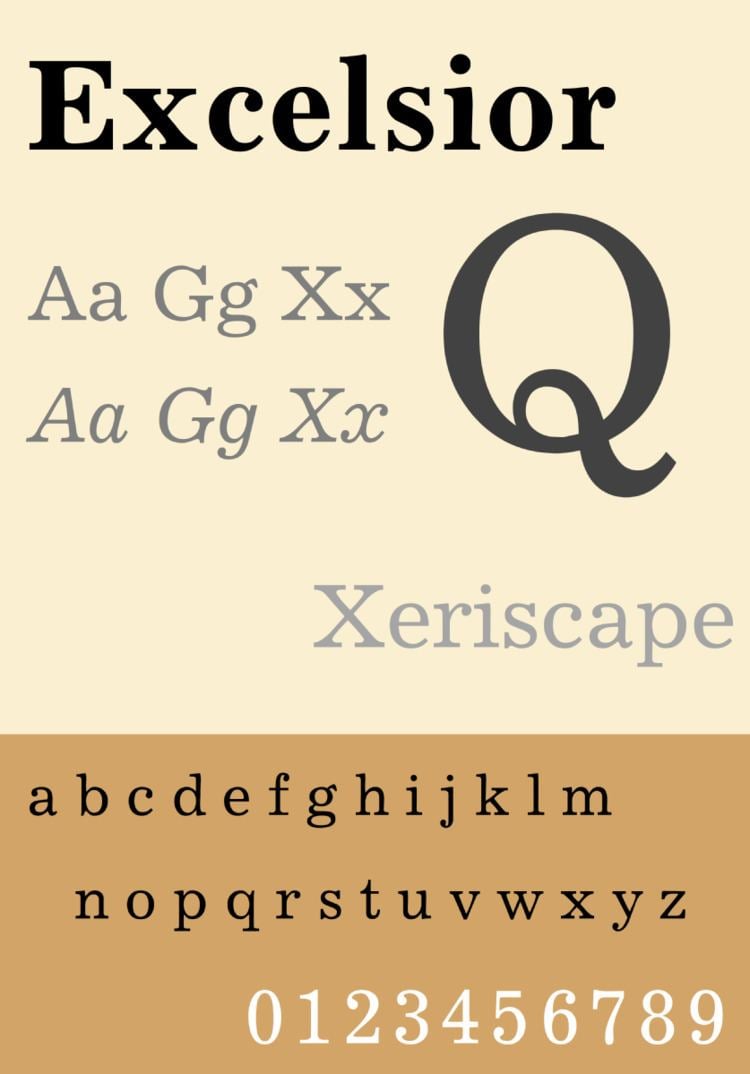
The "legibility group" typefaces were based on slab serif typefaces of the nineteenth century, called 'Clarendon' or 'Ionic', featuring a high x-height, low contrast in stroke weight, wide open counters and ball terminals, intended to make the letters clearly distinguishable even when printed on poor-quality newsprint paper. Linotype carried out a surveys of opometrist as part of their research process. The family became a large group due to the creation of slightly different designs for different printing conditions, such as levels of inking used in different newspaper production processes. An intention was to create a design with more body than the rather spindly Didone typefaces previously often used in newspaper printing.
The Legibility Group typefaces were extremely popular and remained used by many newspapers worldwide throughout the metal type period and beyond; many other newspaper typefaces such as Intertype Imperial were created based on their design. (Monotype's Times New Roman is an exception, as it was created for the unusually high standard of printing of the Times in the 1930s, although its bold is more similar to the Legibility Group style.) In 1972, British printing manager Allen Hutt commented that "the majority of the world's newspapers are typeset in one or another of the traditional Linotype 'Legibility Group', and most of the rest in their derivatives."
Typefaces
Although not part of the family, Linotype marketed its sans-serif Metro and slab serif Memphis as effective complements for headings.