
 | ||
Link catalog.monotype.com/family/monotype/joanna Variations Joanna Sans Nova, Joanna Nova | ||
Joanna typeface top 10 facts
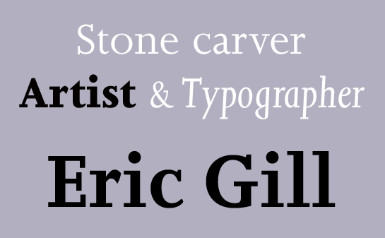
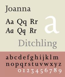
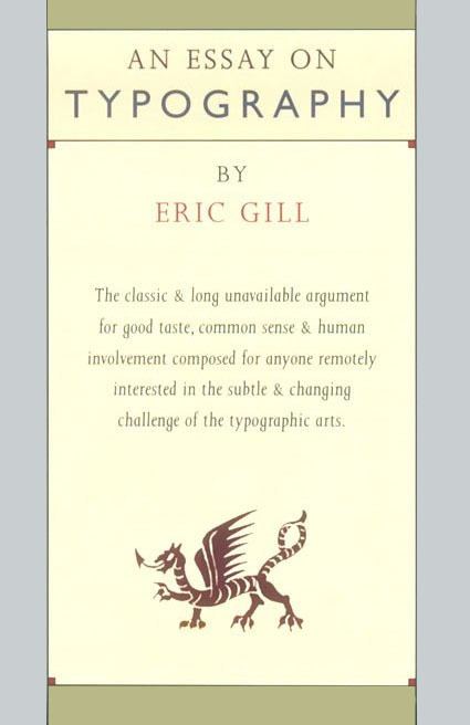
Joanna is a serif typeface designed by Eric Gill (1882–1940) in the period 1930–31, and named for one of his daughters. Gill chose Joanna for setting An Essay on Typography, a book by Gill on his thoughts on typography, typesetting, and page design. He described it as "a book face free from all fancy business."
Contents
Design
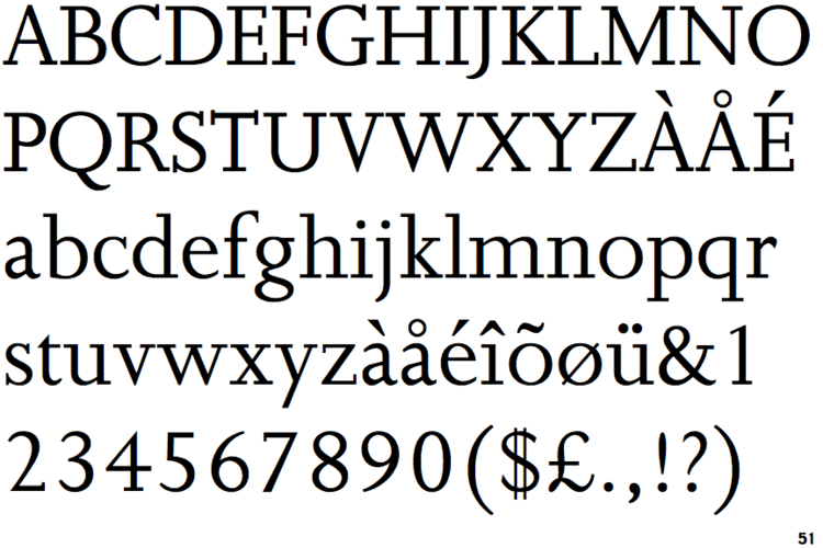
In designing Joanna, Gill took inspiration from the types of Robert Granjon (1513–1589). The underlying armature of both the roman and italics bear similarities with Granjon's type. However, the spare, sharp squared serifs and minimal contrast of strokes give the design a 20th-century modernist feeling, reminiscent of the slab serifs of the nineteenth century but far lighter than most typefaces of this genre. This is very similar to Gill's earlier typeface Solus, in many ways a predecessor to Joanna, in which Gill intended to create a design inspired by the basic structure of slab-serifs of the nineteenth century, with their almost-monoline structure and simple block serifs, but adapted to be suitable for body text. (Solus was never particularly popular, perhaps because it did not have an italic.)
Many of the letter forms of Joanna are characteristic of Gill's preferences, for example the lack of serif on the top left of the 'a', the splayed leg of the 'R' and handwriting-like italic 'g', with many similarities to his stonecarving and also to his other serif typefaces, Cockerel and Perpetua, for example in its handwriting-style italic 'g'. The italics are more vertical than Granjon's with only a slope of about 3°: indeed, in the original cut Gill did not bother to have italic capitals created, simply using the upright ones. The 'f', too, does not descend below the baseline.
History
The typeface was originally designed for proprietary use by Gill's printing shop Hague & Gill, run with his son-in-law René Hague. The type was first produced in a small quantity by the Caslon Foundry for hand composition.
Later around 1937, Monotype recut Joanna for their hot metal typesetting system for exclusive use by publisher J. M. Dent. It was eventually licensed for public release by Monotype in 1958, after Gill's death, when J.M. Dent's exclusivity expired. It was first shown in the Monotype Recorder in 1958, accompanied by an exhibition on his work.
Once released widely, prominent users included the Penguin Modern Classics series in their classic blue-grey covers of the 1960s, before they switched to Helvetica. The original metal type, however, was Gill's property, and is now partly in the collection of the Clark Library in Los Angeles.
Gill's friend and later bibliographer Robert Harling described it in a 1976 book on Gill's work as innovative in its reduced contrast: "the letter-forms have character and beauty, discipline and gaiety. No other alphabet of this century has managed to make typographical affectation so readable....defiant of almost every typographical canon of the day...Joanna Italic is gaily triumphant."
Joanna Nova
Like several Monotype typefaces digitised in the early digital era, the original digital release was criticised for being too light compared to the real thing, though this effect may be compensated for when printing on poor-quality paper into which ink tends to absorb and spread.
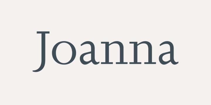
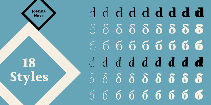
Monotype released in 2015 a more complete and fuller-bodied digitisation named Joanna Nova (shown), by Ben Jones.
All the Monotype versions are somewhat different to the original Caslon type made for Gill, that used in the first edition of An Essay on Typography (historian James Mosley considers it as superior to Monotype's), and Jones described his goal as being to compromise between the different versions "to create a version of Joanna that appears in your mind when you think of Joanna."
Joanna Sans Nova (2015)
Monotype released Joanna Nova in 2015 with a matching sans-serif design by Terrance Weinzierl, Joanna Sans Nova, intended to somewhat resemble Gill Sans but complement Joanna more closely, with a more normally slanted italic not solely inspired by either.
FF Scala (1990)
One of the typefaces most influenced by Joanna is FF Scala, designed in 1990 by the Dutch type designer Martin Majoor and released by FontFont. It is similar in its geometric simplicity combined with the old style letterform. Majoor created a complementary sans-serif design, FF Scala Sans. The resulting font superfamily was one of the first such designs to be popular, and remains common in book printing.
Joanna is the corporate typeface of the United States' Department of Homeland Security, while Scala is used on its seal.