
Classification Old Style | ||
 | ||
Design based on Nicholas Kis' Roman of 1685 Link linotype.com/2993988/janson-family.html Foundry Mergenthaler Linotype Company | ||
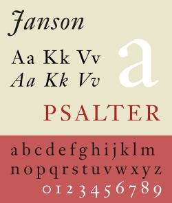
Janson is an old-style serif typeface inspired by a set of Dutch Baroque typefaces. It is an even, regular design, particularly intended for body text.
Contents
Janson is based on surviving designs from Leipzig that were named for Anton Janson (1620–1687), a Leipzig-based printer and punch-cutter from the Netherlands who was believed to have created them. In 1954 Harry Carter and George Buday published and essay, proving that the designer of the Janson typeface was in fact a Hungarian-Transylvanian schoolman and punchcutter, Miklós (Nicholas) Tótfalusi Kis (1650–1702)
Historical background
Miklós Kis, a Transylvanian Protestant priest and schoolteacher, became deeply interested in printing after being sent to Amsterdam to help print a Hungarian Protestant translation of the Bible. This was a period of considerable prosperity for the Netherlands and a time when its styles of printing were very influential across Europe, making it a centre for the creation of new typefaces. He developed a second career as a punchcutter, an engraver of the punches used as a master for making moulds for metal type, working on commission for printers and governments. Kis returned to Transylvania around 1689 and may have left matrices (the moulds used to cast type) in Leipzig on his way home. The Ehrhardt type foundry of Leipzig released a surviving specimen sheet of them around 1720, leading to the attribution to Janson. Kis also cut Greek and Hebrew typefaces, both for use in printing Polyglot Bibles.
Kis's surviving matrices were first acquired by Stempel, and are now held in the collection of the Druckmuseum (Museum of Printing), Darmstadt. Kis's identity as the maker of the typefaces was rediscovered by comparison with type from Hungarian archive sources (including an autobiography) on which his name was identified. Due to their survival, the Janson typefaces became with fine printers of the Arts and Crafts period such as Updike, who could print books from them using hand-set type cast from surviving original matrices.
Revivals
A revival of the face was designed in 1937 by Chauncey H. Griffith of the Mergenthaler Linotype foundry. The revival was taken from the original matrices, held since 1919 by the Stempel Type Foundry, which were Mergenthaler's exclusive agent in Europe.
The most common digital version, Janson Text, comes from a metal version produced by Hermann Zapf in the 1950s at Stempel. This was based on Kis' original matrices. Digitisations are available from Linotype, Adobe, Bitstream (adding Cyrillic glyphs), URW++ (adding an additional light and black weights) and others.
Despite its 17th-century origins, Janson is used in a wide variety of contemporary text applications. As of the magazine's 2011 redesign, Architectural Digest uses Janson for body text in all of its articles.
A separate common revival of the 'Janson' designs is Ehrhardt, created by Monotype in the 1930s. Somewhat more condensed than most Janson revivals, giving it a crisp, vertical appearance, it is a popular book typeface, particularly often used in the UK. Besides a number of revivals specifically of Ehrhardt (described in that article), two more by Linotype and Berthold have been sold under the name of Kis.