
 | ||
The ITV television network began as a group of regional stations, each with their own identities. Each station used its own idents to create an individual identity until the late 1990s when ITV began to introduce a consolidated presentation package as part of a dedicated effort to unify its identity. This article looks at the history of presentation of ITV.
Contents
1981
When ITV was incepted in 1955, most of the franchises had their own individual logos and identities, and were created by the franchise holders for their own use and identification within the network. From 1981, a generic, 'blocky-looking' logo was used infrequently throughout the 1980s, often in a rainbow colouration for promos produced by the "Big 5" franchises (Thames Television, LWT, Granada Television, Yorkshire Television and ATV/Central Television), as well as holding slides used by some of the regions and Channel 4 (for cross-promotion purposes), but it was never used as the centrepiece of an identity.
1989
A new generic ITV logo was introduced on 1 September 1989 and accompanied a first-time, national on-air identity designed by English Markell Pockett with music by Lord David Dundas. The logo was the centre of a whole branding package; there was a national logo and regional logos for all of the ITV franchises. Each franchise had a distinctive portion of their logo included into the V of the ITV logo. The ident was generally formed by beginning with the franchisee's logo, then going into a sliding sequence featuring a dove, a couple in period dress, Big Ben, an athlete, and a pair of dancers before the regional ITV logo is formed. Along with this, each franchise received a regional clock, trailer style, network font and break bumpers.
However, this new look did not go as the designers intended:
The look was dropped at various times depending on region:
October 1998 – October 2002
On 5 October 1998, the ITV logo was changed to a lower cased blue and yellow affair. This was in line with the fact that, with the upper cased ITV logo used previously, the viewer perception of ITV was a high brow stuffy channel, not aimed at younger audiences. ITV changed the logo to seem friendlier and more welcoming to younger audiences.
On 8 November 1999, the next generic look was born, designed by English and Pockett with music by Lord David Dundas, both of whom were involved with the last look. The main theme of the look was the ITV slogan of 'TV from the heart'. There were three variations of the ident.
The lines and static idents could also feature a spinning hearts background that was tinted brown that was used during Daytime schedules. The look was accompanied by a clock superimposed on a spinning hearts background, as well as promotions provided by ITV's Network Promotions Unit. A heart break bumper was also provided. Upon launch and over time, some changes were made to the look:
As with the last look, not all of the companies adopted it:
Once again like the last look, it was dropped at different times:
October 2002 – October 2004
On Monday 28 October 2002, a new idents package was rolled out across the regions using the central theme of a celebrity posing 'backstage'. There would be a clip of the celebrity chilling-out when they were supposedly off screen. The 'ITV1' logo had been softened with smoother edges by this point and it would animate on in the bottom right hand corner, being formed from 3 aligned blue blocks and one yellow block. This package also coincided with the centralisation of continuity from the English, Isle of Man and Scottish Border regions to London. As a result of this, regional idents were always live by a national team of six live from the Carlton/LWT continuity booth. Wales retained its own announcers for the time being.
The regional versions of the idents were now only used in Scotland, Wales and Northern Ireland throughout the day. The other regions had their own idents specifically for use before local programmes. These varied subtly by region:
The set of idents were updated with new sets and celebrities in 2003, with the sets more pronounced blues and yellows and removing the backstage feel. Along with this, news ident graphics and the backgrounds to the regional idents were changed to overlapped blue squares.
A number of regions changed their identities throughout the period:
The look was dropped at different times:
November 2004 – January 2006
The 1 November 2004 heralded a new on-air look coinciding with the launch of ITV3. The ITV1 logo was reworked, splitting it into separate squares. On-screen, the boxes were arranged as a large yellow square containing the '1' with blue ITV boxes on top. This logo would be seen against a generic background of a blue sky with clouds, windows of a high rise building, underwater with fish swimming by and dark blue ribbons flowing against a blue background.
The plan for these Idents were to use them as mini-menus showing what is coming up soon. The Idents would zoom to the left allowing a short video and description of the upcoming programmes to be shown, before the panels of the videos to become part of the ITV1 logo in the centre of the screen. They were not designed to be traditional idents, however despite the fact that ITV took on a team of associate producers to produce these promotions, the promotional idents were used less and less as the months go on.
During this period, ITV spent a lot of this period using themed idents specific to particular programmes, such as Celebrity Love Island.
Once again, not all of the companies took the look:
Regional idents were available, and featured the ITV1 ident with the region name written under the logo, to a background of different shades of dark blue. However, the ident was becoming less frequently seen, usually only before some local news bulletins and the decreasing number of regional programming. ITV1 Wales was the exception to the rule, with a Wales name added to the bottom of all idents in their package.
The ITV plc regions, the only regions to adopt the look, dropped it in 2006 in favour of a complete overhaul.
January – November 2006
On 16 January 2006 a brand new logo and presentation package was unleashed. It brought ITV1, ITV2 and ITV3 in line with ITV4. It was part of a major re-brand of the ITV network, known as Brand 2010, which also included the News and Sport divisions as well as off screen content. It was designed by Red Bee Media following a perception analysis carried out by the audience. The results stated that although all the ITV channels had a good combining brand, with the ITV logo, they all looked the same, couldn't be told apart, that their programming values were blurred and that the ITV logo itself was getting boring.
The solution was to make a new logo in a rounded off box, involving the lower case itv. These, it was claimed, made the service look friendly, retaining what had been attempted in 1998, and yet fresh and crisp. From there they added an extra oblong on the other side of the channel name. All channel shared this look with the colour being the only main difference with the exception of the name. This provided the distinctiveness, yet unity they sought.
The ITV1 idents were created on the basis that ITV1 provokes "an emotion response in all of us" and therefore the so-called 'Emotion' idents were created. Many were shot in South Africa and featured a montage of unrelated scenes, which include such things as a man rubbing his bare chest, girls rolling down a hill and two people hugging trees. These represented moods such as joy, pride, sadness, love etc. In them the 'ITV1' logo would open out and enclose the footage it was superimposed on to. The exception to the rule was one of the ITV1 logo on a black background, used to introduce the news.
The look was controversial both with critics, online and in print, viewers and ITV bosses who saw the look too vague. This look had one regional ident, Pride which was used before regional programming and also for a time at the 19:00 and 22:30 junctions on Thursdays, with an announcer name checking the regional station on some occasions. These were the last ITV idents to include the region's name onscreen. ITV1 Wales also had a full selection of idents for a time before they began using the standard ITV1 idents with the Wales added on the live television feed during transmission.
Only two of the four ITV parent companies adopted any part of the look:
The Idents themselves and their contents:
November 2006 – January 2013
The next presentation of ITV1 was launched on 13 November 2006, just 10 months after the last new look. Following the issues with the previous one, the themes were changed slightly: the logo remained the same shape and style, but with the letters itv changed to black so as to contrast with the yellow of the logo better this had also saw the end of regional idents for the ITV plc owned stations and as of this day the regional names was now used for regional news only and then on 14 January 2013 Channel Television had suffered the loss of regional identity and the regional to the news instead.
The ident films themselves were scrapped and a new set created following the theme of "Alive with Colour" with ITV promoting the new idents as the "second phase" of the look introduced in January. The idents, based on the previous set by Red Bee Media, were designed by The Mill and produced by Blink Productions and Pleix include surreal scenes featuring yellow colours to the same audio track.
The look launched with six idents: 'Beach', 'Bike', 'Lake', 'Market', 'Basketball' and 'Pavement Art', with another 4 added on 3 September 2007 which runs in tandem with the previous ones. These latest idents included an ITV1 logo that was bigger than the ones launched in 2006, but retained the same soundtrack. In April 2010, ITV1 HD was launched, featuring an updated glossier logo based on that of ITV1. In response, ITV1 changed their logo to the glossier version and launched another four idents. These latest idents have been noticeably different from their predecessors: the logo was once again larger and faded on in parts. They also featured individual soundtracks based on those previously and the style of the ident themselves, namely the shooting of them, was very different from those before them. They were accompanied on screen by updated programme promotions, end credit promotions, stings and break bumpers.
Because of these changes, all of the idents were updated with the new logo, including making it bigger in many places. However, the soundtracks remained the same causing some to question why the other idents weren't changed with the new looks. Viewer opinions suggest that the original music is unpopular, but the ident package itself generally popular. This has been the longest lasting ITV generic look to date, lasting far longer than the 1999 Hearts, and being kept by far more companies and for longer collectively than the 1989 Generic look. The primary criticisms of the look have been the scrapping of regional idents. All regions are introduced with a national ident and the region is not referenced to in the announcement. The exception to the rule is ITV1 Wales, with includes the word 'Wales' either underneath the ident or located in the bottom left hand corner of the ident. The Wales ident was used before all programming except overnight for the first few years of the rebrand before being quietly relegated to regional junctions only.
This package was only seen in some areas of the ITV network however:
The ITV plc regions, the only regions to adopt the look, dropped it in 2013 in favour of a complete overhaul.
The idents include:
January 2013 – present
On 15 November 2012, it was announced that ITV1 was to receive a rebrand in January 2013, in which it would revert to its old name of ITV. A new "curvy" logo was introduced with new idents and presentation package. This was first implemented on 14 January 2013. On the same day, ITV1 +1 and ITV1 HD were rebranded to ITV +1 and ITV HD respectively, whilst sister channels ITV2, ITV3, ITV4 and CITV all received new idents and presentation based upon the new corporate logo (later two new channels based on the 2013 ITV logo, first ITV Encore from June 2014, and then ITVBe from October 2014 were also joined the sister channels).
ITV's new idents were created to reflect "everyday life of the Great British public". New idents will be brought in on a consistent basis to reflect the four seasons - Spring, Summer, Autumn, and Winter. In addition, the new ITV logo changes colour on each ident, a process named as "colour picking".
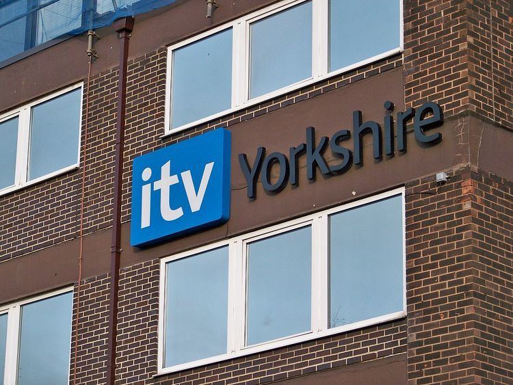
This package is only seen on the ITV plc owned companies of Anglia, Border, Central, Channel Television, Granada, London, Meridian, Tyne Tees, Wales (Later ITV Cymru Wales), West Country and Yorkshire.
UTV fully used the look, when ITV plc bought the channel in February 2016 and relaunched it on 17 October 2016 to match ITV's 2013 branding.
STV Group companies of STV Central and STV North, refused the look, instead continuing with their arrow flip book idents introduced in March 2009.
These are the idents to have been featured so far:
Winter set
At Christmas 2013, a selection of the Winter set of idents returned for use before non-entertainment programming such as news broadcasts. Following the withdrawal of the Christmas idents, the complete set returned for its second rotation on 2 January 2014, all in edited form: as with the subsequent sets, the idents now have the logo form-up much earlier, and it stays on for the remainder of the duration. (Fire Breather, though, is an exception which remains unedited until 1 January 2016.)
Spring set
On 13 April 2013, three months on from the rebrand, ITV introduced a new set of idents. A notable change with these idents is that the logo stays on screen until the end whereas in previous idents would fade away during the ident.
Summer set
On 8 June 2013, ITV introduced its latest set of idents.
Autumn set
ITV's autumn set of idents was introduced on 31 August 2013.
Later Additions
On 29 December 2014, ITV introduces 4 new idents from January 2015 and later, more new idents from February 2015 onwards.
Special idents
Special idents have also been used to mark occasions. The idents used for Easter celebrations during 2013 are documented in the list of Spring idents.
Football Idents
Special idents have used to coincide the ITV's coverage of football leagues and sporting programmes, with three idents continued as the part of the live coverage and sport events: "Garden Kickout", "Trophy Engraving" and "Celebration".
Back to School Idents
Two one-off idents are used during Back to School season on ITV in September 2015 to mark the start of the new school day, they're both aired only once.
Rugby World Cup Idents
These special idents have used to coincide the ITV's coverage of the Rugby World Cup 2015 during 18 September until 31 October, as well as sporting programmes. This coverage will continue as part of the Six Nations 2016.