A heat map (or heatmap) is a graphical representation of data where the individual values contained in a matrix are represented as colors. The term 'heat map' was originally coined and trademarked by software designer Cormac Kinney in 1991, to describe a 2D display depicting financial market information, though similar plots such as shading matrices have existed for over a century.
The company that acquired Kinney's invention in 2003 unintentionally allowed the trademark to lapse.
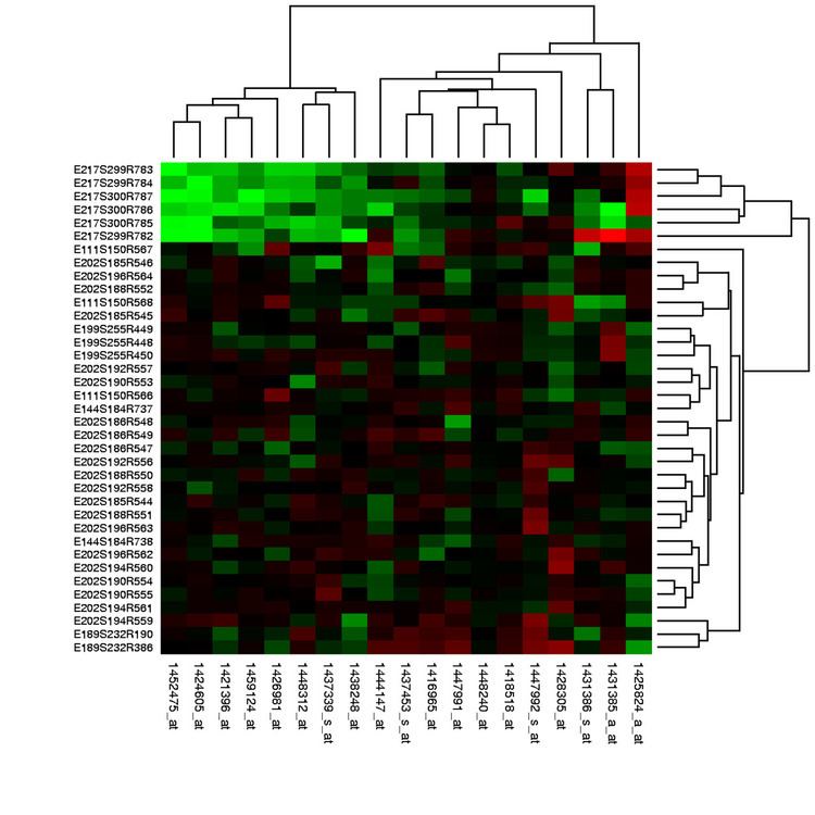
Heat maps originated in 2D displays of the values in a data matrix. Larger values were represented by small dark gray or black squares (pixels) and smaller values by lighter squares. Loua (1873) used a shading matrix to visualize social statistics across the districts of Paris. Sneath (1957) displayed the results of a cluster analysis by permuting the rows and the columns of a matrix to place similar values near each other according to the clustering. Jacques Bertin used a similar representation to display data that conformed to a Guttman scale. The idea for joining cluster trees to the rows and columns of the data matrix originated with Robert Ling in 1973. Ling used overstruck printer characters to represent different shades of gray, one character-width per pixel. Leland Wilkinson developed the first computer program in 1994 (SYSTAT) to produce cluster heat maps with high-resolution color graphics. The Eisen et al. display shown in the figure is a replication of the earlier SYSTAT design.
There are different kinds of heat maps:
Web heat maps have been used for displaying areas of a Web page most frequently scanned by visitors. Web heatmaps are often used alongside other forms of web analytics and session replay tools.Biology heat maps are typically used in molecular biology to represent the level of expression of many genes across a number of comparable samples (e.g. cells in different states, samples from different patients) as they are obtained from DNA microarrays.The tree map is a 2D hierarchical partitioning of data that visually resembles a heat map.A mosaic plot is a tiled heat map for representing a two-way or higher-way table of data. As with treemaps, the rectangular regions in a mosaic plot are hierarchically organized. The means that the regions are rectangles instead of squares. Friendly (1994) surveys the history and usage of this graph.A density function visualization is a heat map for representing the density of dots in a map. It enables one to perceive density of points independently of the zoom factor. Perrot et al (2015) proposed a way to use density function to visualize billions of dots using big data infrastructure with Spark and Hadoop.There are many different color schemes that can be used to illustrate the heatmap, with perceptual advantages and disadvantages for each. Rainbow colormaps are often used, as humans can perceive more shades of color than they can of gray, and this would purportedly increase the amount of detail perceivable in the image. However, this is discouraged by many in the scientific community, for the following reasons:
The colors lack the natural perceptual ordering found in grayscale or blackbody spectrum colormaps.Common colormaps (like the "jet" colormap used as the default in many visualization software packages) have uncontrolled changes in luminance that prevent meaningful conversion to grayscale for display or printing. This also distracts from the actual data, arbitrarily making yellow and cyan regions appear more prominent than the regions of the data that are actually most important.The changes between colors also lead to perception of gradients that aren't actually present, making actual gradients less prominent, meaning that rainbow colormaps can actually obscure detail in many cases rather than enhancing it.Choropleth maps are sometimes incorrectly referred to as heat maps. A choropleth map features different shading or patterns within geographic boundaries to show the proportion of a variable of interest, whereas the coloration a heat map (in a map context) does not correspond to geographic boundaries.
Several heat map software implementations are listed here (the list is not complete):
PermutMatrix is a work space designed to graphically explore numerical datasets. It offers several methods for the optimal reorganization of rows and columns of a numerical dataset.NeoVision Hypersystems, Inc., a software firm founded by Cormac Kinney, and funded by Intel and Deutsche Bank, developed Heatmaps depicting real time financial data and calculations, which were licensed to over 50,000 users. NeoVision Heatmaps became a feature on nasdaq.com.R, a free software environment for statistical computing and graphics, contains several functions to trace heat mapsGnuplot, a universal and free command-line plotting program, can trace 2D and 3D heat mapsThe Google Docs spreadsheet application includes a Heat Map gadget, but for country-wise data only, not for general matrix data.Dave Green's 'cubehelix' colour scheme provides resources for a colour scheme that prints as a monotonically increasing greyscale on black and white postscript devicesOrigin, a graphing and data analysis software can generate heat maps from data in a matrix, or a virtual matrix in a worksheet.Qlucore includes a heat map that is dynamically updated when filter parameters are changed.The ESPN Gamecast for soccer games uses heat maps to show where certain players have spent time on the field.Microsoft Excel can be used to generate heat maps using the Surface Chart. Though the default color range for Surface Charts in Excel is not conducive to heat maps, the colors can be edited to generate user-friendly and intuitive heat maps.Sightsmap is a sightseeing popularity heatmap overlaid on Google Maps, based on crowdsourcing: the number of Panoramio photos taken at each place in the world.Maptitude is business mapping software that includes a variety of customizable heat mapping tools and can use external data such as Excel files to show the results on geographic maps of your location.HeatMap Builder is a standalone application for generating heatmaps of genomic microarray data developed at the Ashley Lab at Stanford.Littlstar provides a heatmap service for 360 degree video and Virtual Reality.