
 | ||
Granby is a sans-serif typeface designed and released by the Stephenson Blake type foundry of Sheffield from 1930.
Granby is influenced by two contemporary British sans-serif designs, the Johnston typeface or Railway Alphabet (1916), the proprietary face of what became London Underground, and Gill Sans by Eric Gill (1928), published by Monotype. Roy Millington's history of Stephenson Blake also cites Futura as an influence.
Like both Johnston and Gill Sans, Granby has an upper-case influenced by Roman square capitals and a lower-case inspired by traditional "old-style" serif letters, making it an example of the humanist style of sans-serif fonts. Granby’s regular style is a robust design bolder than conventional body text fonts, making it suitable for headings and posters and also for legible text at smaller sizes.
Stephenson Blake had prepared type for the Johnston project and Granby is almost identical in many ways, more like Johnston than Gill Sans with diamond-shaped dots (tittles) on the 'i' and 'j' and a wide ‘a’. A difference is its ‘g’, a ‘single-storey’ design influenced by handwriting. According to Mike Ashworth of TfL, London Transport itself made some use of Granby by the 1960s due to the limited availability of Johnston type.
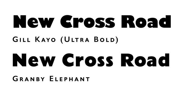
Several styles of Granby were released to extend the design, including condensed weights, an inline style and 'Granby Elephant', an ultra-bold design. As with many sans-serifs, rather than a true italic, an oblique was offered, in which the letters were slanted but not altered to take on more handwriting influences.
While never as popular as Gill Sans on the commercial market, Granby nonetheless remained in use with revivals in phototypesetting and digital versions. A digitisation of some weights is sold by Elsner+Flake and Scangraphic; Red Rooster Fonts has also digitised the Elephant style. It was appropriately used in adverts by the London company Granby Cycles in the 1930s.
Wayfarer, by Jeremy Tankard, is a loose revival of the condensed style, commissioned by Sheffield City Council as their corporate font based on its local heritage. (It also has some influences of Stephenson Blake's well-known Grotesque series.) Dieter Hofrichter's Halifax is also in the same style.