In information visualization and computing, GapChart is a chart for displaying time series data by using non overlapped thick curves. It was invented in 2013 by Fred. Vernier (LIMSI labs at Univ. Paris Sud) and Charles Perin (LIMSI labs at Univ. Paris Sud and AVIZ-INRIA). Jeremy Boy (AVIZ-INRIA) helped them to improve the original design to its current form.
Main idea
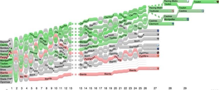
GapChart display one thick curve by time series data. At each time step curves display a flat part and a transition part. Flat parts are separated by gaps proportional to data difference. When two or more time series have same value at the same time step they are distinguished by an external method and represented side by side. Transition steps are represented by straight or S shaped link. They can partially overlap but never totally since star Labels can fit inside thick curves where i't not too steep and different colors ca be used to better distinguish elements.
GapChart can be compared to RankChart with additional space between curves to represent value difference behind the ranking
GapChart can be compared to SlopeGraph where curve thickness is removed from the layout and equal values are distinguished with an external method
GapChart can be compared to table of numbers which are commonly available for many rankings
Curves can be shaded (top to bottom) to better distinguish multiple elements with the same number of points.
Space between curves can be decorated with tick lines (i.e. marking every block of 3, 5 or 10 points according to the application domain) to better visually evaluate gaps
Labels can be added on curves if thick enough and only where not too steep
Consistent well chosen colors can help to follow elements of interest
Top Right and/or Top Left labels can help drawing a full list of elements or initial/final scores
Inspectors can be used on mouse hover in interactive gapChart to display quantitative ranks and scores (or any relevant information like match in championships)
Application domains
Sport: GapChart perfectly apply to all Championship with points and rankings. Colors can be used to highlight qualified teams or relegated ones.
Finance: GapChart can be used to compare stocks, index or fund yields along time while ranking them when is pertinent
Economy: GapChart is useful to compare a list of countries/states in different indexes (for instance NRI) or companies (i.e. Fortune 500)
Academic: GapChart can be used to follow different rankings (i.e. Shanghai ranking, h-indexes, impact factors, ...)