
Foundry Lanston Monotype Shown here Linden Hill | Date released 1927 onwards | |
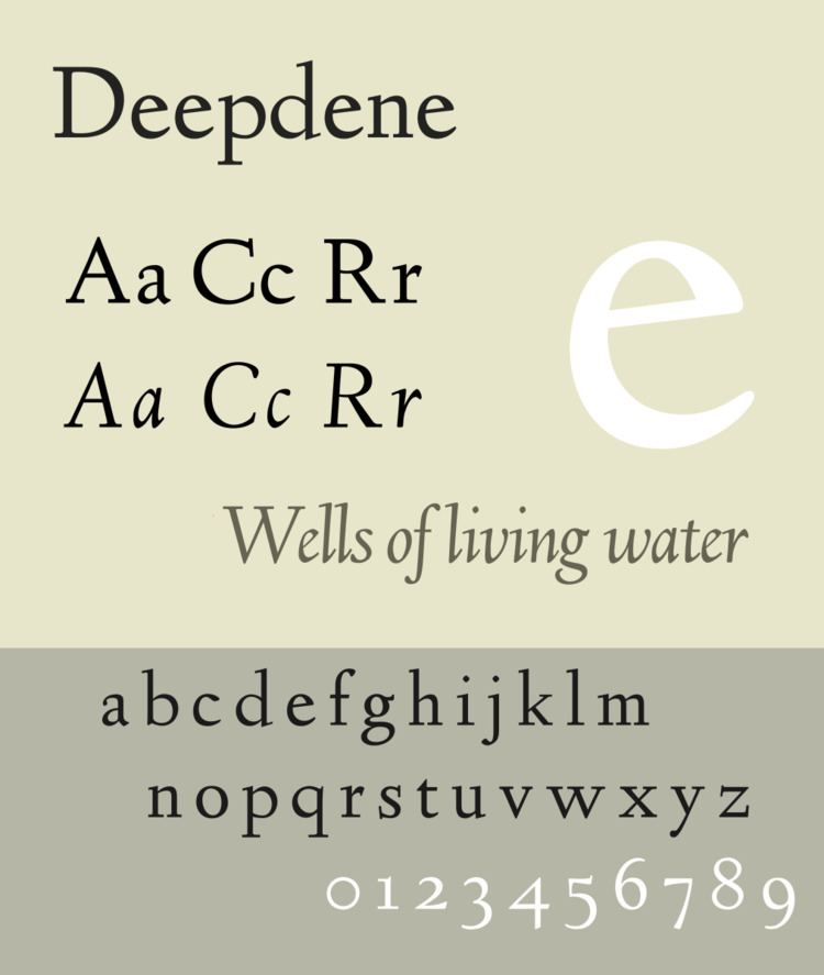 | ||
Deepdene is a serif typeface designed by Frederic Goudy from 1927–1933. It belongs to the "old-style" of serif font design, with low contrast between strokes and an oblique axis. However, Deepdene has crisp serifs and a nearly upright italic, with much less of a slant than is normal for this style.
Contents
Issued by the American branch of Lanston Monotype, Deepdene was popular on its release and often used for the body text of books. Several digitisations have been created.
Deepdene is named after Goudy's home in Marlborough-on-Hudson. This was itself named for the road on which he previously lived in Queens, New York.
Design
Goudy described the design as loosely inspired by "a Dutch type which had just been introduced;" Goudy's friend Paul Bennett suggested in later life that this was Jan van Krimpen's Lutetia although Walter Tracy writes that the attribution cannot be certain. He also later created a medium weight, bold and bold italic.
Goudy's biographer D. J. R. Bruckner praised the design as "the type that brings together the most characteristics of Goudy types the best".
Goudy later created a blackletter design, Deepdene Open Text and the derived Deepdene Text, which was intended to complement it for purposes such as initial capitals. The designs are not related otherwise.
The family in metal type included:
Digitisations
Deepdene has been digitised and released by several organisations and software companies. P22's digitisation under their LTC imprint perhaps uniquely includes the swash capitals and small caps in italics. The open-source "League of Movable Type" project has released an open-source digitisation, "Linden Hill", by Barry Schwartz, in regular and italic with swashes but without bold weights.