
Date released 1913 onwards | Classification Old-style, Venetian Variations Cloister Initials | |
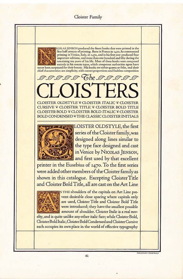 | ||
Cloister is a serif typeface that was designed by Morris Fuller Benton and published by American Type Founders from around 1913. It is loosely based on the printing of Nicolas Jenson in Venice in the 1470s, in what is now called the "old style" of serif fonts. American Type Founders presented it as an attractive but highly usable serif typeface, suitable both for body text and display use.
Contents
Metal type release
To ensure its versatility, Cloister was released in a wide selection of sizes and weights. This included an italic (ATF's design, as italics did not exist in Jenson's time) with swash capitals, an inline style and Cloister Initials, a set of initial capitals by Frederic Goudy to match. The practice of creating a wide range of variants of a successful face was a standard ATF practice in order to capitalise on a successful typeface's popularity and allow coherent layout and graphic design; its 1923 specimen book described its approach of creating families which could allow types to "talk at command with varying emphasis and orchestral power...the client [has] perceived that a catalogue or advertisement set in one type family had more influence...than if its message to the public were confused by a medley of display types."
Unlike many other American Type Founders typefaces, Cloister was cast on the "art line" rather than the standardised "common line" of American metal type used in the period. This meant that it was cast with the area of the typeface above the baseline smaller than normal, so the descenders could be at a long, historically accurate length. ATF released a blackletter design under the name of "Cloister Black"; this and a set of Cloister Borders were the first ATF typefaces to use the name, before Cloister Old Style was released. Later Cloister was released on hot metal typesetting machines such as that of Linotype, Intertype and Monotype, and additional weights were created for these.
Cloister was somewhat variably named by printers in the metal type period, with "Cloister Old Style", "Cloister Oldstyle", "Cloister Old Face" and "Cloister Oldface" all used to refer to it.
Cloister's release in metal type included:
Digitisations
A digitisation has been released by P22 and another by URW. Goudy's Cloister Initials, much esteemed in their own right, have also been digitised by P22 and by Dieter Steffmann. Cloister Black has also been digitised separately.