
 | ||
A burn down chart is a graphical representation of work left to do versus time. The outstanding work (or backlog) is often on the vertical axis, with time along the horizontal. That is, it is a run chart of outstanding work. It is useful for predicting when all of the work will be completed. It is often used in agile software development methodologies such as Scrum. However, burn down charts can be applied to any project containing measurable progress over time.
Contents
Outstanding work can be represented in terms of either time or story points.
Reading burn down charts
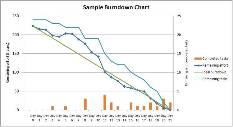
A burn down chart for a completed iteration is shown above and can be read by knowing the following:
Measuring performance
The above table is only one way of interpreting the shape of the burn down chart. There are others.
Removing variability in time estimates
One issue that may be noticed in burn down charts is that whether or not the Actual Work line is above or below the Ideal Work line depends on how accurate the original time estimates are. This means that if a team constantly overestimates time requirements, the progress will always appear ahead of schedule. If they constantly underestimate time requirements, they will always appear behind schedule. This issue is corrected by incorporating an efficiency factor into the burn down chart. After the first iteration of a project, the efficiency factor can be recalculated to allow for more accurate estimates during the next iteration. Some templates automatically calculate the efficiency as a project progresses. This can be used to identify areas/phases where inaccurate estimates consistently occur.