
 | ||
In electrical engineering and control theory, a Bode plot /ˈboʊdi/ is a graph of the frequency response of a system. It is usually a combination of a Bode magnitude plot, expressing the magnitude (usually in decibels) of the frequency response, and a Bode phase plot, expressing the phase shift. Both quantities are plotted against a horizontal axis proportional to the logarithm of frequency. Given that the decibel is itself a logarithmic scale, the Bode amplitude plot is log–log plot, whereas the Bode phase plot is a lin-log plot.
Contents
- Overview
- Definition
- Highpass Filter
- Magnitude Plot
- Phase Plot
- Lowpass Filter
- Frequency Response and Bode Plot
- Rules for handmade Bode plot
- Straight line amplitude plot
- Corrected amplitude plot
- Straight line phase plot
- Example
- Magnitude plot
- Phase plot
- Normalized plot
- An example with pole and zero
- Gain margin and phase margin
- Examples using Bode plots
- Bode plotter
- Related plots
- Proof Sketch for the Relation to Frequency Response
- References
As originally conceived by Hendrik Wade Bode in the 1930s, the plot is only an asymptotic approximation of the frequency response, using straight line segments. However, with the advent of low cost computing, it is often taken nowadays to mean the precise plot of the actual frequency response.
Overview
Among his several important contributions to circuit theory and control theory, engineer Hendrik Wade Bode, while working at Bell Labs in the United States in the 1930s, devised a simple but accurate method for graphing gain and phase-shift plots. These bear his name, Bode gain plot and Bode phase plot. "Bode" is pronounced /ˈboʊdi/ BOH-dee (Dutch: [ˈboːdə]).
Bode was faced with the problem of designing stable amplifiers with feedback for use in telephone networks. He developed the graphical design technique of the Bode plots to show the gain margin and phase margin required to maintain stability under variations in circuit characteristics caused during manufacture or during operation. The principles developed were applied to design problems of servomechanisms and other feedback control systems. The Bode plot is an example of analysis in the frequency domain.
Definition
The Bode plot for a linear, time-invariant system with transfer function
The Bode magnitude plot is the graph of the function
The Bode phase plot is the graph of the phase of the transfer function
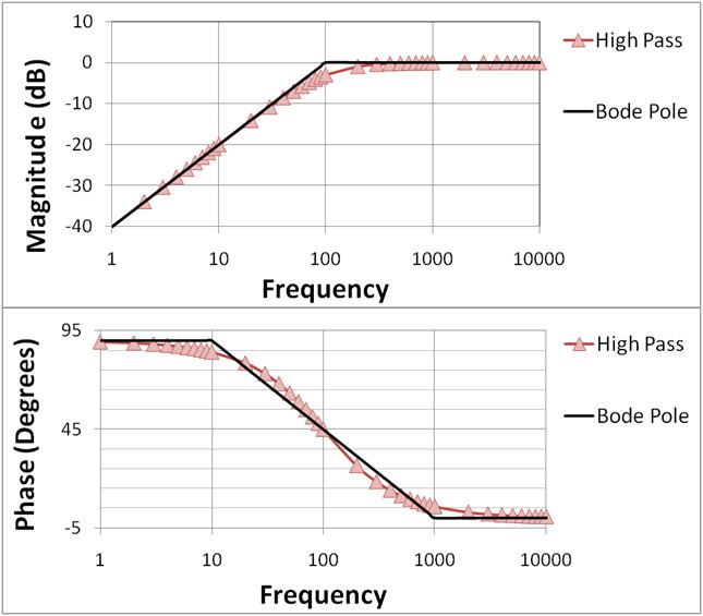
Highpass Filter
The one-pole highpass RC-filter has the transfer function
where
Magnitude Plot
To obtain the Bode magnitude plot one calculates the magnitude of the transfer function along the imaginary axis
The last equality is obtained using the rules for complex numbers. On the Bode magnitude plot, decibels are used, and the plotted magnitude is:
Phase Plot
To obtain the Bode phase plot one calculates the argument of
Care must be taken that the inverse tangent is set up to return degrees, not radians. The resulting Bode plot is shown in Figure 1(a) for
Lowpass Filter
A passive (unity pass band gain) lowpass RC filter has the following transfer function:
where, again,
The magnitude and the phase of the transfer function are related. For minimum-phase systems there is a unique relationship between the magnitude and the phase, the Bode gain-phase relationship.
If the transfer function is a rational function with real poles and zeros, then the Bode plot can be approximated with straight lines. These asymptotic approximations are called straight line Bode plots or uncorrected Bode plots and are useful because they can be drawn by hand following a few simple rules. Simple plots can even be predicted without drawing them.
The approximation can be taken further by correcting the value at each cutoff frequency. The plot is then called a corrected Bode plot.
Frequency Response and Bode Plot
This section illustrates that a Bode Plot is a visualization of the frequency response of a system.
Consider a linear, time-invariant system with transfer function
that is applied persistently, i.e. from a time
i.e., also a sinusoidal signal with amplitude
It can be shown that the magnitude of the response is
and that the phase shift is
A sketch for the proof of these equations is given in the appendix.
In summary, subjected to an input with frequency
Rules for handmade Bode plot
For many practical problems, the detailed Bode plots can be approximated with straight-line segments that are asymptotes of the precise response. The effect of each of the terms of a multiple element transfer function can be approximated by a set of straight lines on a Bode plot. This allows a graphical solution of the overall frequency response function. Before widespread availability of digital computers, graphical methods were extensively used to reduce the need for tedious calculation; a graphical solution could be used to identify feasible ranges of parameters for a new design.
The premise of a Bode plot is that one can consider the log of a function in the form:
as a sum of the logs of its poles and zeros:
This idea is used explicitly in the method for drawing phase diagrams. The method for drawing amplitude plots implicitly uses this idea, but since the log of the amplitude of each pole or zero always starts at zero and only has one asymptote change (the straight lines), the method can be simplified.
Straight-line amplitude plot
Amplitude decibels is usually done using
where
To handle irreducible 2nd order polynomials,
Note that zeros and poles happen when
Corrected amplitude plot
To correct a straight-line amplitude plot:
Note that this correction method does not incorporate how to handle complex values of
Straight-line phase plot
Given a transfer function in the same form as above:
the idea is to draw separate plots for each pole and zero, then add them up. The actual phase curve is given by
To draw the phase plot, for each pole and zero:
Example
To create a straight-line plot for the lowpass filter, introduced above, one considers the transfer function in terms of the angular frequency:
The above equation is the normalized form of the transfer function. The Bode plot is shown in Figure 1(b) above, and construction of the straight-line approximation is discussed next.
Magnitude plot
The magnitude (in decibels) of the transfer function above, (normalized and converted to angular frequency form), given by the decibel gain expression
then plotted versus input frequency
These two lines meet at the corner frequency. From the plot, it can be seen that for frequencies well below the corner frequency, the circuit has an attenuation of 0 dB, corresponding to a unity pass band gain, i.e. the amplitude of the filter output equals the amplitude of the input. Frequencies above the corner frequency are attenuated – the higher the frequency, the higher the attenuation.
Phase plot
The phase Bode plot is obtained by plotting the phase angle of the transfer function given by
versus
Normalized plot
The horizontal frequency axis, in both the magnitude and phase plots, can be replaced by the normalized (nondimensional) frequency ratio
An example with pole and zero
Figures 2-5 further illustrate construction of Bode plots. This example with both a pole and a zero shows how to use superposition. To begin, the components are presented separately.
Figure 2 shows the Bode magnitude plot for a zero and a low-pass pole, and compares the two with the Bode straight line plots. The straight-line plots are horizontal up to the pole (zero) location and then drop (rise) at 20 dB/decade. The second Figure 3 does the same for the phase. The phase plots are horizontal up to a frequency factor of ten below the pole (zero) location and then drop (rise) at 45°/decade until the frequency is ten times higher than the pole (zero) location. The plots then are again horizontal at higher frequencies at a final, total phase change of 90°.
Figure 4 and Figure 5 show how superposition (simple addition) of a pole and zero plot is done. The Bode straight line plots again are compared with the exact plots. The zero has been moved to higher frequency than the pole to make a more interesting example. Notice in Figure 4 that the 20 dB/decade drop of the pole is arrested by the 20 dB/decade rise of the zero resulting in a horizontal magnitude plot for frequencies above the zero location. Notice in Figure 5 in the phase plot that the straight-line approximation is pretty approximate in the region where both pole and zero affect the phase. Notice also in Figure 5 that the range of frequencies where the phase changes in the straight line plot is limited to frequencies a factor of ten above and below the pole (zero) location. Where the phase of the pole and the zero both are present, the straight-line phase plot is horizontal because the 45°/decade drop of the pole is arrested by the overlapping 45°/decade rise of the zero in the limited range of frequencies where both are active contributors to the phase.
Gain margin and phase margin
Bode plots are used to assess the stability of negative feedback amplifiers by finding the gain and phase margins of an amplifier. The notion of gain and phase margin is based upon the gain expression for a negative feedback amplifier given by
where AFB is the gain of the amplifier with feedback (the closed-loop gain), β is the feedback factor and AOL is the gain without feedback (the open-loop gain). The gain AOL is a complex function of frequency, with both magnitude and phase. Examination of this relation shows the possibility of infinite gain (interpreted as instability) if the product βAOL = −1. (That is, the magnitude of βAOL is unity and its phase is −180°, the so-called Barkhausen stability criterion). Bode plots are used to determine just how close an amplifier comes to satisfying this condition.
Key to this determination are two frequencies. The first, labeled here as f180, is the frequency where the open-loop gain flips sign. The second, labeled here f0 dB, is the frequency where the magnitude of the product | β AOL | = 1 (in dB, magnitude 1 is 0 dB). That is, frequency f180 is determined by the condition:
where vertical bars denote the magnitude of a complex number (for example,
One measure of proximity to instability is the gain margin. The Bode phase plot locates the frequency where the phase of βAOL reaches −180°, denoted here as frequency f180. Using this frequency, the Bode magnitude plot finds the magnitude of βAOL. If |βAOL|180 = 1, the amplifier is unstable, as mentioned. If AOL|180 < 1, instability does not occur, and the separation in dB of the magnitude of |βAOL|180 from |βAOL| = 1 is called the gain margin. Because a magnitude of one is 0 dB, the gain margin is simply one of the equivalent forms:
Another equivalent measure of proximity to instability is the phase margin. The Bode magnitude plot locates the frequency where the magnitude of |βAOL| reaches unity, denoted here as frequency f0 dB. Using this frequency, the Bode phase plot finds the phase of βAOL. If the phase of βAOL( f0 dB) > −180°, the instability condition cannot be met at any frequency (because its magnitude is going to be < 1 when f = f180), and the distance of the phase at f0 dB in degrees above −180° is called the phase margin.
If a simple yes or no on the stability issue is all that is needed, the amplifier is stable if f0 dB < f180. This criterion is sufficient to predict stability only for amplifiers satisfying some restrictions on their pole and zero positions (minimum phase systems). Although these restrictions usually are met, if they are not another method must be used, such as the Nyquist plot. Optimal gain and phase margins may be computed using Nevanlinna–Pick interpolation theory.
Examples using Bode plots
Figures 6 and 7 illustrate the gain behavior and terminology. For a three-pole amplifier, Figure 6 compares the Bode plot for the gain without feedback (the open-loop gain) AOL with the gain with feedback AFB (the closed-loop gain). See negative feedback amplifier for more detail.
In this example, AOL = 100 dB at low frequencies, and 1 / β = 58 dB. At low frequencies, AFB ≈ 58 dB as well.
Because the open-loop gain AOL is plotted and not the product β AOL, the condition AOL = 1 / β decides f0 dB. The feedback gain at low frequencies and for large AOL is AFB ≈ 1 / β (look at the formula for the feedback gain at the beginning of this section for the case of large gain AOL), so an equivalent way to find f0 dB is to look where the feedback gain intersects the open-loop gain. (Frequency f0 dB is needed later to find the phase margin.)
Near this crossover of the two gains at f0 dB, the Barkhausen criteria are almost satisfied in this example, and the feedback amplifier exhibits a massive peak in gain (it would be infinity if β AOL = −1). Beyond the unity gain frequency f0 dB, the open-loop gain is sufficiently small that AFB ≈ AOL (examine the formula at the beginning of this section for the case of small AOL).
Figure 7 shows the corresponding phase comparison: the phase of the feedback amplifier is nearly zero out to the frequency f180 where the open-loop gain has a phase of −180°. In this vicinity, the phase of the feedback amplifier plunges abruptly downward to become almost the same as the phase of the open-loop amplifier. (Recall, AFB ≈ AOL for small AOL.)
Comparing the labeled points in Figure 6 and Figure 7, it is seen that the unity gain frequency f0 dB and the phase-flip frequency f180 are very nearly equal in this amplifier, f180 ≈ f0 dB ≈ 3.332 kHz, which means the gain margin and phase margin are nearly zero. The amplifier is borderline stable.
Figures 8 and 9 illustrate the gain margin and phase margin for a different amount of feedback β. The feedback factor is chosen smaller than in Figure 6 or 7, moving the condition | β AOL | = 1 to lower frequency. In this example, 1 / β = 77 dB, and at low frequencies AFB ≈ 77 dB as well.
Figure 8 shows the gain plot. From Figure 8, the intersection of 1 / β and AOL occurs at f0 dB = 1 kHz. Notice that the peak in the gain AFB near f0 dB is almost gone.
Figure 9 is the phase plot. Using the value of f0 dB = 1 kHz found above from the magnitude plot of Figure 8, the open-loop phase at f0 dB is −135°, which is a phase margin of 45° above −180°.
Using Figure 9, for a phase of −180° the value of f180 = 3.332 kHz (the same result as found earlier, of course). The open-loop gain from Figure 8 at f180 is 58 dB, and 1 / β = 77 dB, so the gain margin is 19 dB.
Stability is not the sole criterion for amplifier response, and in many applications a more stringent demand than stability is good step response. As a rule of thumb, good step response requires a phase margin of at least 45°, and often a margin of over 70° is advocated, particularly where component variation due to manufacturing tolerances is an issue. See also the discussion of phase margin in the step response article.
Bode plotter
The Bode plotter is an electronic instrument resembling an oscilloscope, which produces a Bode diagram, or a graph, of a circuit's voltage gain or phase shift plotted against frequency in a feedback control system or a filter. An example of this is shown in Figure 10. It is extremely useful for analyzing and testing filters and the stability of feedback control systems, through the measurement of corner (cutoff) frequencies and gain and phase margins.
This is identical to the function performed by a vector network analyzer, but the network analyzer is typically used at much higher frequencies.
For education/research purposes, plotting Bode diagrams for given transfer functions facilitates better understanding and getting faster results (see external links).
Related plots
Two related plots that display the same data in different coordinate systems are the Nyquist plot and the Nichols plot. These are parametric plots, with frequency as the input and magnitude and phase of the frequency response as the output. The Nyquist plot displays these in polar coordinates, with magnitude mapping to radius and phase to argument (angle). The Nichols plot displays these in rectangular coordinates, on the log scale.
Proof Sketch for the Relation to Frequency Response
This section sketches a proof for the relation between frequency response and the magnitude and phase of the transfer function in Eqs.(1)-(2).
Slightly changing the requirements for Eqs.(1)-(2) one assumes that the input has been applied starting at time
of the input signal with the inverse Laplace transform of the transfer function
where the second term vanishes in the limit
Since
The term in brackets is the definition of the Laplace transform of
stated in Eqs.(1)-(2).