
 | ||
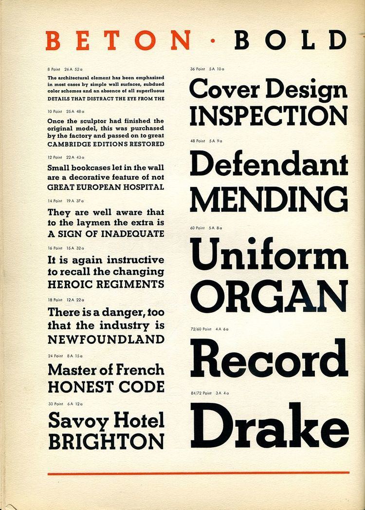
Beton is a slab-serif typeface designed by Heinrich Jost and released originally by the Bauer Type Foundry from 1929 onwards, with most major styles released by 1931. "Beton" is German for concrete (originally from French), a choice of name suggesting its industrial aesthetic.
Beton is a "geometric" slab serif, reflecting the style of German geometric sans-serifs (in particular Futura) which had attracted considerable attention, and adapting the design to the slab serif structure. Its structure is therefore quite strictly monoline. However, its letter 'a' is the conventional 'double-storey' 'a' used in most printing, unlike some of its competitors which reduce the letter to a circular single-story 'a'.
Beton and other similar designs were popular in printing during the 1930s. Competitors included the contemporary Memphis, Karnak in the United States and Rosmini from Nebiolo in Italy, and (a later and particularly similar design) Rockwell from Monotype. Beton has the normal "double-storey" 'a' used in printing, making it unlike Memphis and Karnak. Contemporary designs in a similar style include Neutraface Slab and Archer. Beton itself has been released digitally by several companies including URW and Linotype.