
Date created 1938 | Commissioned by AT&T Corporation | |
 | ||
Link linotype.com/1245683/bell-gothic-family.html Foundry | ||
Bell gothic font download
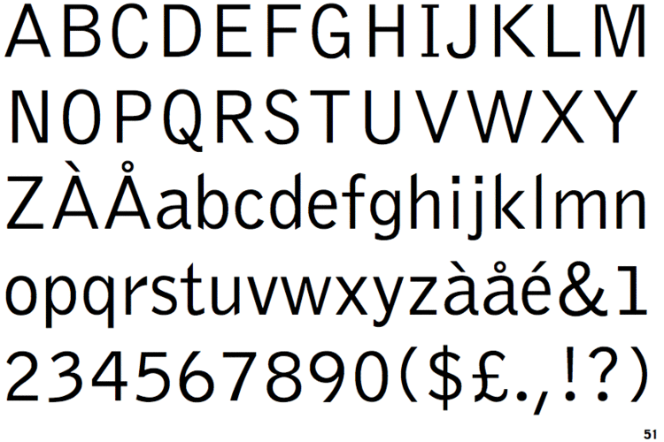
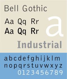
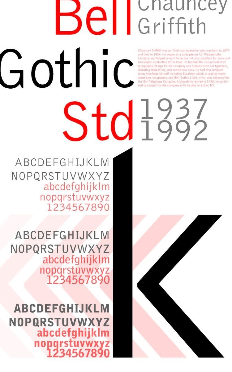
Bell Gothic is a realist sans-serif typeface designed by Chauncey H. Griffith in 1938 while heading the typographic development program at the Mergenthaler Linotype Company. The typeface was commissioned by AT&T as a proprietary typeface for use in telephone directories and has since been made available for general licensing. Bell Gothic is designed for maximum legibility in the adverse conditions of small print on poor-quality newsprint paper, into which ink tends to absorb and spread out. It is therefore a popular font in printing at small sizes.
Contents
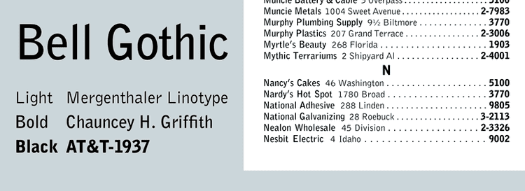
Bell Gothic was replaced by AT&T with Matthew Carter's typeface Bell Centennial in 1978, the one hundredth anniversary of AT&T's founding.
Bell gothic font download
Design
Earlier in Griffith's career at Mergenthaler Linotype, he had developed a highly successful newspaper text face called Excelsior, which overcame many of the limitations of printing smaller point sizes on low quality newsprint. This contributed to his addressing similar limitations of telephone book printing. Bell Gothic was designed to be highly legible at small sizes, economical in its use of space (and hence paper), and reproduce well on uncoated, absorbent paper newsprint stock under less than optimal conditions. Griffith's face Bell Gothic is distinct for the cross bars on the uppercase I, the foot and cross bar on figure 1, and the angled terminus of the stroke on characters b, d, h, k, l, n, p, and q. While there are suggestions of an ink trap in several characters, they are minimal in comparison to the exaggerated ones found in Bell Centennial.
Evolution of use
Bell Gothic remained in uninterrupted use for AT&T telephone directories for forty years. Following AT&T's adoption of Bell Centennial, the Mergenthaler Linotype foundry licensed Bell Gothic for general use. Beginning in the early 1990s Bell Gothic became popular and associated with avant garde experimentation with type at places like the Cranbrook Academy of Art the Design Academy Eindhoven in the Netherlands, and RISD. The typeface was used as a display and caption face by Metropolis magazine, by Canadian graphic designer Bruce Mau in designing the initial ZONE book series, Dutch graphic designer Irma Boom, and has been widely used by Semiotext(e) Books, the MIT Press, and Dia Art Foundation.
Revisions
Along with Matthew Carter's 1978 Bell Centennial reworking, Tobias Frere-Jones designed the Griffith Gothic typeface family for the Font Bureau in 1997. Condensed and italic variants were added, thus expanding the family in 2000. Isabella Chaeva produced a cyrillic version of Bell Gothic for ParaType, based in Moscow, Russia, in 1999. She added italics in Griffith's original style in 2009. (For specimen showings and further information, see External Links.)