
Date released 1997 | Classification Geometric Sans-serif Date created 1927 | |
 | ||
Designer(s) Freda SackDavid QuayKurt Schwitters | ||
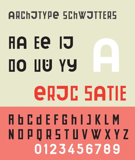
Architype Schwitters is a geometric sans-serif typeface based upon a 1927 phonetic alphabet designed by Kurt Schwitters (1887–1948). The digital revival, shown at right, was produced by Freda Sack and David Quay of The Foundry.
Like many new experimental types to arise from the early twentieth century avant garde in Europe, Schwitters' type is an attempt to remake the Western writing system through reduction, and the abandonment of idiosynchronies. Schwitters proposed a monocase system, adopting a rectilinear interpretation of roman capitals, and contrasting these with six vowel alternate characters, A, e, J, O, Ü, and y scaled to the same height but based upon Carolingian lowercase. The vowel alternates, though primarily used for the short sound, are used somewhat indiscriminately in his print work. Unlike his contemporaries, Herbert Bayer, Theo van Doesburg, and Jan Tschichold all who produced experimental universal alphabets that rejected uppercase, Schwitters retained the form of roman capitals.
Schwitters first developed four intermediate systematic scripts that had round bold vowels combined with straight consonants. The Architype Schwitters revival is an adaptation of those. His actual Systemschrift should have each letter correspond to its point and type of articulation, similar to Hangeul. Consonants would be built as strokes diverging from a vertical I-like bar, vowels would have base forms that ranged from a turned U, over O to U and that could have their stems shortened or crossbars added. Letters would form complex ligatures as in Brahmic scripts.