Foundry Hoefler & Frere-Jones | Date created 2001 | |
 | ||
Designer | ||
Archer is a slab serif typeface designed in 2001 by Tobias Frere-Jones and Jonathan Hoefler for use in Martha Stewart Living magazine. It was later released by Hoefler & Frere-Jones for commercial licensing.
Contents
Structure
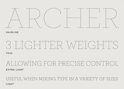
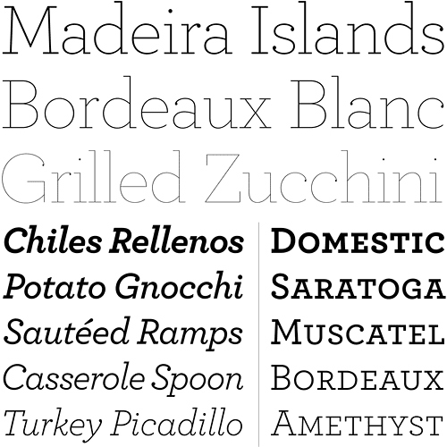
The typeface is a geometric slab serif, one with a geometric design similar to sans-serif fonts. It takes inspiration from mid-twentieth century designs such as Rockwell.
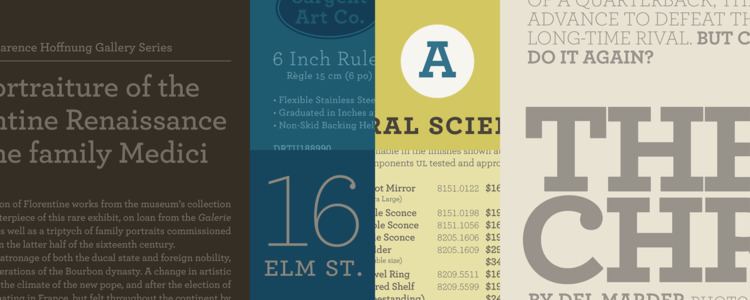
The face is unique for combining the geometric structure of twentieth-century European slab-serifs but imbuing the face with a domestic, less strident tone of voice. Balls were added to the upper terminals on letters such as C and G to increase its charm. Italics are true italic designs, with flourishes influenced by calligraphy, an unusual feature for geometric slab serif designs. As with many Hoefler & Frere-Jones designs, it was released in a wide range of weights from hairline to bold, reflecting its design goal as a typeface for complex magazines.
Uses

The typeface has been used for, among other things, branding for Wells Fargo and is a main font for the San Francisco Chronicle and Wes Anderson's film The Grand Budapest Hotel. It is also the current font used for titles and body text by the Design Observer website.