
 | ||
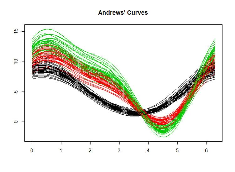
In data visualization, an Andrews plot or Andrews curve is a way to visualize structure in high-dimensional data. It is basically a rolled-down, non-integer version of the Kent-Kiviat radar chart, or a smoothened version of a parallel coordinate plot.
A value
This function is then plotted for
If there is structure in the data, it may be visible in the Andrews' curves of the data.
These curves have been utilized in fields as different as biology, neurology, sociology and semiconductor manufacturing. Some of their uses include the quality control of products, the detection of period and outliers in time series, the visualization of learning in artificial neural networks, and correspondence analysis.
Theoretically, it is possible to project them onto an n-sphere. The projection onto the circle results in the aforementioned Radar chart. This could prove to be a powerful computer-aided multivariable visualization method if, upon projection onto the common tridimensional sphere, the layers are given some degree of transparency on their alpha channel so as to allow to see through.