
Designer Joel Kaden, Tony Stan | Date created 1974 | |
 | ||
Design based on Sholes's 1868 typewriter patent Re-issuing foundries Apple, Mergenthaler Linotype Company, Adobe Type | ||
The american typewriter
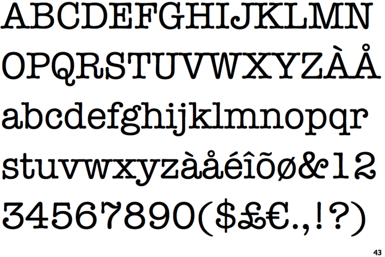
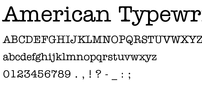
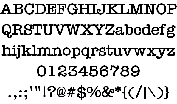
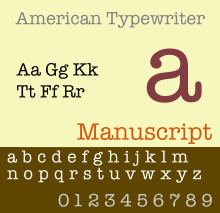
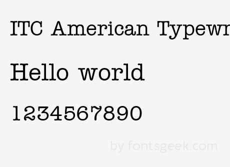
American Typewriter is a slab serif typeface created in 1974 by Joel Kaden and Tony Stan for International Typeface Corporation. It is based on the slab serif style of typewriters; however, unlike most true typewriter fonts, it is a proportional design: the characters do not all have the same width. American Typewriter is often used to suggest an old-fashioned or industrial image. It was originally released in cold type (photocomposition) before being released digitally. Like many ITC fonts, it has a range of four weights from light to bold (with matching italics) and separate condensed styles. Some releases do not have italics.
Contents
In the history of typewriters, early typewriters were initially thought to be replacements for printing and so featured proportional fonts. Monospaced typefaces, those designed so every letter takes up the same amount of space, were a more practical alternative and soon replaced printing types.
American Typewriter was by no means the first typeface to imitate typewriting. Foundry catalogs of the late nineteenth century were already offering them, and press manufacturers even made press-size ribbons so that letters looking as if they had been typed could be produced wholesale.
In the original release, the A faces are identical to the regular ones, except for alternate versions of the following characters: &, $, R, e.
Used in media
From the 1983–84 season to the 1988–89 season, MotorWeek used the font for road tests, as well as the closing credits. It is also used in the famous I Love New York (I ♥ NY) logo.
Tesco used the font for in-store signage between the late 1970s and mid-1990s.
OS X and iOS include the font (without italics), and some applications use it.