
Foundry URW Date released 1987 | Date created 1983-7 | |
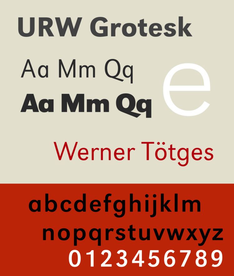 | ||
URW Grotesk is a large sans-serif typeface family designed by Hermann Zapf for URW in the mid-1980s.
URW Grotesk is a sans-serif of mixed design, with influences both of geometric sans-serifs of the 1920s and 1930s, such as Futura and Erbar, as well as "grotesque" and "humanist" sans-serifs. Elements related to the geometric model include the "single-storey" letter 'a', based on a circle. Other elements are less purely geometric, and more based on classic serif typefaces, for example the 't' with a curl to bottom right and an angled stroke terminal, unlike Futura's 't' composed of two simple cross-strokes. Starting from Zapf's original designs, URW created an extremely large range of weights and widths by computerised interpolation and extrapolation.
Florian Hardwig's obituary for Zapf described it as "not a typical design for him, utterly uncalligraphic...but naturally, wonderfully functional." It is the primary typeface used by the University of Nebraska at Omaha. The design was originally intended for Axel Springer publications. Zapf designed a serif companion font at the same time as part of the same (ultimately abandoned) redesign project, URW Antiqua.