

Objectives :
Objectives of the course is to provide the foundation in which further techniques having a quantitative bias can be build up and for their application in solving Business problems.
Statistics
Statistics is the study of the collection, organization, analysis, interpretation and presentation of data. It deals with all aspects of data including the planning of data collection in terms of the design of surveys and experiments. When analyzing data, it is possible to use one of two statistics methodologies: descriptive
Scope
Statistics is a mathematical body of science that pertains to the collection, analysis, interpretation or explanation, and presentation of data, or as a branch of mathematics. Some consider statistics to be a distinct mathematical science rather than as a branch of mathematics.
Misuse of statistics
Misuse of statistics can produce subtle, but serious errors in description and interpretation—subtle in the sense that even experienced professionals make such errors, and serious in the sense that they can lead to devastating decision errors. For instance, social policy, medical practice, and the reliability of structures like bridges all rely on the proper use of statistics.
Even when statistical techniques are correctly applied, the results can be difficult to interpret for those lacking expertise. The statistical significance of a trend in the data—which measures the extent to which a trend could be caused by random variation in the sample—may or may not agree with an intuitive sense of its significance. The set of basic statistical skills (and skepticism) that people need to deal with information in their everyday lives properly is referred to as statistical literacy.
There is a general perception that statistical knowledge is all-too-frequently intentionally misused by finding ways to interpret only the data that are favorable to the presenter. A mistrust and misunderstanding of statistics is associated with the quotation, "There are three kinds of lies: lies, damned lies, and statistics". Misuse of statistics can be both inadvertent and intentional, and the book How to Lie with Statistics outlines a range of considerations. In an attempt to shed light on the use and misuse of statistics, reviews of statistical techniques used in particular fields are conducted (e.g. Warne, Lazo, Ramos, and Ritter (2012)).
Type of data
Various attempts have been made to produce a taxonomy of levels of measurement. The psychophysicist Stanley Smith Stevens defined nominal, ordinal, interval, and ratio scales. Nominal measurements do not have meaningful rank order among values, and permit any one-to-one transformation. Ordinal measurements have imprecise differences between consecutive values, but have a meaningful order to those values, and permit any order-preserving transformation. Interval measurements have meaningful distances between measurements defined, but the zero value is arbitrary (as in the case with longitude and temperature measurements in Celsius or Fahrenheit), and permit any linear transformation. Ratio measurements have both a meaningful zero value and the distances between different measurements defined, and permit any rescaling transformation.
Because variables conforming only to nominal or ordinal measurements cannot be reasonably measured numerically, sometimes they are grouped together as categorical variables, whereas ratio and interval measurements are grouped together as quantitative variables, which can be either discrete or continuous, due to their numerical nature. Such distinctions can often be loosely correlated with data type in computer science, in that dichotomous categorical variables may be represented with the Boolean data type, polytomous categorical variables with arbitrarily assigned integers in the integral data type, and continuous variables with the real data type involving floating point computation. But the mapping of computer science data types to statistical data types depends on which categorization of the latter is being implemented.

Other categorizations have been proposed. For example, Mosteller and Tukey (1977) distinguished grades, ranks, counted fractions, counts, amounts, and balances. Nelder (1990) described continuous counts, continuous ratios, count ratios, and categorical modes of data. See also Chrisman (1998),van den Berg (1991).
The issue of whether or not it is appropriate to apply different kinds of statistical methods to data obtained from different kinds of measurement procedures is complicated by issues concerning the transformation of variables and the precise interpretation of research questions. "The relationship between the data and what they describe merely reflects the fact that certain kinds of statistical statements may have truth values which are not invariant under some transformations. Whether or not a transformation is sensible to contemplate depends on the question one is trying to answer" (Hand, 2004, p. 82).
Frequency Distributions & Graphs
Definitions
1. Raw Data
Data collected in original form.
2. Frequency
The number of times a certain value or class of values occurs.
3. Frequency Distribution
The organization of raw data in table form with classes and frequencies.
4. Categorical Frequency Distribution
A frequency distribution in which the data is only nominal or ordinal.
5. Ungrouped Frequency Distribution
A frequency distribution of numerical data. The raw data is not grouped.
6. Grouped Frequency Distribution
A frequency distribution where several numbers are grouped into one class.
7. Class Limits
Separate one class in a grouped frequency distribution from another. The limits could actually appear in the data and have gaps between the upper limit of one class and the lower limit of the next.
8. Class Boundaries
Separate one class in a grouped frequency distribution from another. The boundaries have one more decimal place than the raw data and therefore do not appear in the data. There is no gap between the upper boundary of one class and the lower boundary of the next class. The lower class boundary is found by subtracting 0.5 units from the lower class limit and the upper class boundary is found by adding 0.5 units to the upper class limit.
9. Class Width
The difference between the upper and lower boundaries of any class. The class width is also the difference between the lower limits of two consecutive classes or the upper limits of two consecutive classes. It is not the difference between the upper and lower limits of the same class.
10. Class Mark (Midpoint)
The number in the middle of the class. It is found by adding the upper and lower limits and dividing by two. It can also be found by adding the upper and lower boundaries and dividing by two.
11. Cumulative Frequency
The number of values less than the upper class boundary for the current class. This is a running total of the frequencies.
12. Relative Frequency
The frequency divided by the total frequency. This gives the percent of values falling in that class.
13. Cumulative Relative Frequency (Relative Cumulative Frequency)
The running total of the relative frequencies or the cumulative frequency divided by the total frequency. Gives the percent of the values which are less than the upper class boundary.
14. Histogram
A graph which displays the data by using vertical bars of various heights to represent frequencies. The horizontal axis can be either the class boundaries, the class marks, or the class limits.
15. Frequency Polygon
A line graph. The frequency is placed along the vertical axis and the class midpoints are placed along the horizontal axis. These points are connected with lines.
16. Ogive
A frequency polygon of the cumulative frequency or the relative cumulative frequency. The vertical axis the cumulative frequency or relative cumulative frequency. The horizontal axis is the class boundaries. The graph always starts at zero at the lowest class boundary and will end up at the total frequency (for a cumulative frequency) or 1.00 (for a relative cumulative frequency).
17. Pareto Chart
A bar graph for qualitative data with the bars arranged according to frequency.
18. Pie Chart
Graphical depiction of data as slices of a pie. The frequency determines the size of the slice. The number of degrees in any slice is the relative frequency times 360 degrees.
19. Pictograph
A graph that uses pictures to represent data.
20. Stem and Leaf Plot
A data plot which uses part of the data value as the stem and the rest of the data value (the leaf) to form groups or classes. This is very useful for sorting data quickly.
Measures of Central Tendency
A measure of central tendency is a single value that attempts to describe a set of data by identifying the central position within that set of data. As such, measures of central tendency are sometimes called measures of central location. They are also classed as summary statistics. The mean (often called the average) is most likely the measure of central tendency that you are most familiar with, but there are others, such as the median and the mode.

The mean, median and mode are all valid measures of central tendency, but under different conditions, some measures of central tendency become more appropriate to use than others. In the following sections, we will look at the mean, mode and median, and learn how to calculate them and under what conditions they are most appropriate to be used.
Mean (Arithmetic)
The mean (or average) is the most popular and well known measure of central tendency. It can be used with both discrete and continuous data, although its use is most often with continuous data (see our Types of Variable guide for data types). The mean is equal to the sum of all the values in the data set divided by the number of values in the data set. So, if we have n values in a data set and they have values x1, x2, ...,
xn, the sample mean, usually denoted by
![]()
This formula is usually written in a slightly different manner using the Greek capitol letter, ![]() , pronounced "sigma", which means "sum of...":
, pronounced "sigma", which means "sum of...":
![]()
You may have noticed that the above formula refers to the sample mean. So, why have we called it a sample mean? This is because, in statistics, samples and populations have very different meanings and these differences are very important, even if, in the case of the mean, they are calculated in the same way. To acknowledge that we are calculating the population mean and not the sample mean, we use the Greek lower case letter "mu", denoted as µ:
![]()
The mean is essentially a model of your data set. It is the value that is most common. You will notice, however, that the mean is not often one of the actual values that you have observed in your data set. However, one of its important properties is that it minimises error in the prediction of any one value in your data set. That is, it is the value that produces the lowest amount of error from all other values in the data set.
An important property of the mean is that it includes every value in your data set as part of the calculation. In addition, the mean is the only measure of central tendency where the sum of the deviations of each value from the mean is always zero.
When not to use the meanThe mean has one main disadvantage: it is particularly susceptible to the influence of outliers. These are values that are unusual compared to the rest of the data set by being especially small or large in numerical value. For example, consider the wages of staff at a factory below:
| Staff | 1 | 2 | 3 | 4 | 5 | 6 | 7 | 8 | 9 | 10 |
| Salary | 15k | 18k | 16k | 14k | 15k | 15k | 12k | 17k | 90k | 95k |
The mean salary for these ten staff is $30.7k. However, inspecting the raw data suggests that this mean value might not be the best way to accurately reflect the typical salary of a worker, as most workers have salaries in the $12k to 18k range. The mean is being skewed by the two large salaries. Therefore, in this situation, we would like to have a better measure of central tendency. As we will find out later, taking the median would be a better measure of central tendency in this situation.
Another time when we usually prefer the median over the mean (or mode) is when our data is skewed (i.e., the frequency distribution for our data is skewed). If we consider the normal distribution - as this is the most frequently assessed in statistics - when the data is perfectly normal, the mean, median and mode are identical. Moreover, they all represent the most typical value in the data set. However, as the data becomes skewed the mean loses its ability to provide the best central location for the data because the skewed data is dragging it away from the typical value. However, the median best retains this position and is not as strongly influenced by the skewed values.Median
The median is the middle score for a set of data that has been arranged in order of magnitude. The median is less affected by outliers and skewed data. In order to calculate the median, suppose we have the data below:
| 65 | 55 | 89 | 56 | 35 | 14 | 56 | 55 | 87 | 45 | 92 |
We first need to rearrange that data into order of magnitude (smallest first):
| 14 | 35 | 45 | 55 | 55 | 56 | 56 | 65 | 87 | 89 | 92 |
Our median mark is the middle mark - in this case, 56 (highlighted in bold). It is the middle mark because there are 5 scores before it and 5 scores after it. This works fine when you have an odd number of scores, but what happens when you have an even number of scores? What if you had only 10 scores? Well, you simply have to take the middle two scores and average the result. So, if we look at the example below:
| 65 | 55 | 89 | 56 | 35 | 14 | 56 | 55 | 87 | 45 |
We again rearrange that data into order of magnitude (smallest first):
| 14 | 35 | 45 | 55 | 55 | 56 | 56 | 65 | 87 | 89 | 92 |
Only now we have to take the 5th and 6th score in our data set and average them to get a median of 55.5.
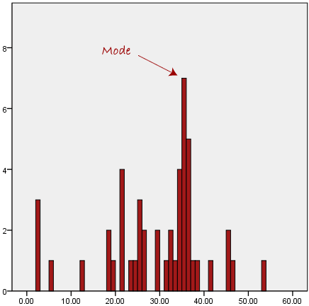
ModeThe mode is the most frequent score in our data set. On a histogram it represents the highest bar in a bar chart or histogram. You can, therefore, sometimes consider the mode as being the most popular option. An example of a mode is presented below:
Normally, the mode is used for categorical data where we wish to know which is the most common category, as illustrated below:
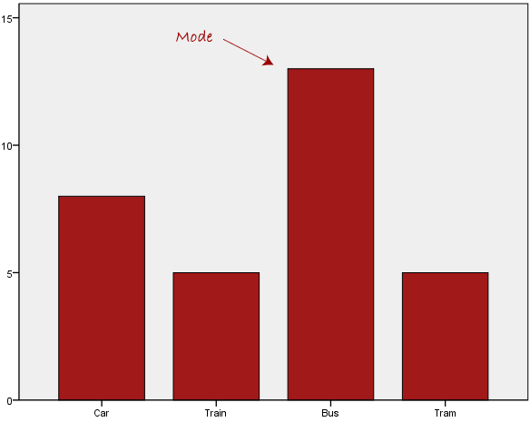
We can see above that the most common form of transport, in this particular data set, is the bus. However, one of the problems with the mode is that it is not unique, so it leaves us with problems when we have two or more values that share the highest frequency, such as below:
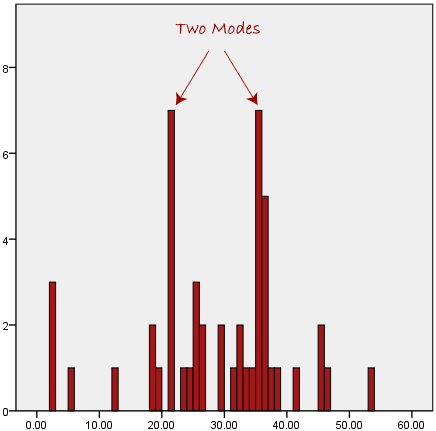
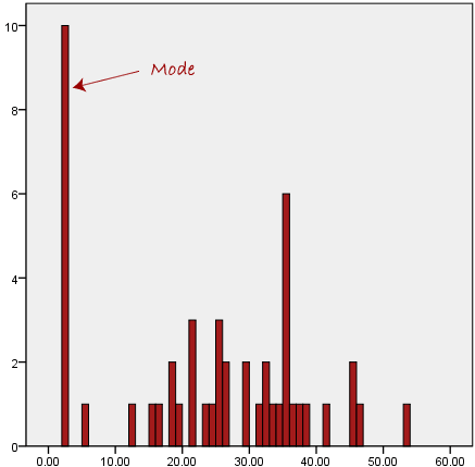
We are now stuck as to which mode best describes the central tendency of the data. This is particularly problematic when we have continuous data because we are more likely not to have any one value that is more frequent than the other. For example, consider measuring 30 peoples weight (to the nearest 0.1 kg). How likely is it that we will find two or more people with exactly the same weight (e.g., 67.4 kg)? The answer, is probably very unlikely - many people might be close, but with such a small sample (30 people) and a large range of possible weights, you are unlikely to find two people with exactly the same weight; that is, to the nearest 0.1 kg. This is why the mode is very rarely used with continuous data.
Another problem with the mode is that it will not provide us with a very good measure of central tendency when the most common mark is far away from the rest of the data in the data set, as depicted in the diagram below:
In the above diagram the mode has a value of 2. We can clearly see, however, that the mode is not representative of the data, which is mostly concentrated around the 20 to 30 value range. To use the mode to describe the central tendency of this data set would be misleading.
Measures of dispersion - Quartile deviationIt is based on the lower quartile
Quartile Deviation (Q.D)
The quartile deviation is a slightly better measure of absolute dispersion than the range. But it ignores the observation on the tails. If we take difference samples from a population and calculate their quartile deviations, their values are quite likely to be sufficiently different. This is called sampling fluctuation. It is not a popular measure of dispersion. The quartile deviation calculated from the sample data does not help us to draw any conclusion (inference) about the quartile deviation in the population.
Coefficient of Quartile Deviation:
A relative measure of dispersion based on the quartile deviation is called the coefficient of quartile deviation. It is defined as
Coefficient of Quartile Deviation

It is pure number free of any units of measurement. It can be used for comparing the dispersion in two or more than two sets of data.
Example:
The wheat production (in Kg) of 20 acres is given as: 1120, 1240, 1320, 1040, 1080, 1200, 1440, 1360, 1680, 1730, 1785, 1342, 1960, 1880, 1755, 1720, 1600, 1470, 1750, and 1885. Find the quartile deviation and coefficient of quartile deviation.
Solution:
After arranging the observations in ascending order, we get
1040, 1080, 1120, 1200, 1240, 1320, 1342, 1360, 1440, 1470, 1600, 1680, 1720, 1730, 1750, 1755, 1785, 1880, 1885, 1960.
Quartile Deviation (Q.D) ![]()
Coefficient of Quartile Deviation 
Measures of skewness.
In probability theory and statistics, skewness is a measure of the asymmetry of the probability distribution of a real-valued random variable about its mean. The skewness value can be positive or negative, or even undefined.
The qualitative interpretation of the skew is complicated. For a unimodal distribution, negative skew indicates that the tail on the left side of the probability density function is longer or fatter than the right side – it does not distinguish these shapes. Conversely, positive skew indicates that the tail on the right side is longer or fatter than the left side. In cases where one tail is long but the other tail is fat, skewness does not obey a simple rule. For example, a zero value indicates that the tails on both sides of the mean balance out, which is the case both for a symmetric distribution, and for asymmetric distributions where the asymmetries even out, such as one tail being long but thin, and the other being short but fat. Further, in multimodal distributions and discrete distributions, skewness is also difficult to interpret. Importantly, the skewness does not determine the relationship of mean and median.
Consider the distribution in the figure. The bars on the right side of the distribution taper differently than the bars on the left side. These tapering sides are called tails, and they provide a visual means for determining which of the two kinds of skewness a distribution has:

1. negative skew: The left tail is longer; the mass of the distribution is concentrated on the right of the figure. The distribution is said to be left-skewed, left-tailed, or skewed to the left. Example (observations): 40, 49, 50, 51.
2. positive skew: The right tail is longer; the mass of the distribution is concentrated on the left of the figure. The distribution is said to be right-skewed, right-tailed, or skewed to the right. Example (observations): 49, 50, 51, 60.
Karl pearson’s co-efficient of skewness
Step-1: Calculate mid points for the class interval
Step2: Calculate average
Step3: Calculate Median
Step4: Calculate Standard deviation
Step5: Carl Pearsons coefficient =
3*(mean-median)/standard deviation
Explanation: The value of Carl Pearsons coefficient of skewness is a measure of symmetry and shows the manner in which the items are clustered around the average. In symmetrical distribution, the items show a perfect balance on either side of the mode but in a skew distribution the balance is thrown to one side. In our case the distribution is positively skewed. There are more values below the average than above the average.
Correlation analysis
Correlation and regression analysis are related in the sense that both deal with relationships among variables. The correlation coefficient is a measure of linear association between two variables. Values of the correlation coefficient are always between -1 and +1. A correlation coefficient of +1 indicates that two variables are perfectly related in a positive linear sense, a correlation coefficient of -1 indicates that two variables are perfectly related in a negative linear sense, and a correlation coefficient of 0 indicates that there is no linear relationship between the two variables. For simple linear regression, the sample correlation coefficient is the square root of the coefficient of determination, with the sign of the correlation coefficient being the same as the sign of b1, the coefficient of x1 in the estimated regression equation.
Neither regression nor correlation analyses can be interpreted as establishing cause-and-effect relationships. They can indicate only how or to what extent variables are associated with each other. The correlation coefficient measures only the degree of linear association between two variables. Any conclusions about a cause-and-effect relationship must be based on the judgment of the analyst.
Karl Pearson’s co-efficient of correlation
In statistics, the Pearson product-moment correlation coefficient (r) is a common measure of the correlation between two variables X and Y. When measured in a population the Pearson Product Moment correlation is designated by the Greek letter rho (?). When computed in a sample, it is designated by the letter "r" and is sometimes called "Pearsons r." Pearsons correlation reflects the degree of linear relationship between two variables. It ranges from +1 to -1. A correlation of +1 means that there is a perfect positive linear relationship between variables. A correlation of -1 means that there is a perfect negative linear relationship between variables. A correlation of 0 means there is no linear relationship between the two variables. Correlations are rarely if ever 0, 1, or -1. If you get a certain outcome it could indicate whether correlations were negative or positive.
Mathematical Formula: The quantity r, called the linear correlation coefficient, measures the strength and the direction of a linear relationship between two variables. The linear correlation coefficient is sometimes referred to as the Pearson product moment correlation coefficient in honor of its developer Karl Pearson.
The mathematical formula for computing r is:
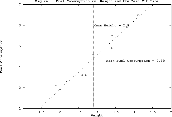
Regression analysis
Regression analysis involves identifying the relationship between a dependent variable and one or more independent variables. A model of the relationship is hypothesized, and estimates of the parameter values are used to develop an estimated regression equation. Various tests are then employed to determine if the model is satisfactory. If the model is deemed satisfactory, the estimated regression equation can be used to predict the value of the dependent variable given values for the independent variables.
Regression model.
In simple linear regression, the model used to describe the relationship between a single dependent variable y and a single independent variable x is y = a0 + a1x + k. a0and a1 are referred to as the model parameters, and is a probabilistic error term that accounts for the variability in y that cannot be explained by the linear relationship with x. If the error term were not present, the model would be deterministic; in that case, knowledge of the value of x would be sufficient to determine the value of y.
Least squares method.
Either a simple or multiple regression model is initially posed as a hypothesis concerning the relationship among the dependent and independent variables. The least squares method is the most widely used procedure for developing estimates of the model parameters.
As an illustration of regression analysis and the least squares
method, suppose a university medical centre is investigating the
relationship between stress and blood pressure. Assume that both a
stress test score and a blood pressure reading have been recorded for
a sample of 20 patients. The data are shown graphically in the figure below,
called a scatter diagram. Values of the independent variable, stress
test score, are given on the horizontal axis, and values of the
dependent variable, blood pressure, are shown on the vertical axis.
The line passing through the data points is the graph of the
estimated regression equation: y = 42.3 + 0.49x. The parameter
estimates, b0 = 42.3 and b1 = 0.49, were obtained using the least
squares method.