
Designer(s) Guy Jeffrey Nelson | ||
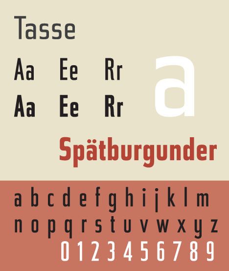 | ||
Tasse is a revival of Paul Renner's Steile Futura. The family consists of 4 weights and 5 widths each, but no italic fonts were made. Nelson maintained Renner's alternative characters, adding additional alternate characters. The face is licensed by Font Bureau.
Tasse shows influence of pen-written letters in contrast to the modular geometry of Futura. The face is unusual for a sans-serif in having a true italic rather than a sloped Roman. Lowercase italic a becomes single story, and the suggestion of calligraphic strokes are found in the italic characters e, h, K, k, m, n, and u. Renner's original character set offered alternative, more rounded, versions of uppercase roman characters A, E, M, and W.
References
Tasse Wikipedia(Text) CC BY-SA