 | ||
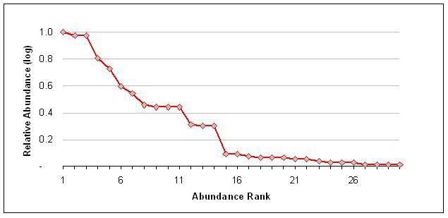
A rank abundance curve or Whittaker plot is a chart used by ecologists to display relative species abundance, a component of biodiversity. It can also be used to visualize species richness and species evenness. It overcomes the shortcomings of biodiversity indices that cannot display the relative role different variables played in their calculation.
The curve is a 2D chart with relative abundance on the Y-axis and the abundance rank on the X-axis.
Interpreting a rank abundance curve
The rank abundance curve visually depicts both species richness and species evenness. Species richness can be viewed as the number of different species on the chart i.e., how many species were ranked. Species evenness is reflected in the slope of the line that fits the graph (assuming a linear, i.e. logarithmic series, relationship). A steep gradient indicates low evenness as the high-ranking species have much higher abundances than the low-ranking species. A shallow gradient indicates high evenness as the abundances of different species are similar.
