
 | ||
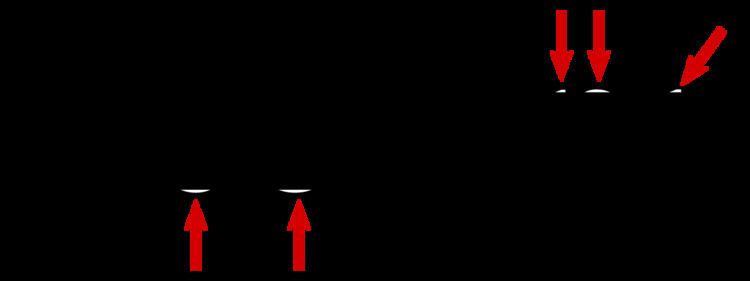
In typeface design, the overshoot of a round or pointed letter (like O or A) is the degree to which it extends higher or lower than a comparably sized "flat" letter (like X or H), to achieve an optical effect of being the same size; it compensates for inaccuracies in human visual perception.
Formally, it is the degree to which capital letters go below the baseline or above the cap height, or to which a lowercase letter goes below the baseline or above the x-height.
For example, the highest and lowest extent of the capital O will typically exceed those of the capital X. Although the extent of overshoot varies depending on the design and the designer, perhaps 1% to 3% of the cap or x-height is typical for O. Peter Karow's Digital Formats for Typefaces recommends 3% for O and 5% for A.
Similar design
Similar subtle adjustments to create an even appearance occur in other fields. For example, in the game of go, the stones, which are black and white, are of slightly different sizes (black slightly larger), to give the appearance of being the same size.