
Date released 1959 | Designer Arthur Ritzel | |
 | ||
Link linotype.com/1268/neuzeit-s-family.html Foundry Mergenthaler Linotype Company, Stempel Type Foundry | ||
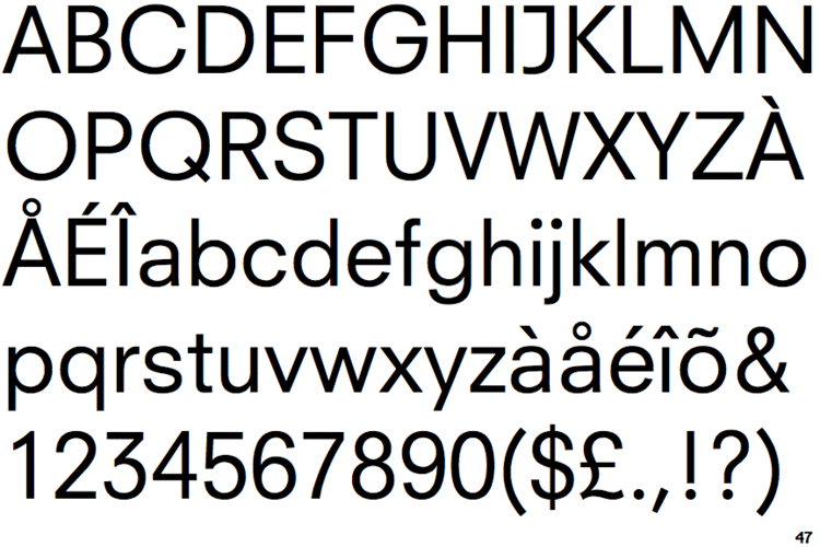
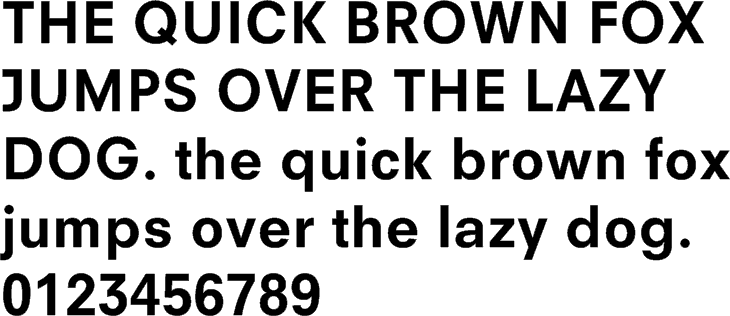
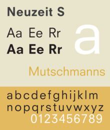
Neuzeit S is a sans-serif typeface designed by Arthur Ritzel in 1959 (as Neuzeit-Buch) and 1966 (as Neuzeit-Buch S) for Linotype and a corporate typeface for Siemens. The German name translates to English as "new time" and refers to the modern era. The face combines characteristics of both geometric and realist (neo-grotesque) sans-serif classifications, and is based on Neuzeit Grotesk, a more purely geometric sans-serif designed by Wilhelm Pischner in 1928 for the Stempel Type Foundry.

Neuzeit S is distinct for its contrast of wide circular characters o, O, p, q, and Q with the more compact characters h, n, u, and t.
References
Neuzeit S Wikipedia(Text) CC BY-SA