
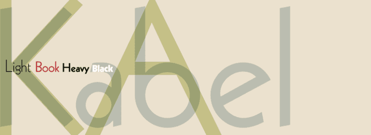
Variations Stempel Kabel | Date released 1927 | |
 | ||
Kabel is a sans-serif typeface designed by German designer Rudolf Koch, and released by the Klingspor foundry from 1927 onwards.
Contents
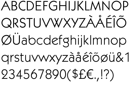
Kabel belongs to the "geometric" style of sans-serifs, which was becoming popular in Germany at the time of Kabel's creation. Based loosely on the structure of the circle and straight lines, it nonetheless applies a number of unusual design decisions, such as a delicately low x-height (although larger in the bold weight), a quirky tilted 'e' and irregularly angled terminals, to add delicacy and an irregularity suggesting stylish calligraphy, of which Koch was an expert. A variety of rereleases and digitisations have been created.
Design
Like its contemporary Futura, Kabel bears influence of earlier “artistic” sans-serif typefaces; the 1919 Feder Schrift, drawn by Jakob Erbar, and more so his 1922 design called Erbar. Still, Kabel is as much Expressionist as it is Modernist, and may be considered as a sans serif version of his Koch-Antiqua, sharing many of its character shapes and proportions, most notably its low x-height and its two-storey 'g' with a large, partly open lower loop. Stroke weights are more varied than most geometric sans-serifs, and the terminus of vertical and horizontal strokes are cut to an angle. This gives Kabel the effect of not quite sitting on the baseline and making for a more animated, less static feeling than Futura. The capitals are broad and show influence of Roman square capitals. The capital 'W' has a four-terminal form and the 'G' has no terminal.
Koch marketed Kabel with a specimen showing the capitals supposedly derived from a construction grid of perfect rectangles and circles, but Walter Tracy and others have noted that this graphic does not really resemble the letters of the printed type, which were clearly drawn freely rather than by uncorrected geometry: "Koch probably drew [his] letters without constraint, and then 'rationalised' them afterwards…Koch was evidently not a man to be bound by arbitrary rules. In Kabel Light the arms of E are actually three different lengths, the bowl of R is deeper than that of B, and in P it is deeper still…and Y does not have the vertical stem shown in the diagram. In short, Koch's sense of style is in command, rather than any geometric formula. The result is an alphabet of capitals that relate perfectly without need [of] 'mathematical harmony'…they are, for my taste, the most attractive of all sans-serif capitals."
The face was not named after any specific cable, although the Zugspitze cable car had been completed in 1926, and a Berlin-Vienna facsimile telegraphy line opened in 1927. The name had techie cachet in its day (Piet Zwart's NKF kabel catalogue of 1927 is well-known) and is primarily metaphorical and allusive, a pun referring to both the monolinear construction of the face, and the role of type as a means of communication.
Release
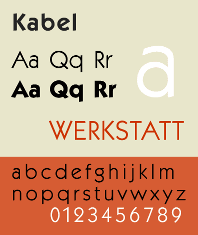
The original release of Kabel was in four weights: Light (released first), Medium, Bold and Heavy. The latter has a redesigned structure to fit the thicker strokes, with an enlarged x-height and more regularity, without the angled terminals of the lighter weights. Also released was an inline design, “Prisma”, a headline weight “Zeppelin”, and condensed weights.
Some metal type releases offered stylistic alternates, alternate characters with a different design. Many reduced the eccentricities of Kabel and in particular made it more resemble Futura, which was very dominant in printing of the period. (This offering of Futura-like alternates such as a single-storey ‘a’, which historian Paul Shaw has called a "Futura-ectomy", was common among other sans-serifs of the time, including Monotype’s Gill Sans, Linotype's Metro and Erbar.)
Originally released by Koch’s employer the Klingspor Foundry, to widen sales the design was also made available by the Stempel Foundry (which bought Klingspor in 1956, having already owned some shares) and on Linotype’s “machine composition” hot metal typesetting and phototypesetting systems. Linotype continues to sell Kabel in digital format. Owing to Kabel’s popularity, many adaptations and simple knock-offs were sold by other companies, such as Phil Martin’s Alphabet Innovations. This particularly occurred in the phototypesetting and digital type periods, taking advantage of the lack of international copyright protection for typefaces.
ITC Kabel
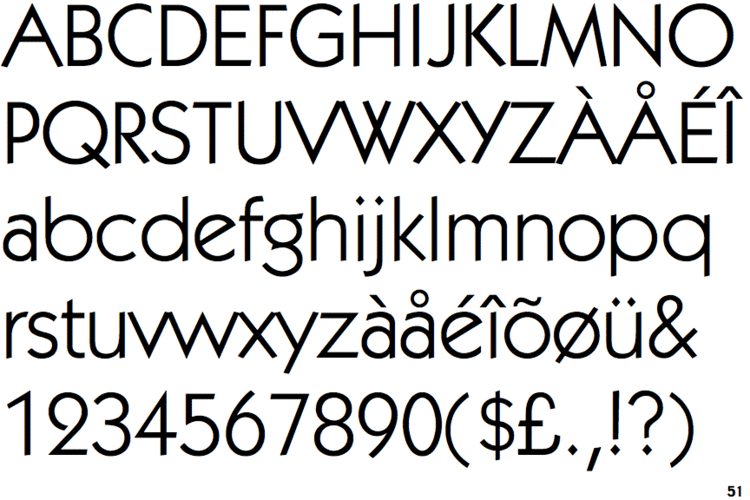
Victor Caruso's 1975 adaptation for phototypesetting, licensed by D Stempel AG, for the International Typeface Corporation, is very well-known. It follows the standard ITC approach of a dramatically increased x-height accompanied by multiple weights from Book to Ultra.
ITC also sold ITC Grizzly, an adaptation of the bold weight.
Neue Kabel
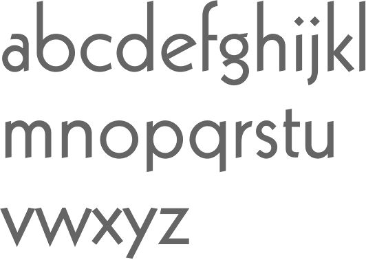
A 2016 release by Marc Schütz with an x-height between the original and the ITC digitisation.
Other
Bhikkhu Pesala created the open-source revival Kabala, named after a Pāli word meaning 'a morsel of food' due to its intended use in Buddhist religious publications. This release is inspired by the ITC weight set and structure, but adds a number of features including italics, small caps and combined characters.
Prominent usage
Google's corporate typeface, 'Product Sans', has some similarities to Kabel, in particular the angled 'e', but other features such as the 'M' and 'g' are very different, resembling Helvetica or Futura. Product Sans is a proprietary design not available for licensing.