
 | ||
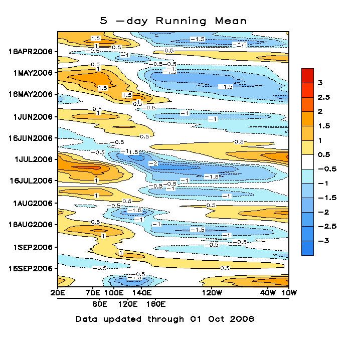
A Hovmöller diagram is a commonly used way of plotting meteorological data to highlight the role of waves. The axes of a Hovmöller diagram are typically longitude or latitude (abscissa or x-axis) and time (ordinate or y-axis) with the value of some field represented through color or shading. Hovmöller diagrams are also used to plot the time evolution of vertical profiles of scalar quantities such as temperature, density, or concentrations of constituents in the atmosphere or ocean. In that case time is plotted along the abscissa and vertical position (depth, height, pressure) along the ordinate.
The diagram was invented by Ernest Aabo Hovmöller (1912-2008), a Danish meteorologist, in a paper of 1949.
References
Hovmöller diagram Wikipedia(Text) CC BY-SA