
Date released 1910 + 1915 Date created 1910 | Trademark 1915 Classification Display | |
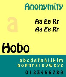 | ||
Hobo is a sans-serif typeface. It is unique in having virtually no straight lines and no descenders. It was created by Morris Fuller Benton and issued by American Type Founders in 1910. A light version, Light Hobo, was released in 1915. Matrices were offered for mechanical composition by Intertype. Hobo possesses uniquely organic and art nouveau-style features. The lower case letters provided the basis for Robert Wiebking's Advertisers Gothic of 1917.
There are several theories regarding the font's name, and in fact it is widely recognized as one of the more interesting mysteries in typographic history. One theory states that its name came from a story stating that it was sketched in the early 1900s, sent to the foundry nameless, and progressed so little for so long, that it was called "that old hobo". Hobo, originally called Adface, was finally patented in 1915 along with Light Hobo. The prevailing bow-legged shape of the letterforms inspired another long-held theory that it was so named because they resembled those of a bow-legged hobo.
The most complete and most plausible theory demonstrates how Benton, who lived and worked near a large Russian community, must have seen a particular cigar poster spelling what appears to read like "HOBO!" ("ново", Russian for "New!"). The poster's hand-lettering of the word bears striking and unique resemblances to the font; the shape of the O at the extreme right of the poster was probably traced by Benton to match his own Capital O precisely, and those shapes helped define the design of the font.
Digital versions of this face are often found in Mac OS and Microsoft Windows systems.
Usage in popular culture
Hobo was used as the main typeface in the title sequence and promotional materials of the 1969 film Butch Cassidy and the Sundance Kid. Hobo was also used in the opening titles of The Dukes of Hazzard, Hobo also used as the main typeface in the title card sequence of Winx Club.