Trisha Shetty (Editor)

Harrod–Johnson diagram

Updated on
Edit
Like
Comment
Share on FacebookTweet on TwitterShare on LinkedInShare on Reddit
Harrod–Johnson diagram

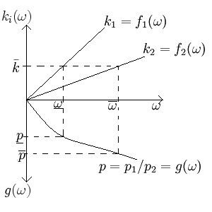
In two-sector macroeconomic models, a Harrod–Johnson diagram is a way of visualizing the relationship between the output price ratios, the input price ratios, and the endowment ratio of the two goods. Often the goods are a consumption and investment good, and this diagram shows what will happen to the price ratio if the endowment changes. The diagram juxtaposes a graph which has input price ratios as its horizontal axis, endowment ratios as its positive vertical axis, and output price ratios as its negative vertical axis. This may seem unintuitive, but doing this makes it easier to see the relationship between the output price ratios and the endowment. The diagram is named after economists Roy F. Harrod and Harry G. Johnson.

Derivation

If we let our good 1 be an investment good, governed by the equation Y 1 = F 1 ( K , L )

and good 2 be a consumption good: Y s = F s ( K , L ) then to calculate rental and wage rates, we optimize a representative firm's profit function, giving p 1 D K [ F 1 ( K , L ) ] = r = p 2 D K [ F 2 ( K , L ) ] for the rental rate of capital, r, and p 1 D L [ F 1 ( K , L ) ] = w = p 2 D L [ F 2 ( K , L ) ] for the wage rate of labor, w, so the input price ratio, ω , is ω = w / r = p i D L [ F i ( K , L ) ] , p i D K [ F i ( K , L ) ] for i = { 1 , 2 } . Normalizing this equation by letting k i = K i / L i , and solving for k i , gives us the formulas to be graphed in the first quadrant.

On the other hand, normalizing the equation p 1 D K [ F 1 ( K , L ) ] = p 2 D K [ F 2 ( K , L ) ] (or p 1 D L [ F 1 ( K , L ) ] = p 2 D L [ F 2 ( K , L ) ] , which is presumably equivalent), and solving for the price ratio, p 1 / P 2 , gives the formula which is to be graphed in the fourth quadrant.

With these three functions graphed together, we can see our relationship.

References

Harrod–Johnson diagram Wikipedia